2017/03/1
"Harri Display Typeface and Basque Lettering" by Juan Luis Blanco
There is something about the visual landscape of the Basque Country that will not go unnoticed to the eyes of its visitors regardless of their knowledge of typography: the peculiar lettering style spread all over the region on street plates, signs, posters and fascias. They display extremely heavy letters in a sort of overemphasised glyphic style with characteristic concave stems that produce very sharp terminals and awkward letter forms. Those shapes look certainly rough, unrefined and overdone, conveying a sort of primitiveness rooted way back in time. This seems to make it a convenient choice for food shops, restaurants, cider houses and other cases in which projecting the idea of authenticity, tradition and "Basqueness" is intended.
Harri, as a typographic project, started the very day a client asked me to design a logo that would be clearly recognised as Basque, with a firm restriction: to avoid "that typeface used for cider houses and butcher shops", in obvious reference to the Basque lettering style afore-mentioned.
2017/07/6
Multi selected as one of the Typographica's favourite typefaces of 2016
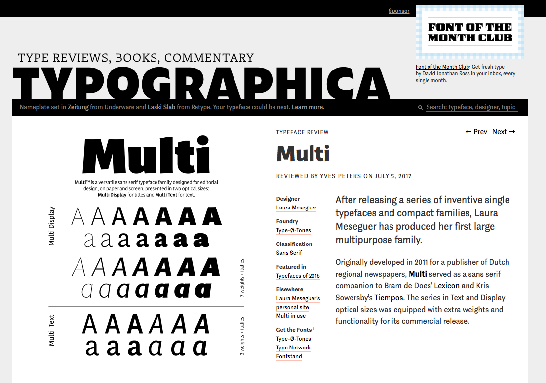
Great news arrived. Today we got the news that Laura's typeface family Multi has been selected and reviewed by Yves Peters as one of the "Our Favourite Typefaces of 2016" for Typographica. There is no better reward for a type designer that being appreciated by others who can see what is behind the work you have done.
Founded in 2002, Typographica is a review of typefaces and type books, with occasional commentary on fonts and typographic design. Edited by Stephen Coles with Caren Litherland and designed by Chris Hamamoto. Typographica's Favourite typefaces selections are made by graphic designers, type designers, educators, and enthusiasts who have a taste and good eye for type.
We have to thank Yves for his words, so elegant and subtle. He writes how he feels, not how he thinks, that's poetry for us. You can read his review here.
2017/04/25
Improved versions of some of our typefaces families: Arboria, Arbotek, Joost and Rumba.
Probably you already know that these four families are pretty different.
ARBORIA and ARBOTEK are related to each other because both are based on a geometric construction, while Arboria has six weights and two constructions — Roman and Italic — and is meant for editorial design projects, Arbotek has more variety among the four styles.
JOOST, in its third incarnation, originally published in 1995, has abandoned the original modules to obtain a better relationship between the different styles. The new set of characters incorporates Central European, stylistic set for capital letters and an OpenType Features repertoire.
Finally, RUMBA, which is based on a calligraphic structure, explores the optical sizes principle from a very personal way. In coincidence with the release of these typefaces in TypeNetwork, we have included some extra characters and improve the performance of the OT Features.
2017/04/23
Major updates for 2 classic fonts: Designal and Memimas
DESIGNAL was originally published in 2002 as the first typeface in our collection specially designed for signage and packaging. The new version contains numerous visual adjustments, as well as a redesigned uppercase that incorporates interesting variations in a 'unicase' set. Felix Rufín has worked on rationalising its extensive pictogram collection.
MEMIMAS is one of the most veteran Type-Ø-Tones projects (1991) and, among its technical constraints, a project that demands constant evolution. The updated version 4.1 incorporates alternative Uppercase characters (in Script and Sans versions) and automatic ligatures for the lowercase that will appear as Contextual Alternates; as well as numerous improvements in the drawing, redesign of characters and OpenType features.
2017/03/7
The design of Magasin
I’ve always been fascinated by typefaces based on fluid handwriting, and as an amateur calligrapher of copperplate, I decided to design Magasin as a display font based on this experience.
Origins and background
My first approach to this project began with the lettering I designed for BoMo, a graphic design studio, in spring 2011. It’s based on a brief: feminine, professional and sensibility. The solution came as a well-crafted series of ‘calligraphic letters’ with high contrast, the B, the M and the o, combined as two connected syllables. During the design process, I discovered the significant potential that this idea could have if it were developed as a typeface. Thus, almost one year later, I began to sketch it, and two years after I released it!. It evolved from the initial three letters of the logo but with differences: slightly less condensed proportions, different designs for the two upper case letters and a new construction of the connecting strokes.
It combines a sense of script with a geometric and slightly condensed structure resulting in idiosyncratic curves, yet with a retro-chic twist. These might probably be the most attractive features because of all together they give a very strong identity to words.
During my research, I review a lot of previous & excellent typefaces sharing a similar idea, but any of them had this sense of a connected and upright script. Somehow, Magasin explores and pays tribute to the charm and playness of typefaces that were designed during the 1930s. Some inspiring references are Corvinus, released by Bauer in 1935 (designed by Imre Reiner in 1934), Quirinus (Alessandro Butti,1939) and Fluidum (1951), a kind of non-connected script version of Quirinus, also designed by Butti for the Nebiolo type foundry.
2017/01/20
"Las tipos de la imprenta"
El tipo de la imprenta es una imprenta digital muy concienciada con el trabajo de los diseñadores. Una vez más este año, han lanzado un calendario promocional para dar a conocer su trabajo con una idea muy interesante: comprar doce tipografías diseñadas en España y utilizarlas para ilustrar cada uno de los meses. El calendario ha sido diseñado por Sapristi. Las tipografías elegidas por El tipo de la imprenta para su calendario de 2017 son: Atocha, de Joluvian; Wilma, de Enric Jardí; FF Pepe, de Pepe Gimeno; Lalola, de Laura Meseguer; Trola, de Jordi Embodas; Paquita Pro, de Juanjo López; Póster, de Íñigo Jerez; o Memimas, de José Manuel Urós.
El tipo de la imprenta recogen una pequeña descripción e historia de cada una de las tipografías que han usado en el proyecto y un enlace para licenciarla.
Podéis leer más sobre el proyecto aquí.
2017/01/19
A new stage for the typographic design company
Solo, the graphic design studio based in Barcelona was the one in charge of the full redesign of our website. At last but not least, we need to say that we are happy! Now they have shared the project at their own site and this is what they wrote about it:
It is not often you have the opportunity to carry out a design project that you are also the main recipient of.
The designer's essential tool —besides the idea— is the typeface, which works as an essential means of communication, facilitating understanding of the project and conveying its content to the public.
Type–Ø–Tones is an independent typographic design company created in 1990 by Josema Urós, Enric Jardí, Laura Meseguer and Joan Barjau. Over recent years, we have been able to see how this project is reaching a full state of maturity, combining the initial nature of the display typeface and digital experimentation with more complex and polished font families, families for reading newspapers, magazines and brand names.
The new website and online shop of the design company clearly shows this evolution of the Type–Ø–Tones project; the relaxed use of colour, the graphic simplification —without losing the original essence— the expressiveness of the letters and the combination of typeface with illustration leads to an intuitive platform that can be browsed both vertically and in landscape, and which prioritises font display.
Both the process for testing these fonts and the checkout procedure have been devised for graphic designers, the main endorsers of typography workshops, and are presented as a visual and colouristic set that supports all Type–Ø–Tones collections.