2019/05/24
The design process of Skope by José Manuel Urós
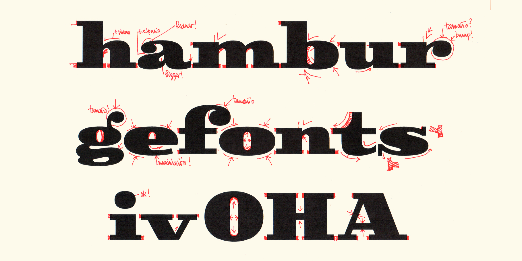
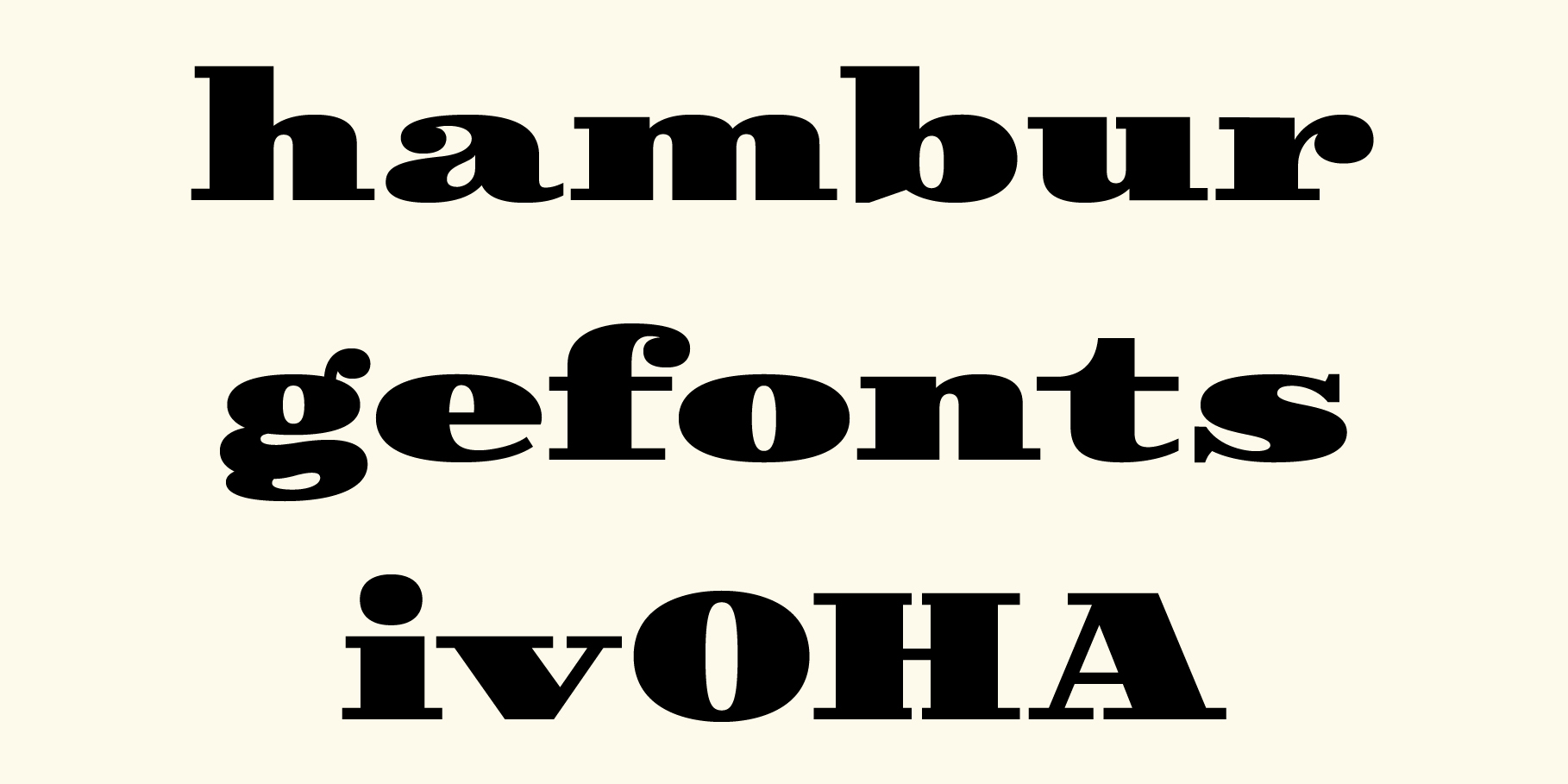
Skope started as an exercise for our teaching classes. For years, in our type design classes, we have been using an exercise that, familiarly, we call 'Hamburgefontsiv'. This exercise consists in the creation of some letters for different alphabets (in fact, only the key characters that appear in the word 'Hamburgefontsiv') taking as reference logos, loose characters or any other form of lettering that doesn't belong to an existing, complete or consistent alphabetic system.
In our 'possible' project folders, we store references that can be the basis for new alphabets, ideas for lettering or solutions for future graphic works. Sometimes, these references contain happy stylistic coincidences that make us move files from 'possible' to 'ongoing'.
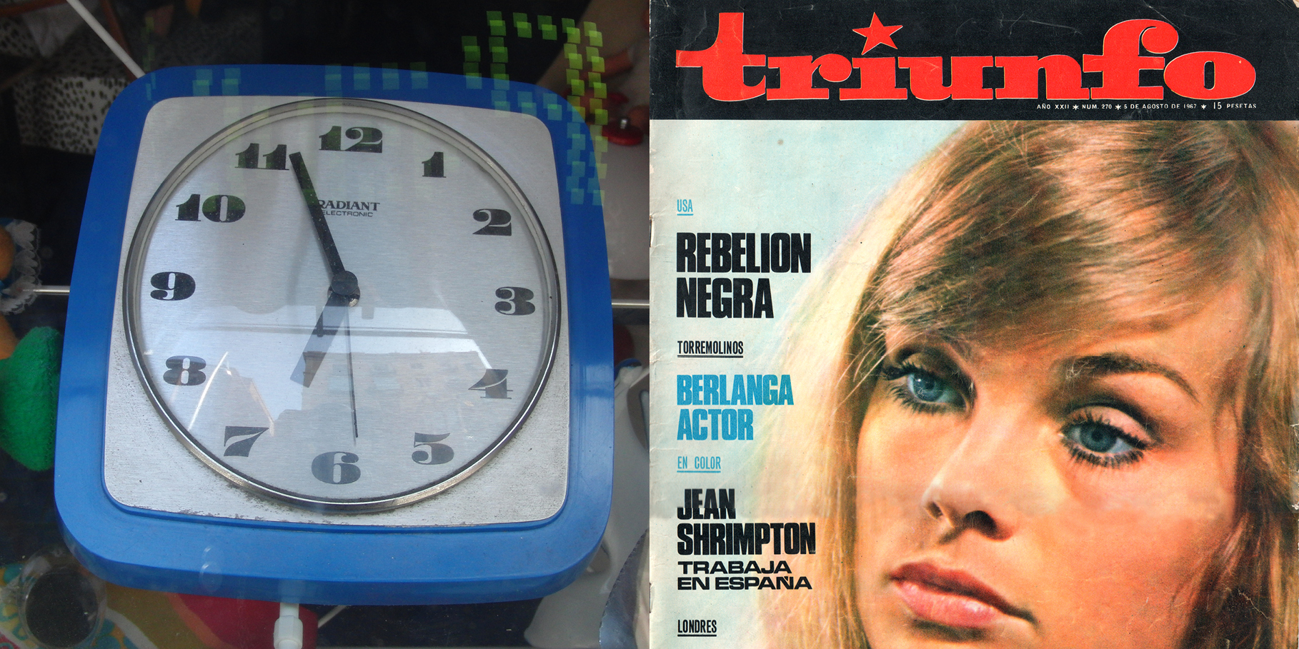
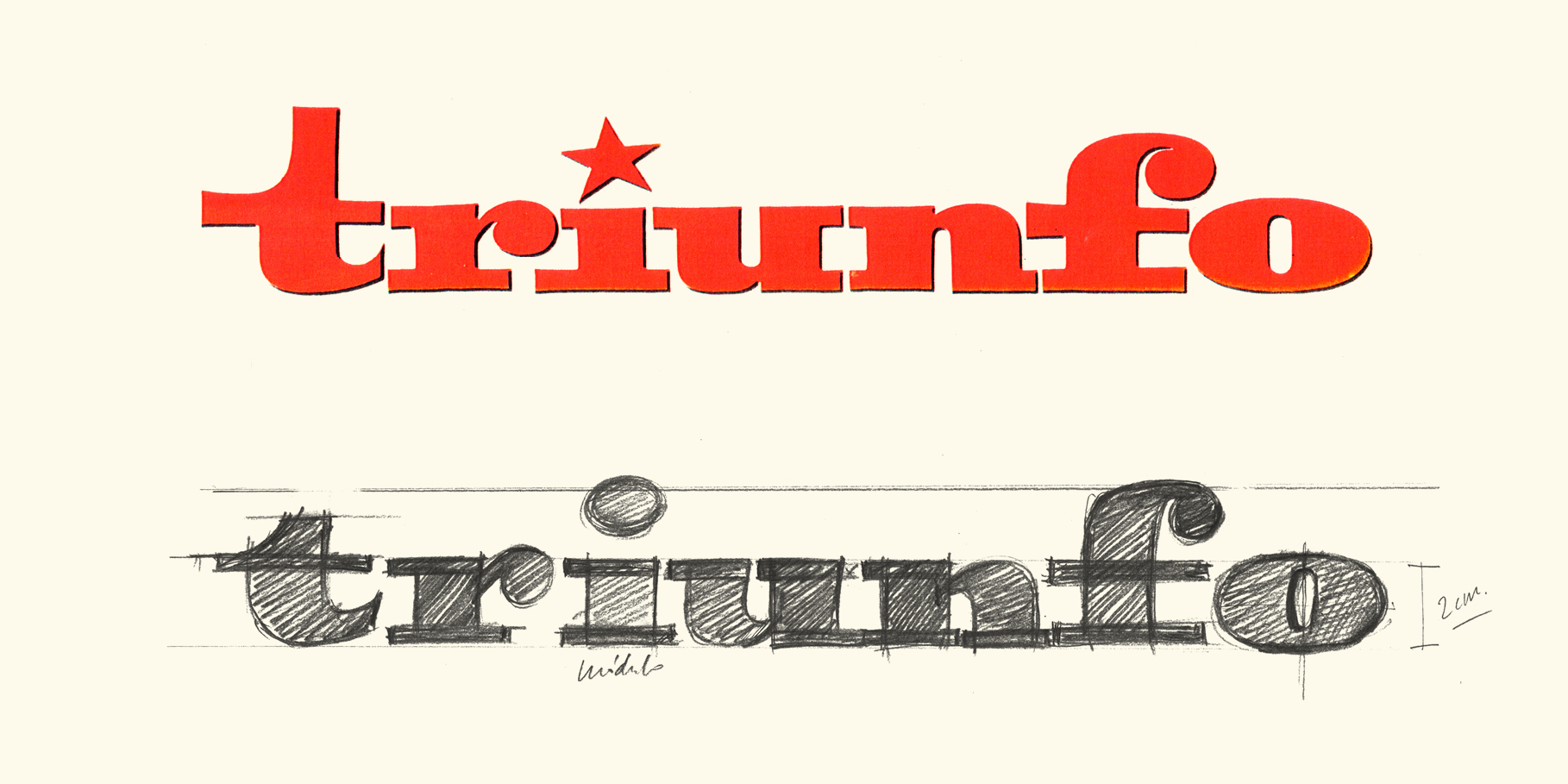
This is the case with Skope: a photograph of a kitchen clock from the '70s and the masthead of the disappeared Triunfo magazine (link). Both references refer to a style of extreme horizontal lettering that unifies Clarendon's, Poster Bodoni's and wood types' details with the iconography of '60s pop lettering and comic-books headlines.
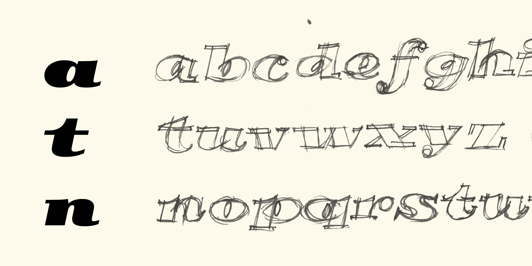
Due to Skope's stylistic characteristics, I decided that manual sketching was the best way to deal with the project and, when some characters were already digitized, we received, along with Laura Meseguer, the commission to carry out an online course of typographic design in Domestika. We decided to use 'Hamburgefontsiv' as an exercise for the course and, in our practice, we used Skope as a model to explain the process.
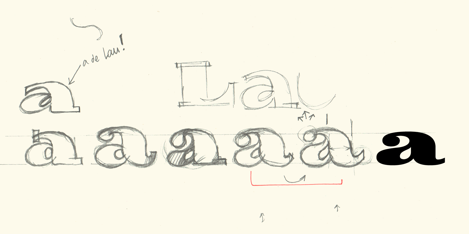
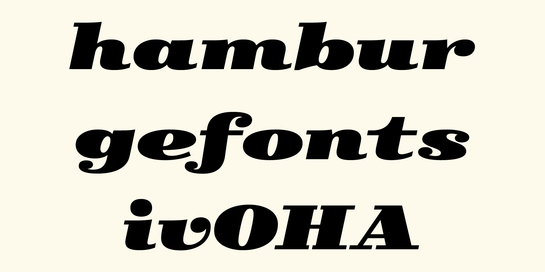
For Skope Italic, again, more sketches. The capitals are basically 'obliques', that is, mechanically inclined and subject to optical adjustments, but the lower case letters required a 'true italics' treatment.
I want to thank Manuel Urda, Francesc Capdevila -Max-, Joost Swarte and all the anonymous sign-painters the inspiration for Skope.
Hand-made sketches by Laura Meseguer and Josema Urós.
