2022/10/14
Eixample Collection: from street signage to typography
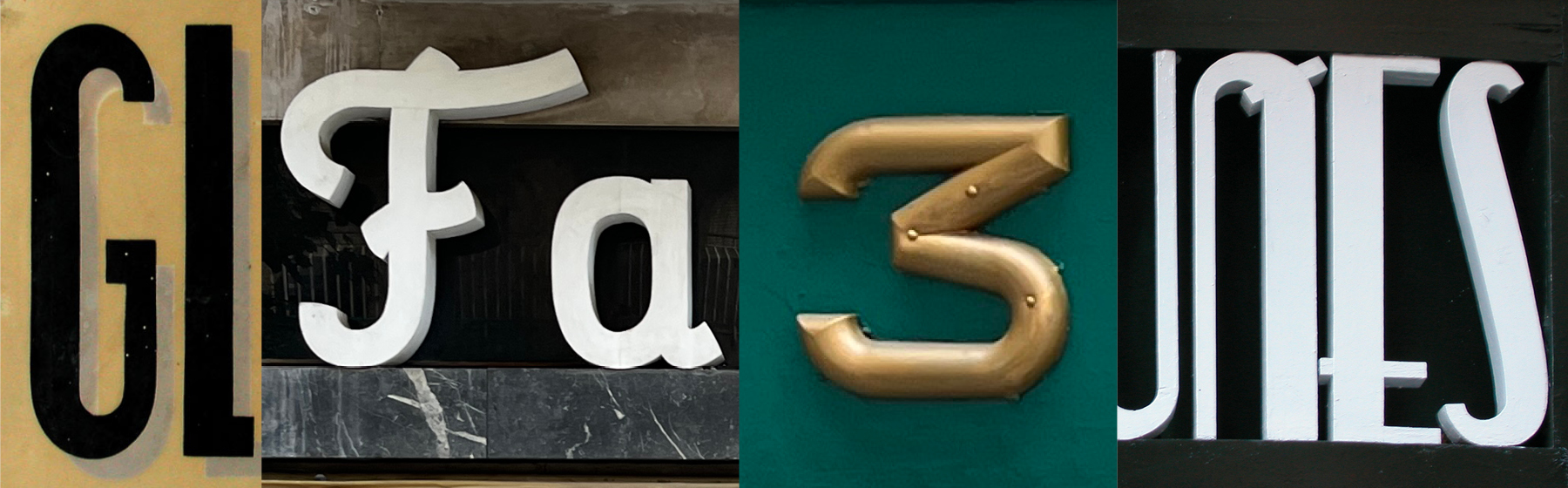
For years we have made quite a collection of street signs’ photography. Out of pure joy or just for personal study and notes we have also redrawn or reinterpreted the letterings, playing with different shapes from different art movements.
Some of the letterings from the Barcelona Eixample neighborhood were used as a base to design the typographic suite with the same name. While they don’t seem to have a precise style appertaining they blend together flavours of Art-Deco modernism and Bauhaus’ modularity.
We have maintained the historical DNA but the challenge we gave ourselves was to go further and make these typefaces more contemporary and broaden their type of usage– not only for big display titles but also for smaller point size in longer texts.
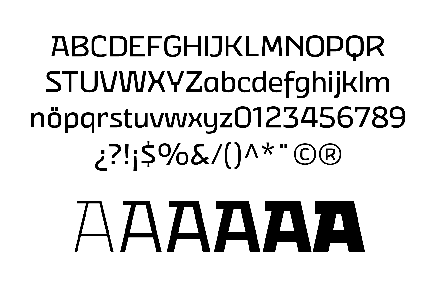
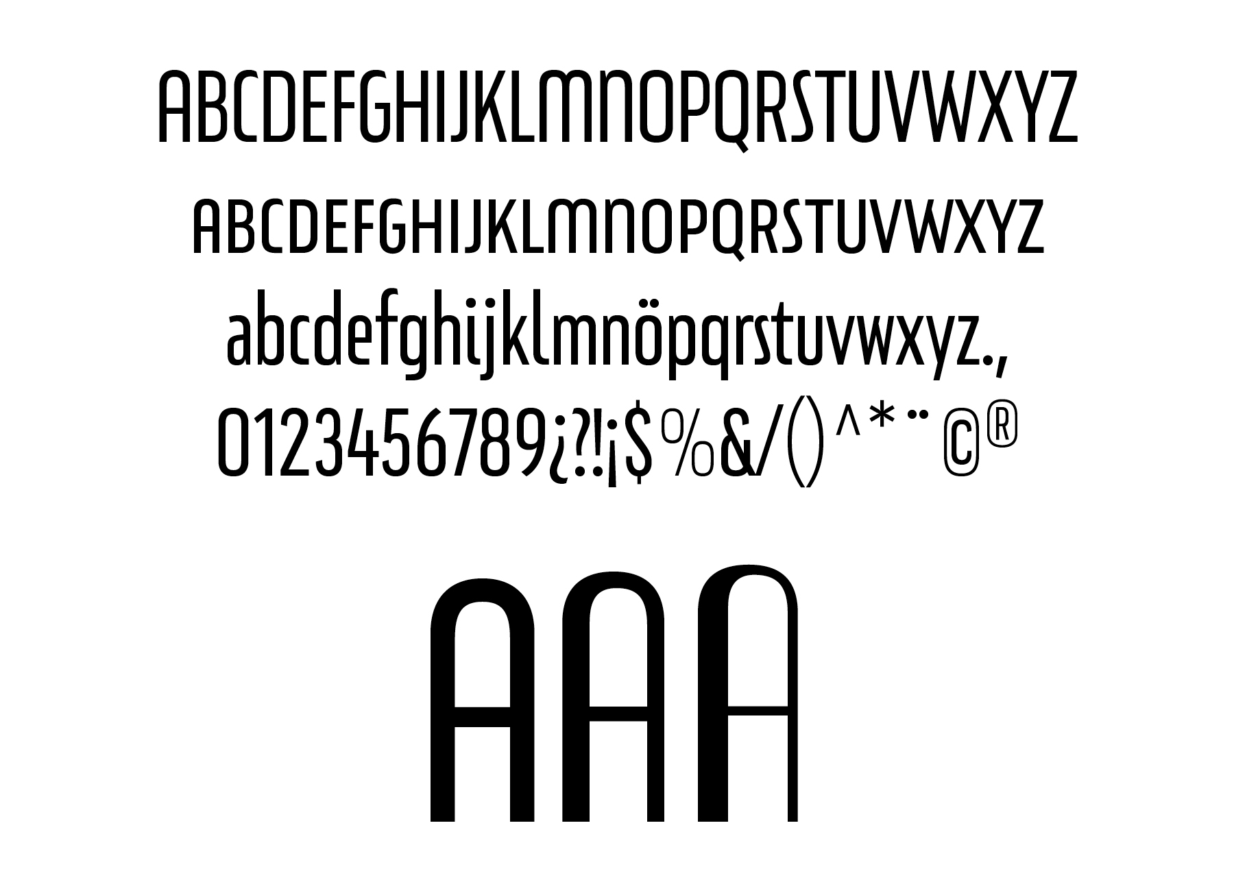
Eixample Villa
Villa is the abbreviation for Carrer Villarroel (Villarroel Street), where the Villarroel Pharmacy has been displaying this sign since the first quarter of the twentieth century.
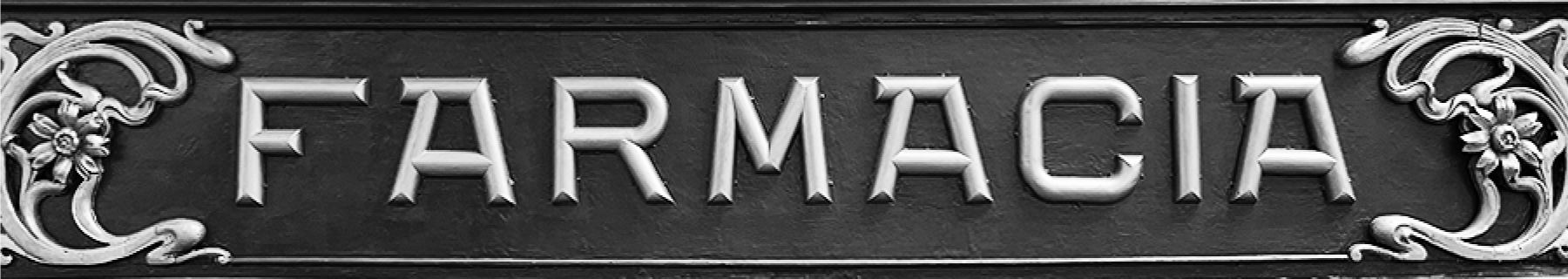
Like the rest of the families in the Eixample series, Villa shows its origin as a display font, but it has been engineered to give good results at small sizes as well.
The uppercase A was the main influencer for the design of Eixample Villa character set.
Design decisions.
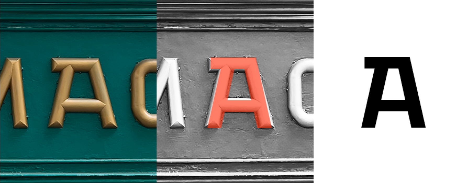
The Eixample Villa typeface system consists of sturdy letters free of ornaments with an industrial aspect. Only the treatment of the curves borrows modernist features.
Some letters – marked with red – are faithful representations of the original sign. Other letters – marked with blue – have been slightly redesigned to work better within the typeface system. And some letters – marked with black – are designed from scratch as we progressed into exploring the personality of the new typefaces.
Eixample Villa: Quick family overview.
Eixample Glaces
In 2003 we photographed a sign with the word GLACES painted on a refrigerator, on which, over the years, we have speculated on how to manage the concept of double vertical modulation.
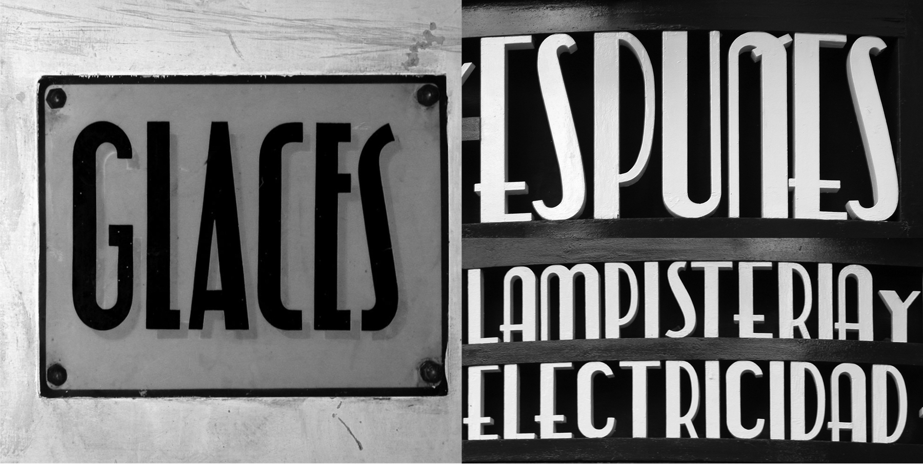
Both the painted Glaces example and the sign on the famous Barcelona attention grabber Espuñes sign are direct references to for the design of Eixample Glaces. Coincidentally they are also situated within few meters from one another.
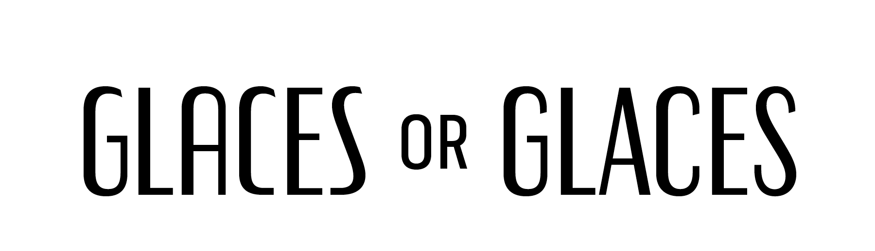
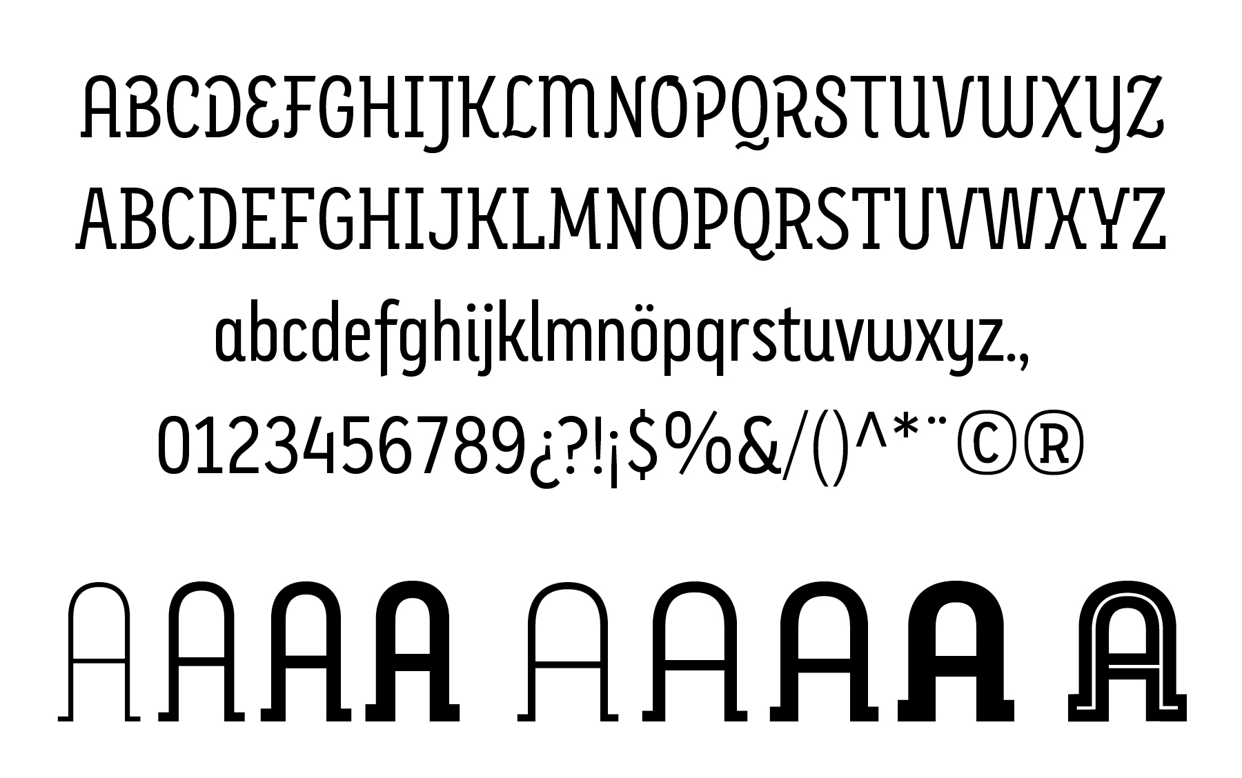
After studying the original Glaces aperture treatment we saw an opportunity to unify their design within the typeface system by creating alternates. Therefore Eixample Graces type family offers the users conventional closed apertures for characters like C, G, S but also an open and playful approach as well. They can be accessed by using the stylistic set opentype features.
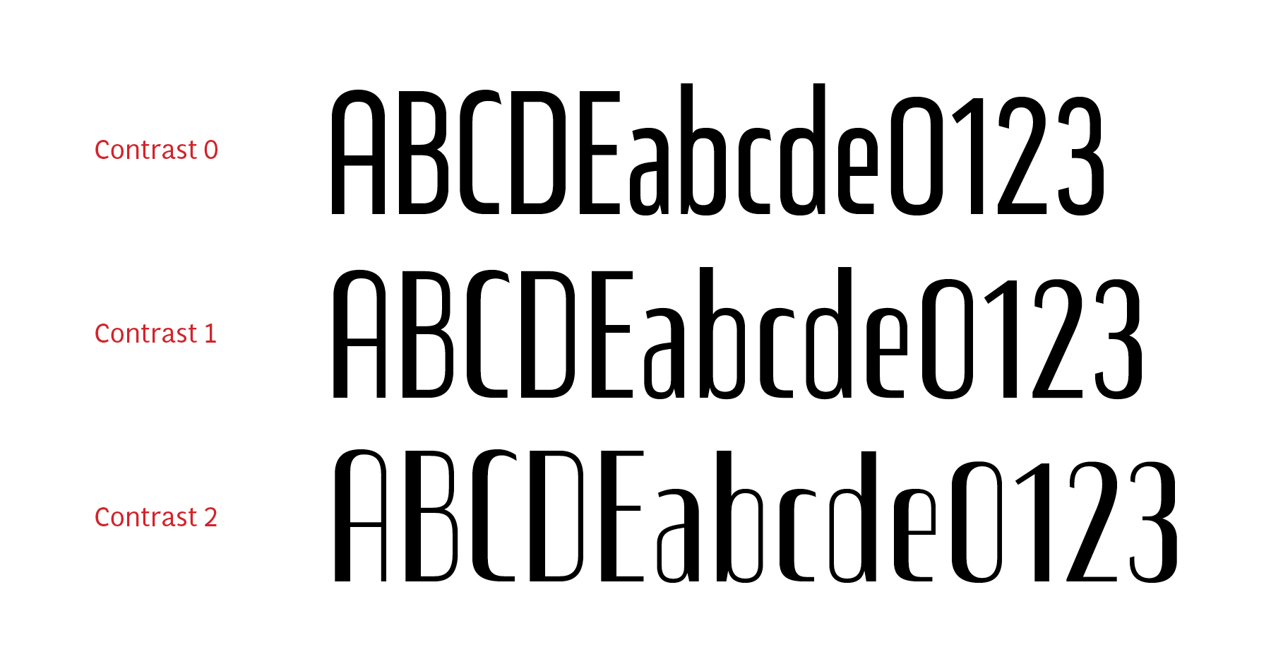
This model has been expanded and the original idea has been developed in three variants that oscillate between monolinear and high contrast. In order to increase its versatility, the character set includes small caps.
Eixample Glaces: Quick family overview.
Eixample Dip
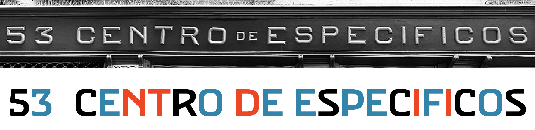
Dip is the abbreviation for Carrer Diputació (Diputació Street), where the original sign spells Farmacia Específicos Diputación.
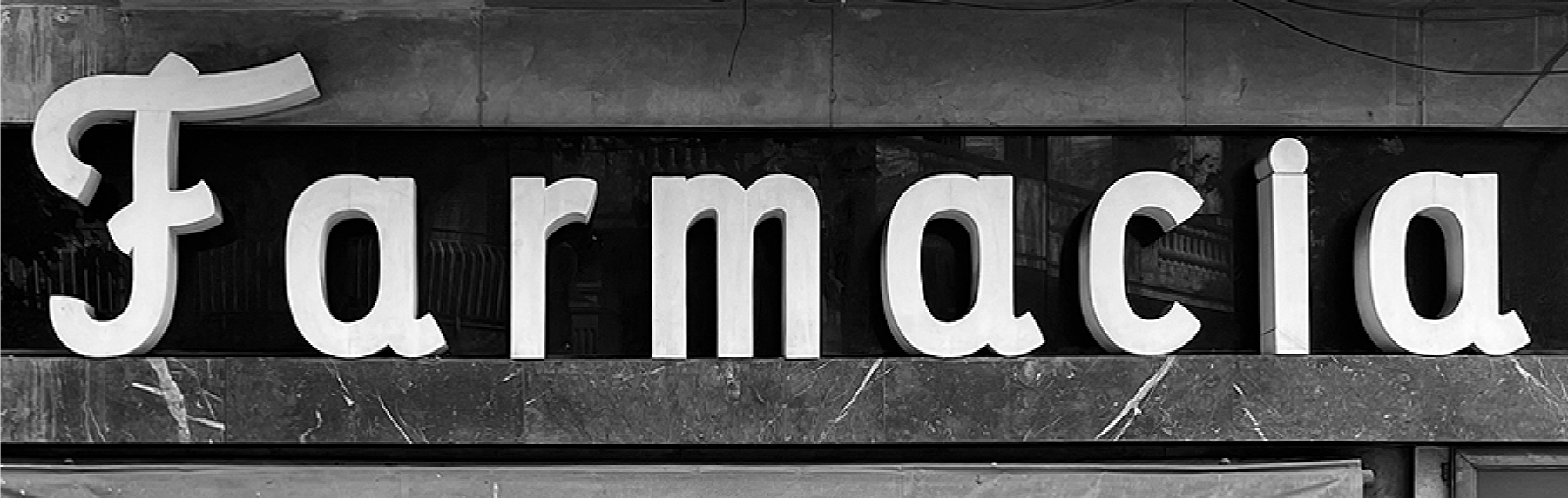
The reference taken from the pharmacy sign is a curious model, where sans-serif lowercase letters coexist with a script uppercase. This fundamentals create the system that we have introduced in Eixample Dip.
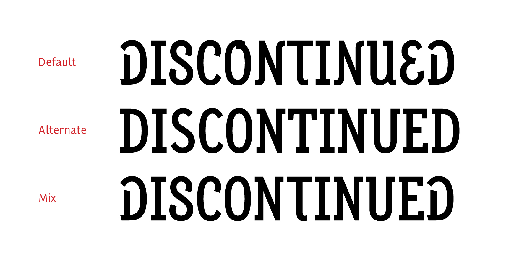
Uppercase combinations. Default/Alternate/Hybrid.
The capitals are built with contained decoration to achieve maximum compatibility between letters. The script capitals are the default uppercase but we have also included alternative capitals, a slab style that can be combined with the scripts.
Eixample Dip Narrow was designed with the direct influence of the sign’s narrow proportions while Eixample Dip proportions were specially adjusted for prolonged reading.
Eixample Dip: Quick family overview.

During the drawing process of the Eixample Dip family the idea of an extra style emerged – an inline version specially created for display usage. Inspired by poster and label letterings this inline follows the letter shapes while also including a stencil concept. The inline is cut by the construction strokes direction. In order for the letters to accommodate the inline a thicker, more wider version of the Eixample Dip was extrapolated and optically corrected. We also did various tests to understand what is the best inline thickness in relation with the thickness of the strokes.
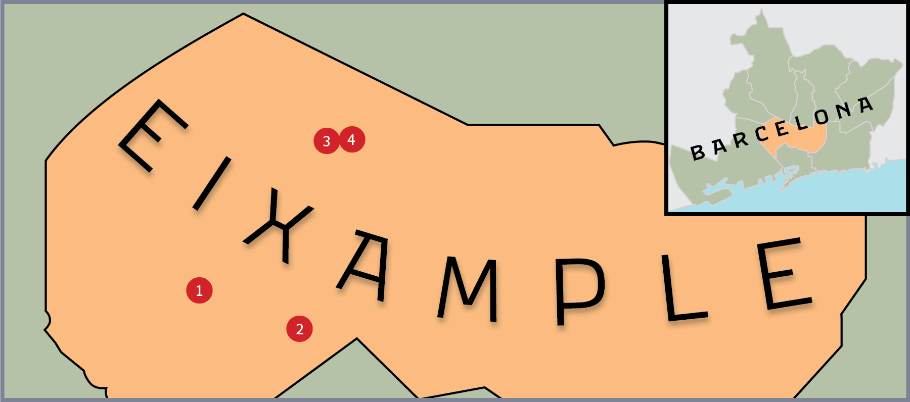
Location of our references on a map of the Eixample neighborhood. 1.Dip, 2.Villa, 3.Glaces, 4.Espuñes.
[Photographs by Andra Năiță, Mircea Stancă, Sabina Chipară, Juan Dávila and Josema Urós]
