2017/03/1
DINosaur brings fun to the template
Technical sans serifs designed on grids or based on templates are very popular, especially among designers. However, many perceive them as cold and impersonal. DINosaur is a friendly alternative.
Discover the many faces of DINosaur in its postcard gallery.
While—just like any other designed artifacts—typefaces are subject to trends and fashions, some typographic models enjoy an enduring popularity. This doesn’t only happen to typefaces that have a historical importance. Alphabets that are part of the vernacular, the everyday world that surrounds us, become ingrained in our collective consciousness. They conjure up comforting feelings of familiarity, sometimes of nostalgia. Understandably, type designers and foundries try to tap into those emotions. Many do so in less imaginative ways, creating slavish facsimiles. Yet some manage to find a fresh approach and turn these mainstays into exciting and useful contemporary fonts.
One example is the technical sans serif: letters drawn by engineers and architects, using only straight lines and simple circular arcs, often with the aid of grids or stencils. Their “undesigned” appearance exerts a strange attraction to many designers fascinated by their modularity and strict geometry. Among others, this has resulted in a multitude of adaptations of the alphabets devised by the Deutsches Institut für Normung, the German Institute for Standardization, such as DIN 1451.
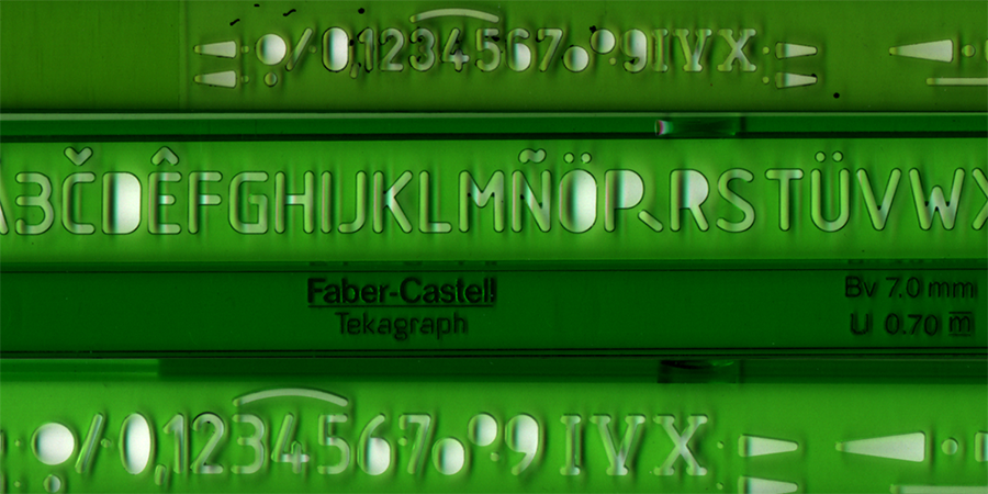
The "Instituto Nacional de Racionalización del Trabajo" proposed a grid-based system to teach technical lettering.
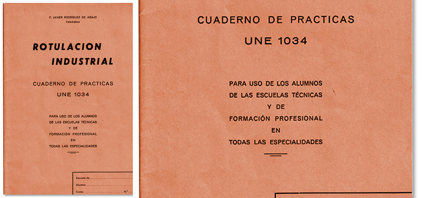
The cover for the technical calligraphy manual José Manuel Urós found in his files.
The story of DINosaur began with the discovery of a technical calligraphy manual in José Manuel “Josema” Urós’ files. The manual described how to letter technical drawings according to the standards of the Instituto Nacional de Racionalización del Trabajo, the Spanish National Institute for Labor Rationalization. Technical lettering alphabets always held a special place in Josema’s heart, and his high school assignments were replete with headlines in this style. Finding the manual inspired him to create a digital typeface based on the upright version of the alphabet.
Even though DINosaur’s morphology and Josema’s approach to its digitization were radically different from everything he had drawn so far, its source of inspiration was conceptually in line with many of his previous typefaces. On the one hand, Josema favors the emotional factor over other considerations when selecting personal projects, an attitude that Type-Ø-Tones shares on a foundry level. This has been clearly reflected in previous creations. MeMimas is based on the Spanish system to teach children how to read and write, while EbúScript emulates Josema’s personal handwriting. Geneva, Optica, Reload, and Solida reflect the influence from the good old days of his early Macs; Matricia is a remnant of a decade of using matrix printers. Arboria, Arbotek, and Joost stem from Josema’s interest in Art Deco aesthetics, minimalism, and the ligne claire style of comics. On the other hand, whenever the typeface calls for it, Type-Ø-Tones have a preference for the analog, the gestural, with deliberate, well-considered “imperfections” in both design details and the general appearance.
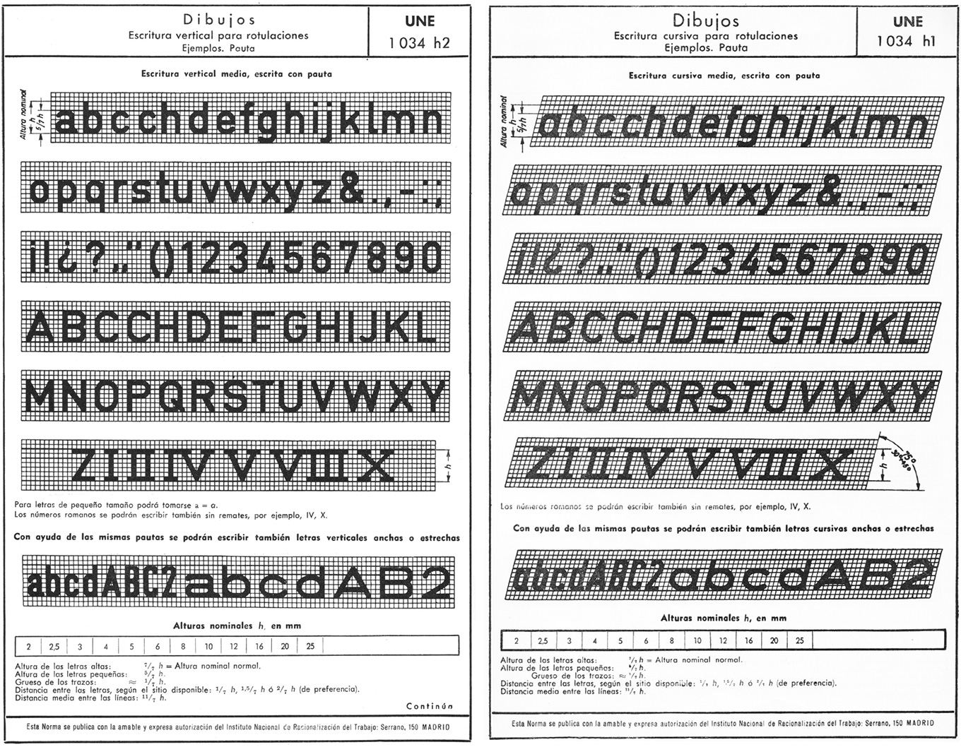
The original UNE alphabet.
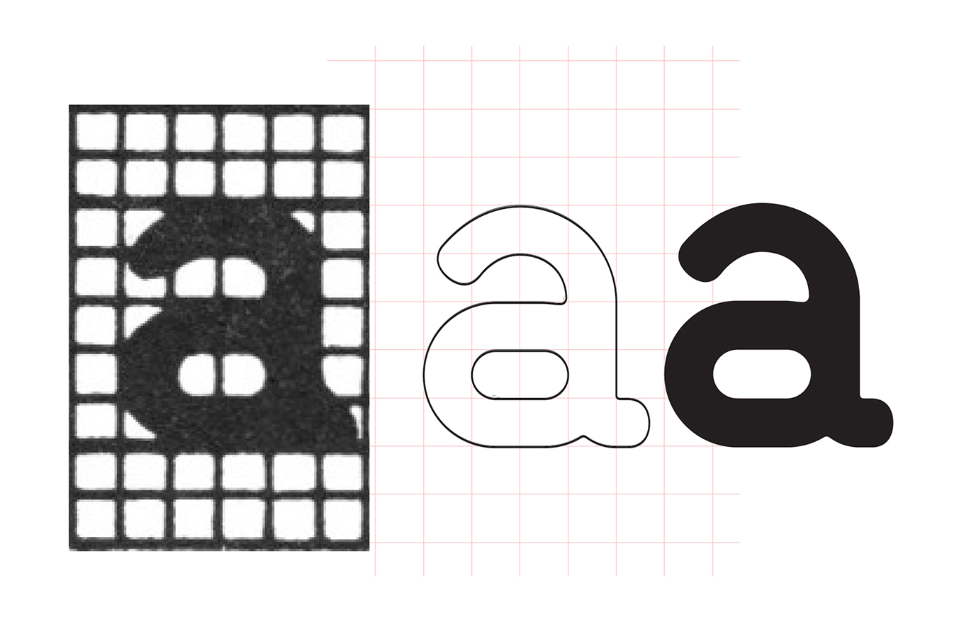
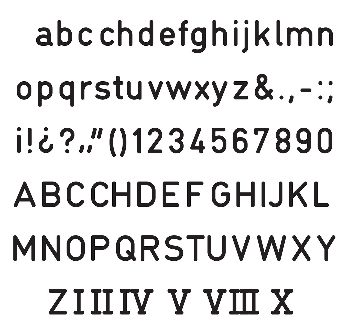
A literal digitization, strictly adhering to the underlying grid, produced uninteresting letter forms.
Josema applied the modular rules of the UNE manual in his first sketches. This formally “faithful” way of working resulted in a mechanical, uninteresting, even boring set of characters. When evaluating this outcome, Josema recalled from his early experiences with hand-drawn technical lettering and perforated rules that the fluidity of the act of writing by hand was more important than the mechanical construction of the characters. The grid was supposed to guide the hand, rather than constrain its natural flow. This realization made Josema set new goals for drawing DINosaur: achieve the perfect balance between the gestural movement and the mathematical structure it is applied to. Instead of rigidly staying true to its form, DINosaur had to respect the spirit of the UNE alphabet. It would also have an impact on the finish of the letter forms. Because it is virtually impossible to draw perfectly straight, angular corners when writing with a stencil ruler, the letters would only have rounded terminals and curved corners.
Evolution of DINosaur from the first formally faithful digitization to its final form.
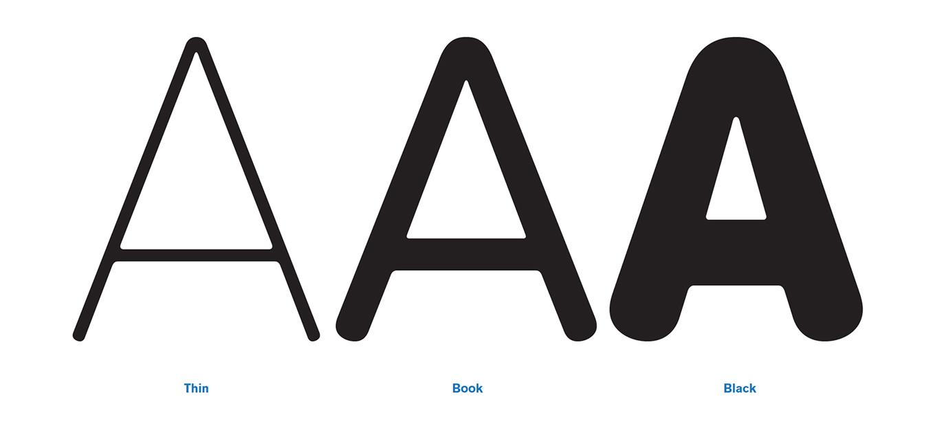
Trying out additional weights to expand DINosuar in a full-fledged type family.
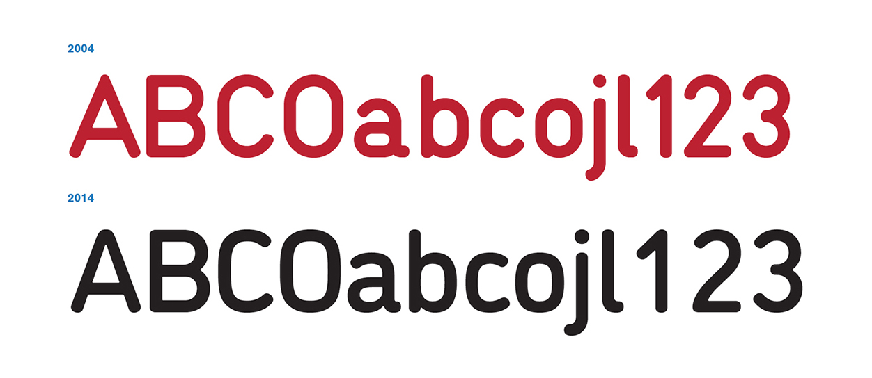
As with any other personal project, Josema did not pin himself on a final date for completing the typeface. This allowed DINosaur to slowly and organically evolve over a period of ten years, and helped it eventually achieve a level of execution that exceeded his initial expectations. The long gestation period also gave Type-Ø-Tones the opportunity to ponder turning the single font into a family. DINosaur was originally conceived as a single bold weight for display use. With one style already fully fleshed out, additional weights could be tested to expand the typeface and increase its usefulness for a greater number of applications and languages.
No need to hesitate between Northern rationality and Latin joyfulness anymore: DINosaur’s got you covered. Its six weights with matching italics cover the entire expressive range from a delicate Thin to a forceful Black. An alternate single-story a allows the user to fine-tune its appearance. Self-assured and friendly in large sizes, the typeface lends body text a soft-spoken efficiency. DINosaur offers the best of both worlds—it looks cool and clean but feels warm and comforting. This elevates the family above the fray of technical sans serifs. Subconsciously, the readers will notice this crucial difference, as it adds humanity to the stylish letter forms.
This text was initially written by Josema Urós and reviewed and edited for its publication at Typenetwork by Yves Peters.
