


Author
José Manuel Urós
Creation
2016
Actual version
1.5 (2019)
Styles
12
Character sets
Basic Latin
Latin-1 Supplement
Latin-2 Central European
License Types
Desktop, Webfont, ePub, App, Server
Description
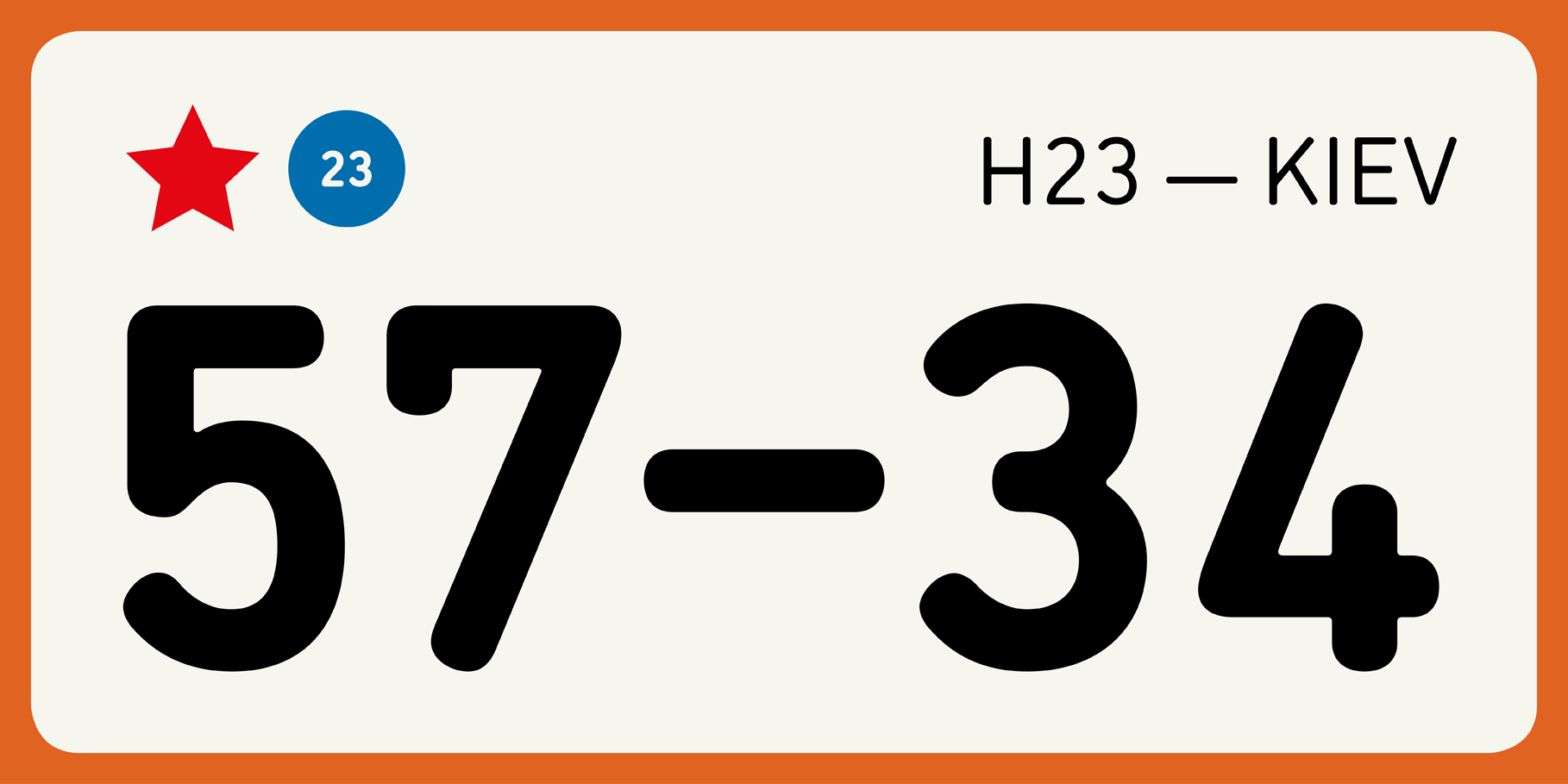
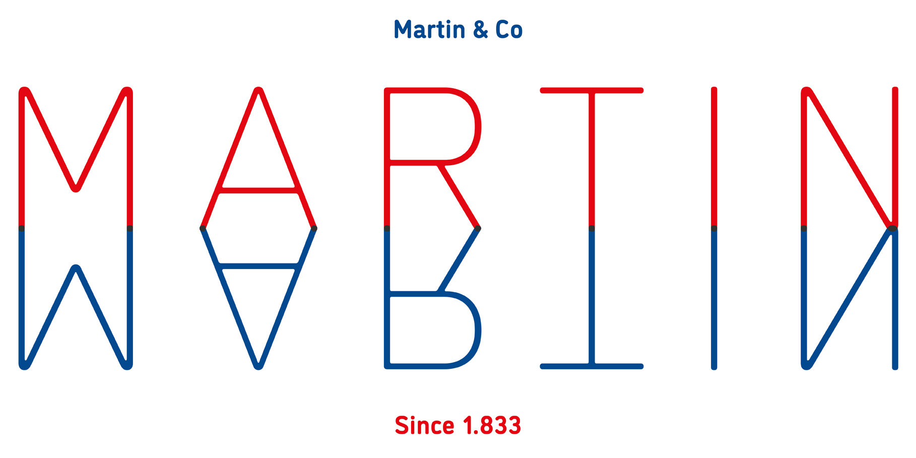
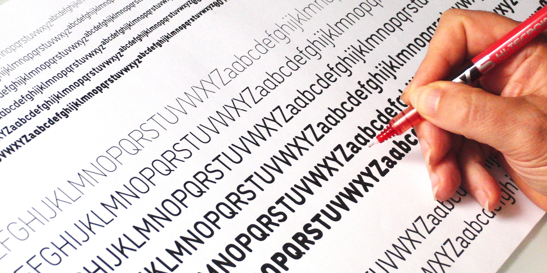
DINosaur can be considered, from a not too orthodox perspective, as a ‘revival’, since the original font –which corresponds to the Bold weight on the final version– is extracted from a technical calligraphy manual for industrial lettering.
The references used to create the system were based on capturing objects annexes to the original on a time travel where industrial labelling was mainly handwriting, freehand drawn or using rules perforated with stencilled alphabets.
DINosaur extreme roundness is not an ornamental fact, but the effect of tracers or rottrings wanting to generate mechanical forms.
Hosted webfonts
TypeNetwork
Free trials and desktop rentals
Fontstand
Tags
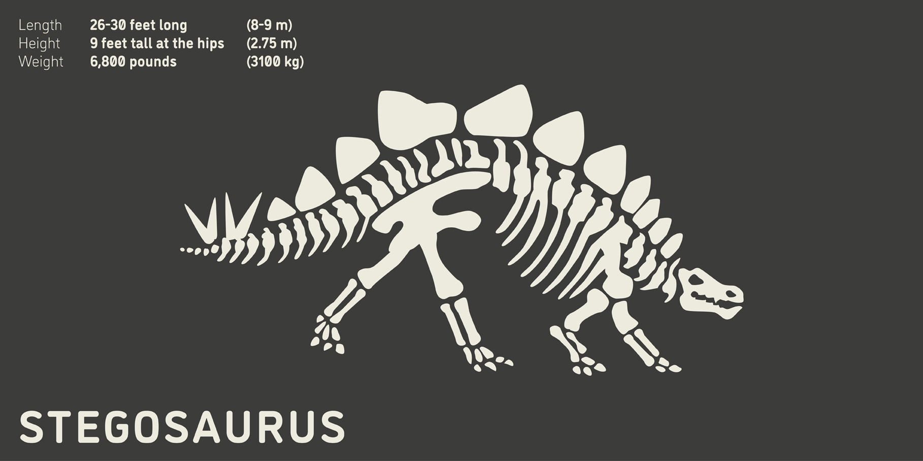
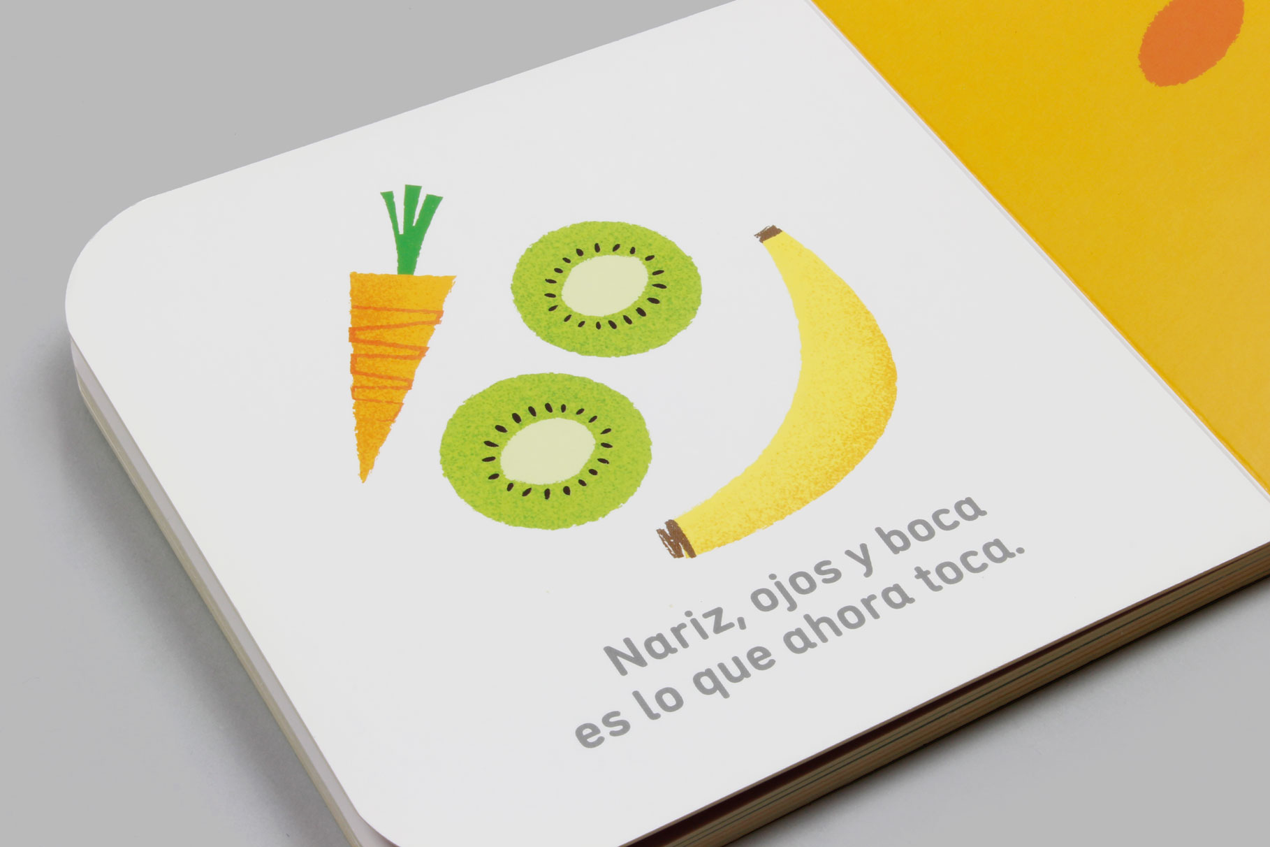
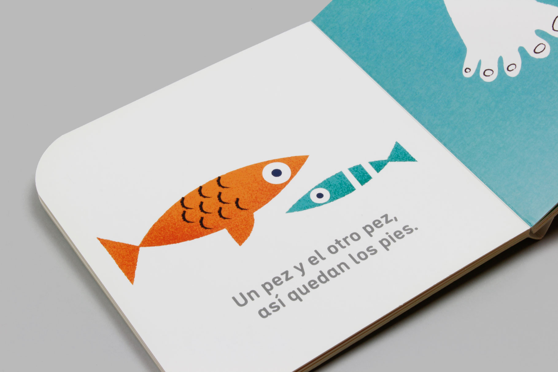
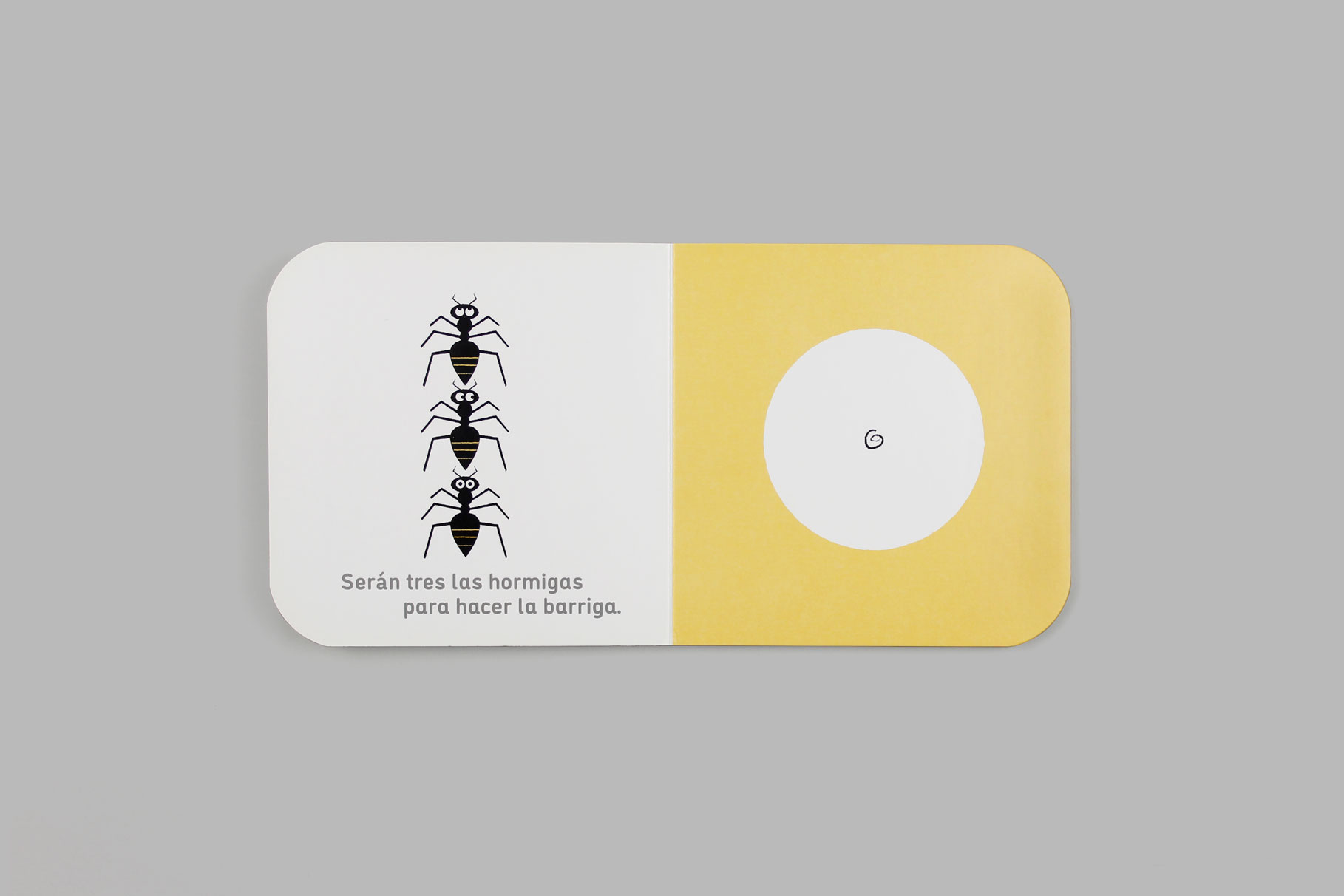
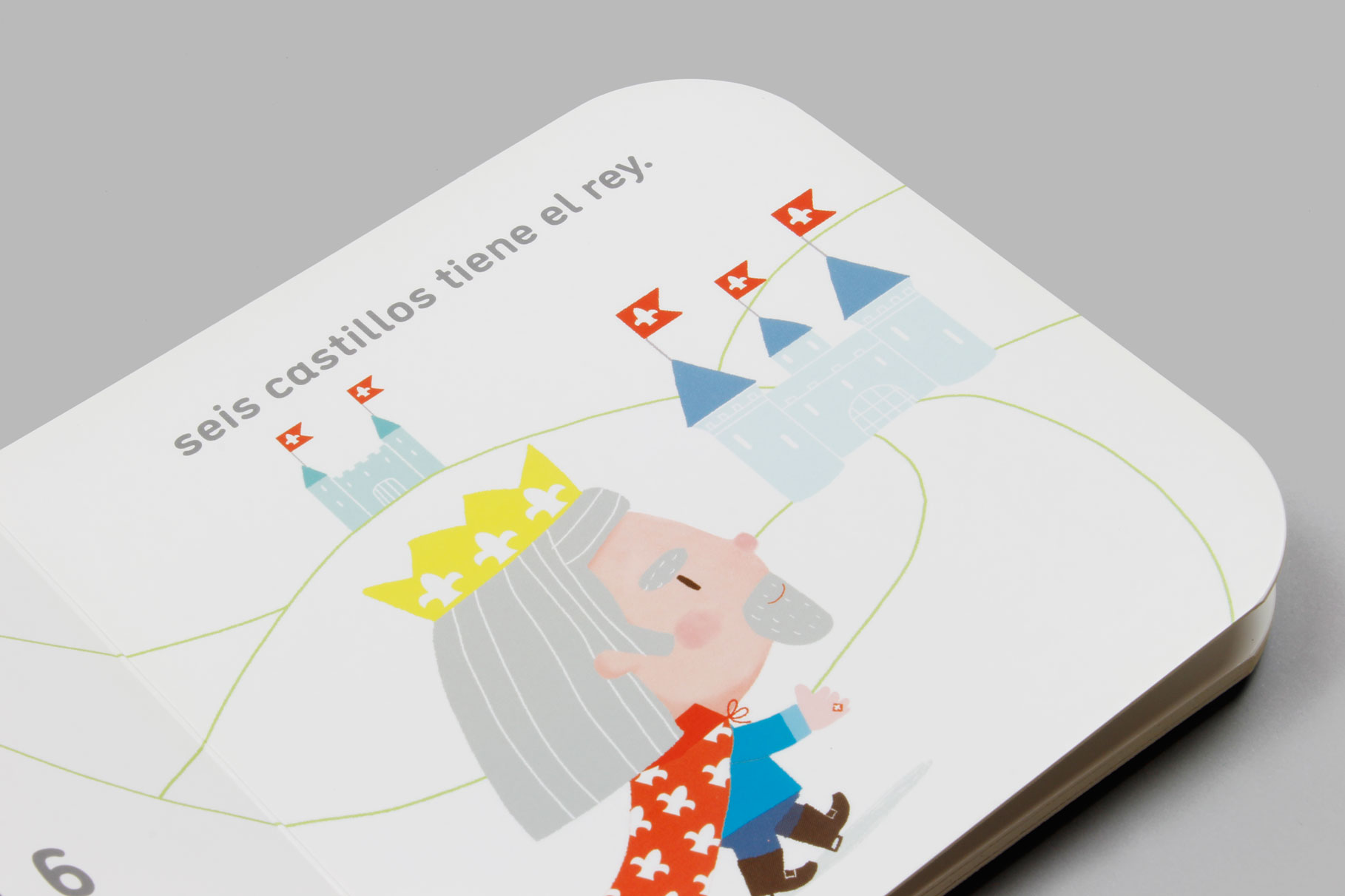
Display, Display & Text, Editorial Design, Kids, On Screen, Rounded, Sans Serif, Text
