2016/10/19
Blanc Versus
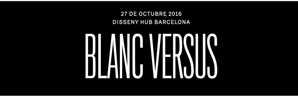
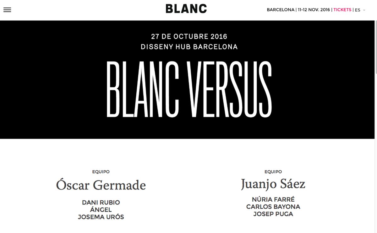
El festival Blanc siempre organiza un pre-Blanc y este año lo hace de una manera novedosa: el Blanc Versus. Dos equipos seleccionados por dos profesionales del sector del diseño gráfico y la ilustración. Óscar Germade y Juanjo Sáez serán los responsables de una amistosa competición donde cada uno presentará su propio equipo de ponentes.Un outsider, una promesa emergente y una figura con trayectoria en su ámbito profesional serán las características de cada uno de los tres ponentes seleccionados para cada equipo. El próximo 27 de Octubre Josema Urós, escogido por Óscar Germade, dará una charla en el #BlancVersus. Allí nos vemos!