2017/03/1
"Harri Display Typeface and Basque Lettering" by Juan Luis Blanco
There is something about the visual landscape of the Basque Country that will not go unnoticed to the eyes of its visitors regardless of their knowledge of typography: the peculiar lettering style spread all over the region on street plates, signs, posters and fascias. They display extremely heavy letters in a sort of overemphasised glyphic style with characteristic concave stems that produce very sharp terminals and awkward letter forms. Those shapes look certainly rough, unrefined and overdone, conveying a sort of primitiveness rooted way back in time. This seems to make it a convenient choice for food shops, restaurants, cider houses and other cases in which projecting the idea of authenticity, tradition and "Basqueness" is intended.
Harri, as a typographic project, started the very day a client asked me to design a logo that would be clearly recognised as Basque, with a firm restriction: to avoid "that typeface used for cider houses and butcher shops", in obvious reference to the Basque lettering style afore-mentioned.
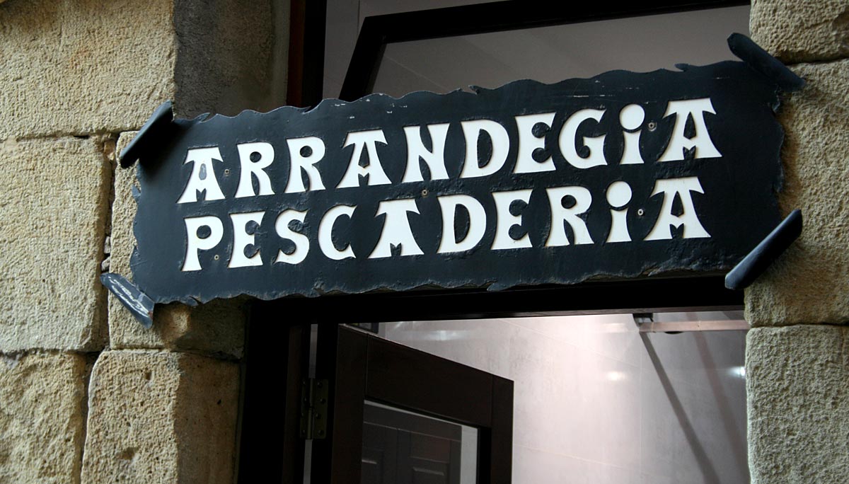
Fish Shop in Guetaria
They definitely needed a more polished image, and I realised there was nothing I could use to meet their expectations. So there was a need and there was room for innovation, and I decided something had to be done. Years later I defined Harri as a Basque "low-fat" typeface because its starting point was a light and refined version that would contrast strongly with the black, almost fat, letter forms customary in this style. The final project comprises also those black variants because they are the main inspiration for both the overall design and the details of most of the characters, the sort of details that show its unmistakable "Basqueness".

Harri Display Typeface family, from Light to ExtraBold
The research for the project and the design of Harri was done in the Basque Country. And, if there is something that defines Basque people is that, whatever their political views, they are extremely opinionated about nationalism. As a result, it is almost impossible to talk about any Basque cultural instance and not getting trapped in the discourse of nationalism vs. no-nationalism which, let's be serious, needs to be rephrased as myNationalism vs. yourNationalism. When it comes to the origin of the "Basque" lettering style it is not difficult to find such conflicting views, this is people convinced that it is a vernacular style from the Basque Country and others who think it is just an invention of the nationalist movements in the early 20th century, that is, nothing original, or at least nothing traditionally Basque at all.
The interesting thing is that, to some extent, both views are equally wrong, which in the end makes them complementary. It is obvious that nationalist movements fostered the development of a visual system aimed at reinforcing both their distinctiveness and their presence in the Basque society of the early 20th century. Typography, or better-said lettering, had to play a significant role in that endeavour. But it is also undeniable that it is not the mere invention of the propaganda manager of a nationalist organisation. There are clear sources of inspiration that have been pointed out by different scholars regardless of their position on Basque nationalism. These sources are the ancient inscriptions carved on gravestones* which can still be found in the French part of the Basque Country (Behe Nafarroa, Lapurdi and Zuberoa) and some areas of the North of Navarra. These inscriptions —some of them dated in the 17th century— show a recognisable influence of contemporary engravings and some Romanesque inscriptions of earlier times that can be found all over Europe.
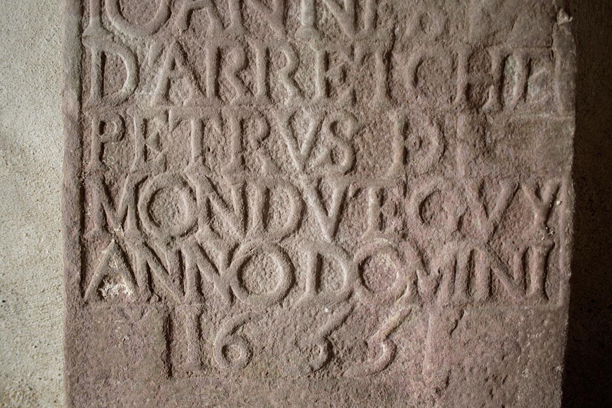
Inscription found in Ezpeleta
Therefore, it is easy to agree that it is neither a relatively recent invention nor a deeply rooted and exclusively Basque manifestation. That said, which I find original and unique is the way it has evolved from those origins. And the most remarkable fact in my view is how its use has spread all over the Basque Country as an identity conveyor. The fact that Basque people seem to feel identified by this lettering style, and moreover, the fact that people from other places associate those forms with a Basque origin is what makes them convincingly Basque. Harri takes part of its significant features from those ancient inscriptions, in which letters are not incised but carved in relief.
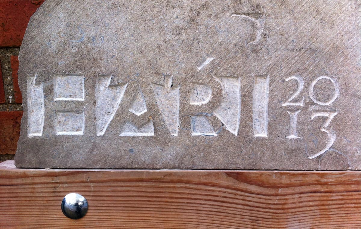
Stone carving exercise done by Juan Luis Blanco along his studies in Reading
The fact that the space between letters is what has to be removed produce heavier and less contrasting shapes and gives rise to a series of interesting composition devices for space saving. Of course, the current widely-used shapes derived from them are taken into account but keeping always in sight their predecessors: the Romanesque inscriptions and ultimately the Roman Capitals, in which its proportions are based. As a central guideline, there is the idea of making a refined yet decidedly Basque typeface —something that my client would have been willing to use— and also to echo the peculiar evolution of this style through its weights, from the clean formal Roman-inspired light to the extreme expressive Basque-style extra bold. Besides that, some of the space-saving tricks that make every piece of stone carving unique are available as contextual alternates, and a bunch of stylistic sets allow to change the shapes of some key letters in order to emphasise or completely neutralise its Basque character.
* The name "Harri", meaning stone in The Basque language, is an homage to its roots.
