2021/04/13
The Beautiful People
“The Beautiful People”, an exhibition by Laura Meseguer
Concept & exhibition design: Laura Meseguer and Eider Corral
La Sala. Centre d'Art Contemporani. Sala de les Columnes. Vilanova i la Geltrú (Barcelona)
On display in two periods: November 13, 2020, to January 5, 2021 and From March 12 to April 11, 2021
The original show was organized by Blanc! Festival as part of the Blanc Orígens Program and La Sala. Centre d'Art Contemporani at Vilanova i la Geltrú, with the aim of continuing to display graphic design discipline to all audiences, with the collaboration and involvement of design professionals.
Curator: Eider Corral
Photos of the exhibition: Marina Roca
Official Video: The Beautiful People
Filmaker: Crispetes Films
Exhibition website
Website design: Alex Velasco
‘The Rigor of Joy’. Essay by Oscar Guayabero. Translated into English by Tamye Riggs
Conversaciones: Laura Meseguer y Eider Corral. Online Interview. (In Spanish)
General views of the "Corpus Room" at La Sala. Centre d’Art Contemporani ©Photo: Marina Roca
The Concept
“The Beautiful People”, consists of an analysis of Laura’s typographic work where she and the curator wanted to highlight its relational character since it arises from the interaction and synergies between disciplines and between people, the exhibition is the result of this shared reflection.
The way in which Eider Corral, the curator, presents the exhibition is more looking forward than backward, a kind of prospective monograph where the pieces on display respond to different subjects and relate to other graphic design practices: the authorship, the education, the collaborations, the workshop, the genre perspective, the vernacular typography, the expressiveness and its ability to connecting cultures. Laura’s practice around typography is almost total and the exhibition aims to collect that.
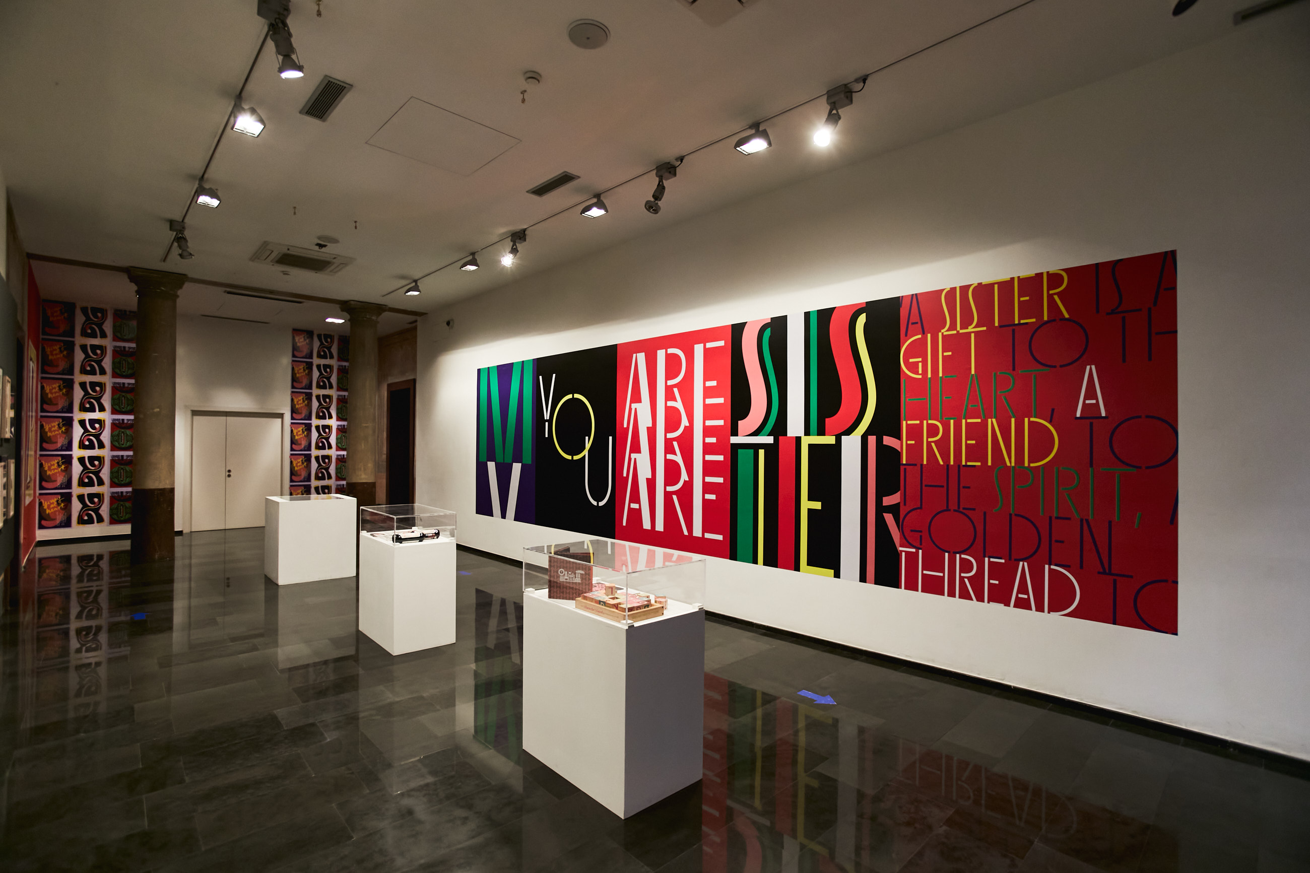
"Sisters Wall" ©Photo: Marina Roca
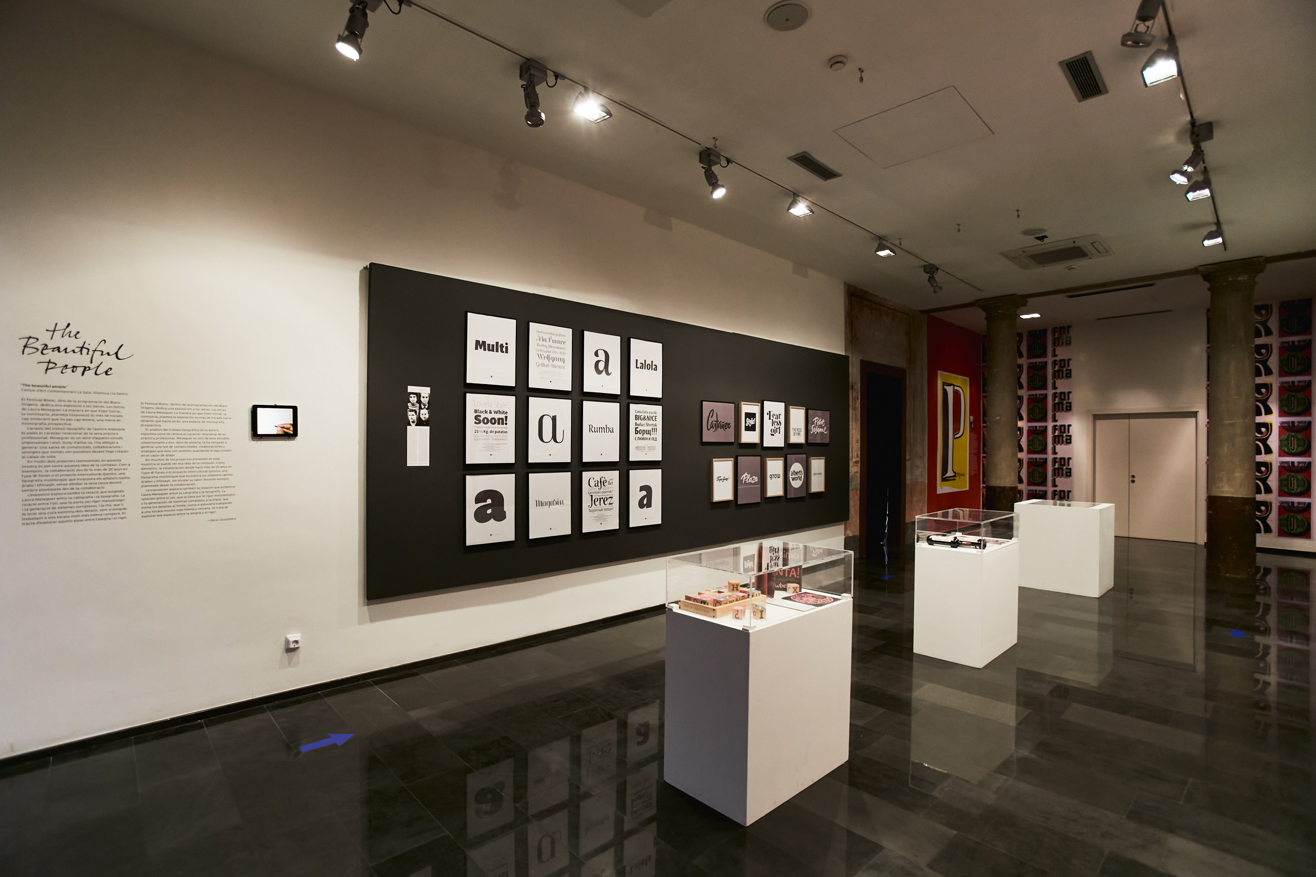
The Exhibition has different parts: a “Corpus Room”, and the “Qandus Room”.
The “Corpus Room” presents a walk from calligraphy to lettering to typography, displaying the relationship between disciplines, starting by introducing Laura’s calligraphy in action, Type-Ø-Tones, some typefaces (Rumba, Magasin, Lalola and Multi) and some wordmarks in different lettering styles. The vitrines serve to display Girard Sansusie, some lettering work in use, Rumba’s sketches, and the book “How to create typefaces” in three editions.
Lettering Extravaganza’s posters are presented as a mural piece in two parts, and finally the “Sisters Wall” as an explosion of words that claim to women's relevance not only in design but in society.
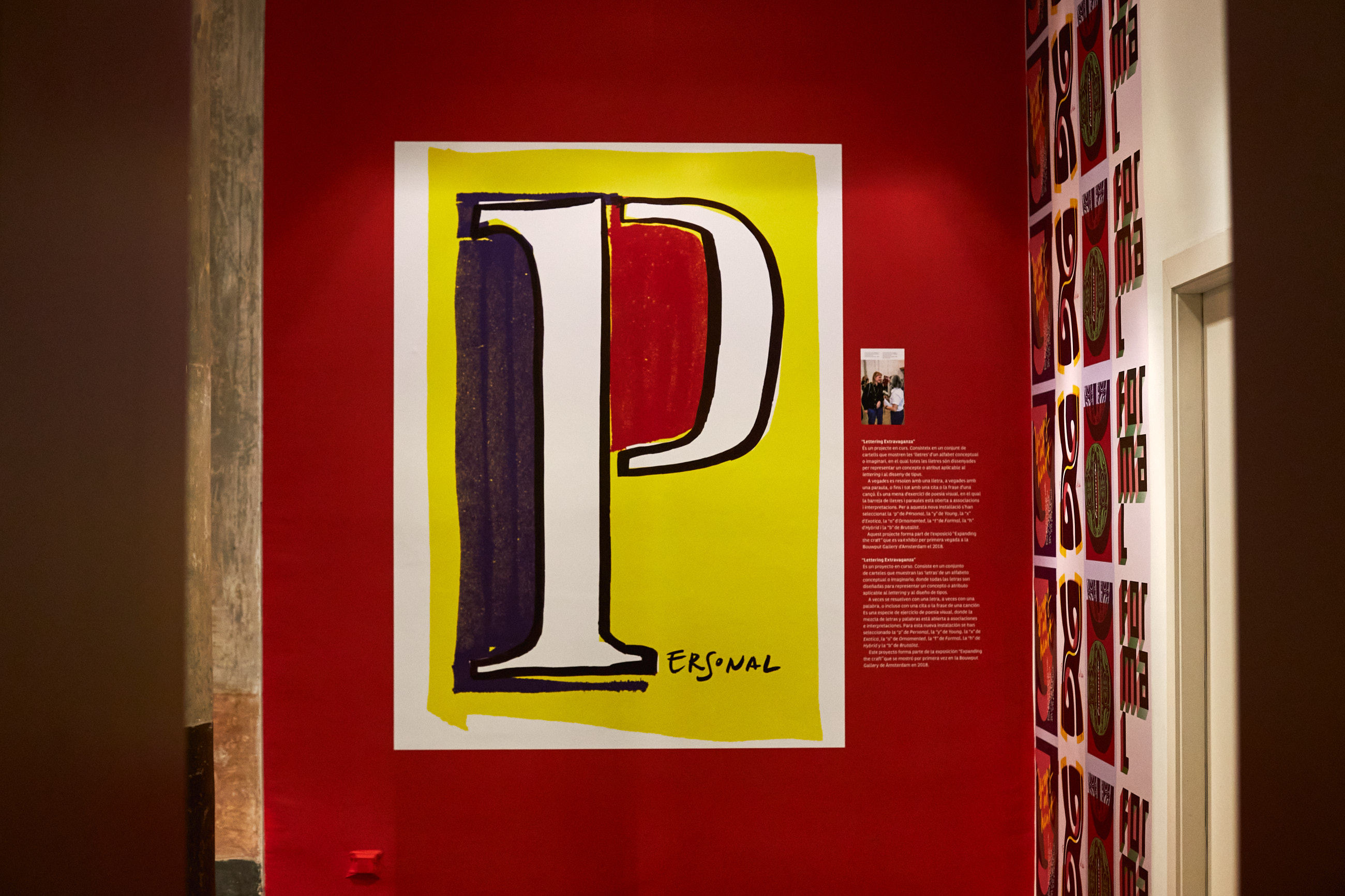
“Lettering Extravaganza” ©Photo by Marina Roca
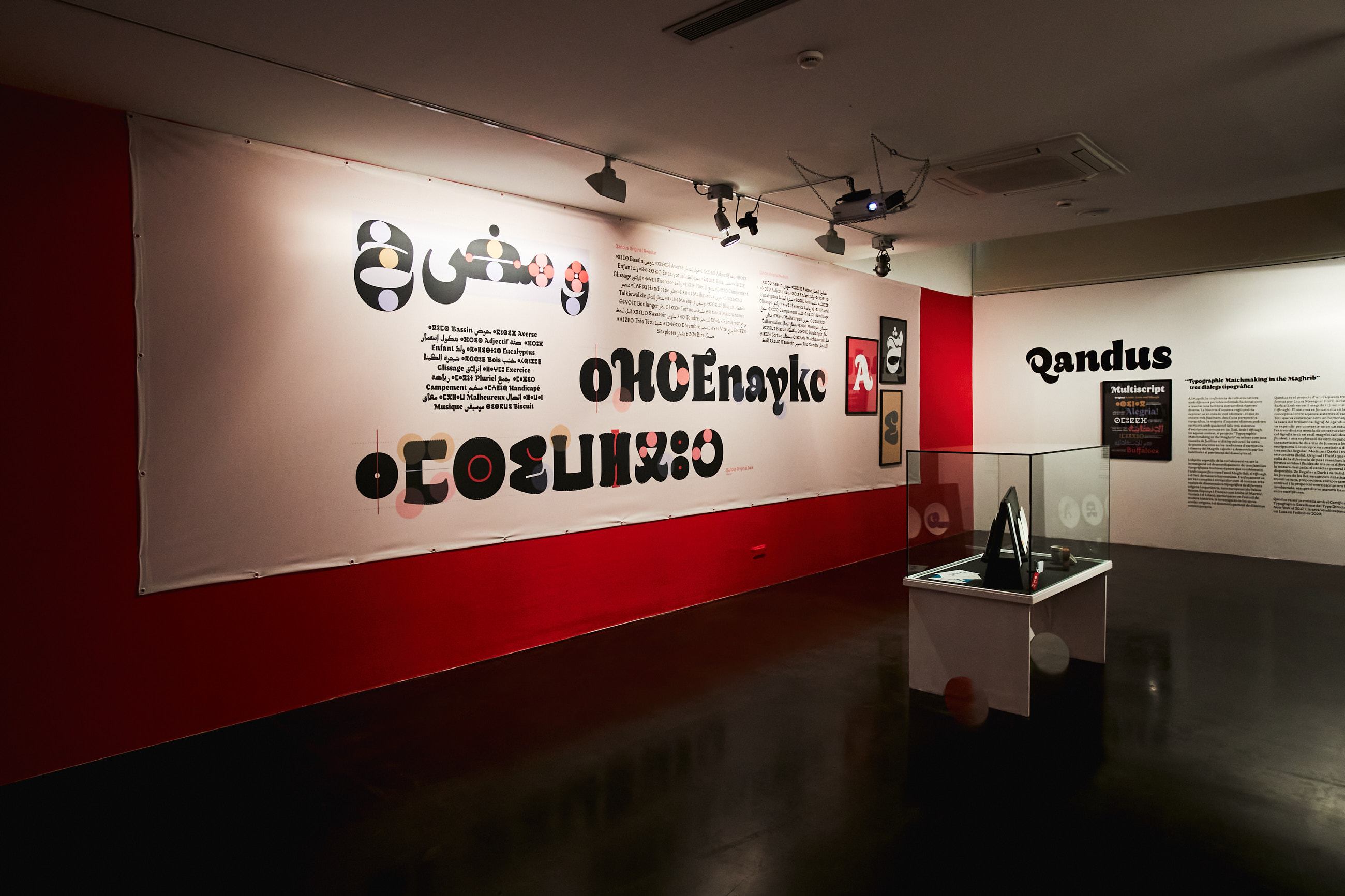
General view of "Qandus Room" ©Photo: Marina Roca
The “Qandus Room” highlights the social role of type design and displays the Qandus project in different parts:
—The story. A description of the project
—The process. A visual display of different moments of the design process
—The system. A mural displaying the three scripts working together
—The crafts. “Nomadic Traces”, the exhibition where Qandus was displayed for the first time and “Dialogue”, both projects have some pieces on display at the vitrine.
—The movies by Jan de Bruin:
“The Typographic Matchmaking in the Maghrib”
“Typographic Matchmaking in the Maghrib: Making Of”
“Nomadic Traces: Typographic Journeys”
