


Author
José Manuel Urós, Sabina Chipară
Creation
2022
Actual version
1
Styles
6
Character sets
Basic Latin
Latin-1 Supplement
Latin-2 Central European
Latin Plus
License Types
Desktop, Webfont, ePub, App, Server
Description
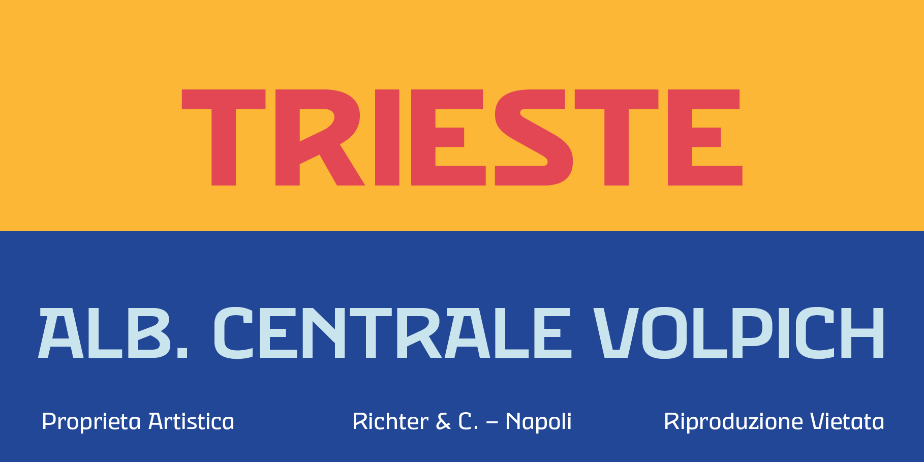
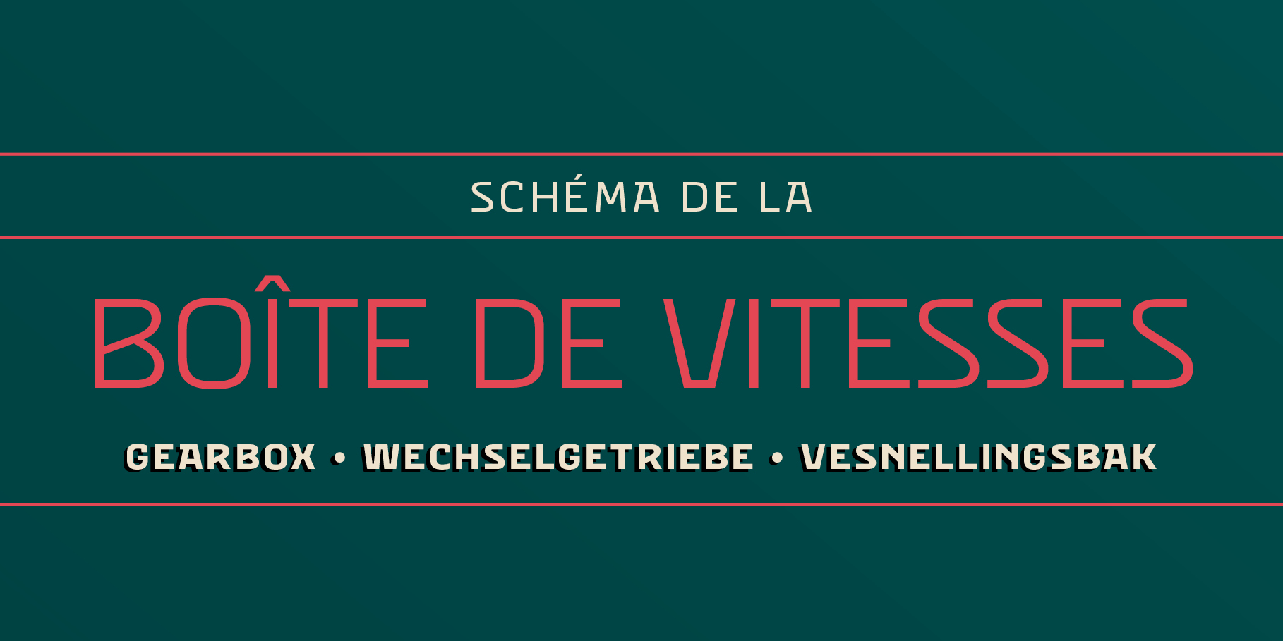
The Eixample project is inspired by modernist signage of various examples found in the Eixample neighbourhood in Barcelona. The name of each subfamily is related to its location or to specific elements of the original sign.
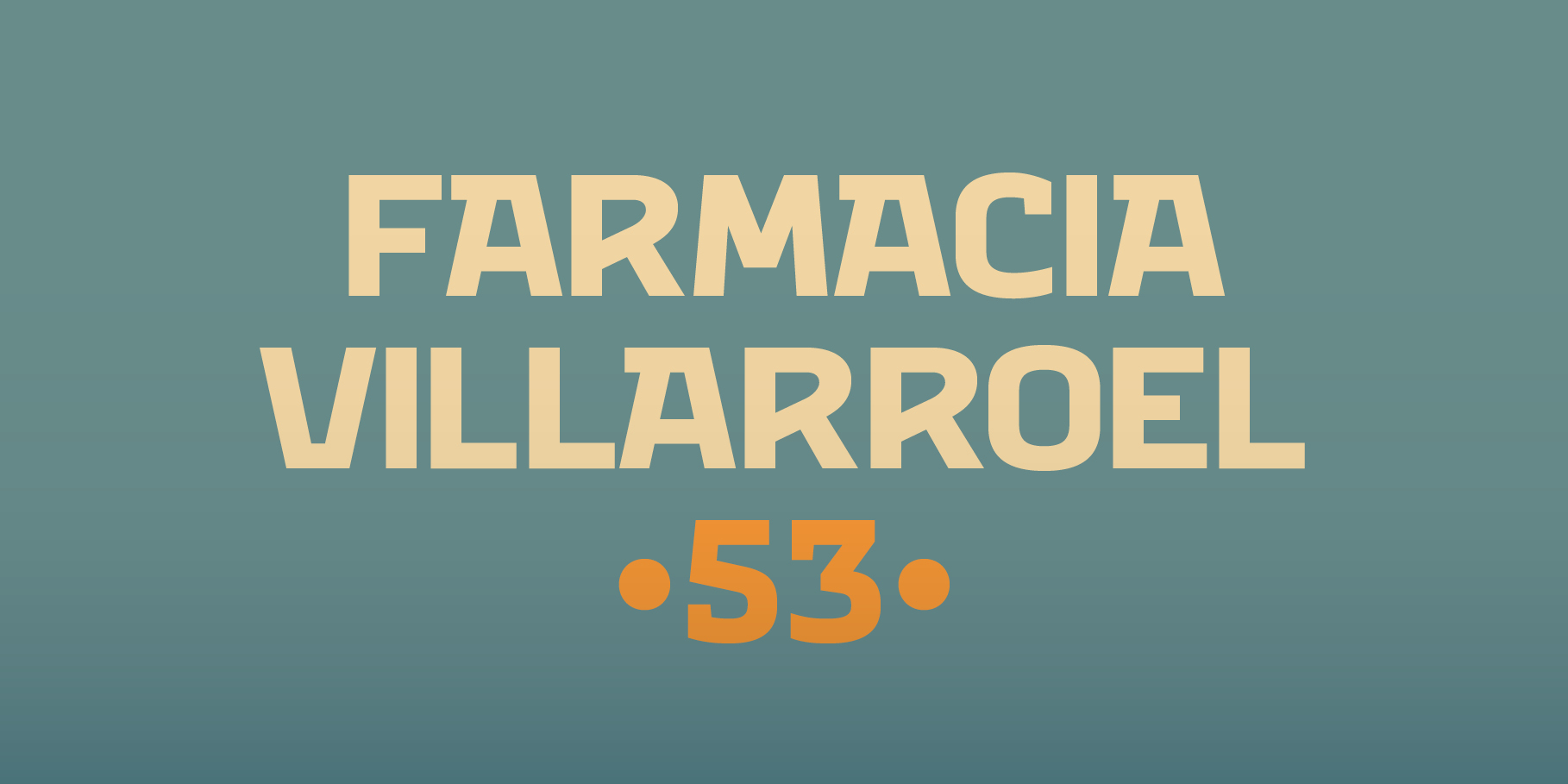
Villa is the abbreviation for Carrer Villarroel (Villarroel Street), where the Villarroel Pharmacy has been displaying this sign since the first quarter of the twentieth century.
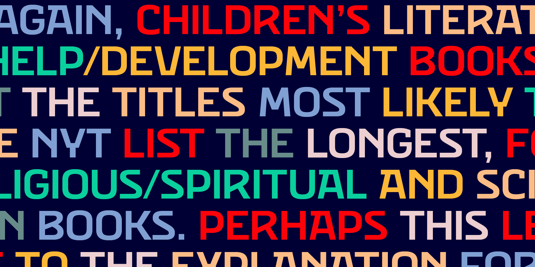
The Eixample Villa typeface system consists of sturdy letters free of ornaments with an industrial aspect. Only the treatment of the curves borrows modernist features.
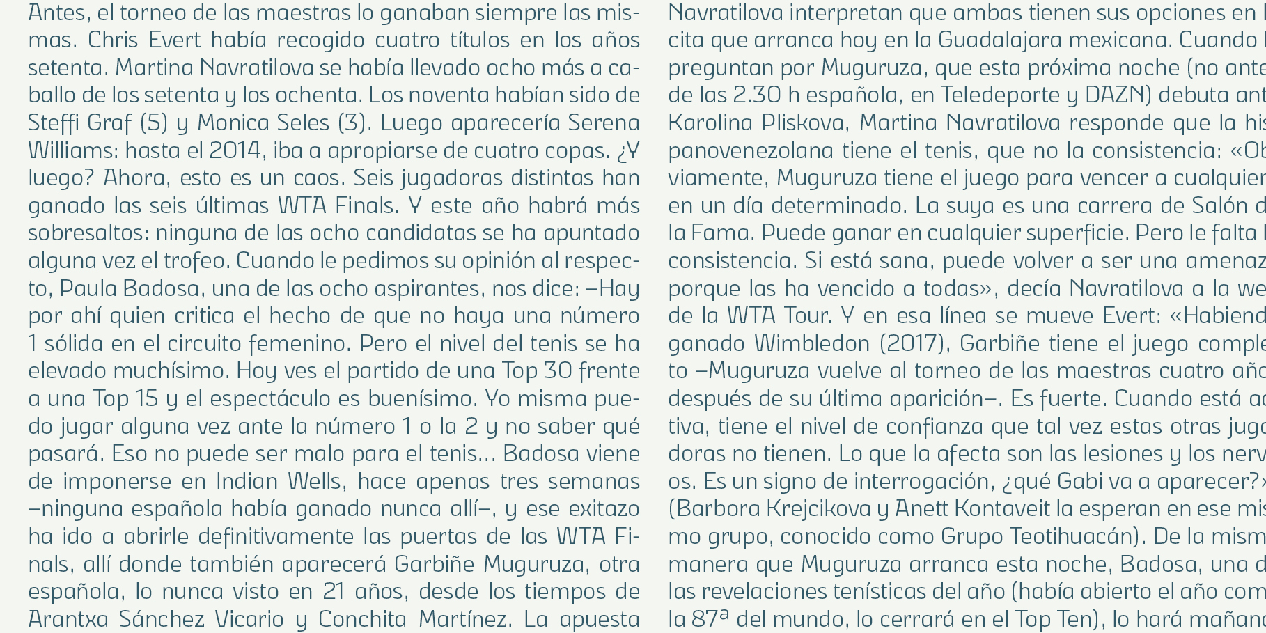
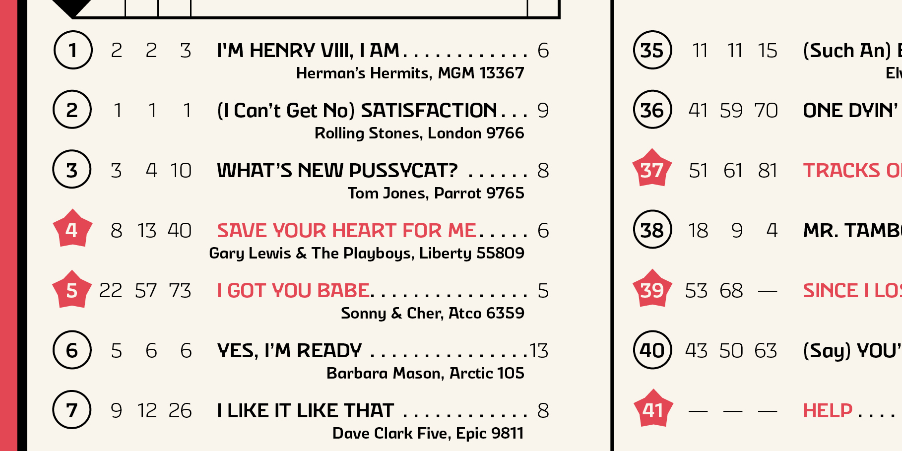
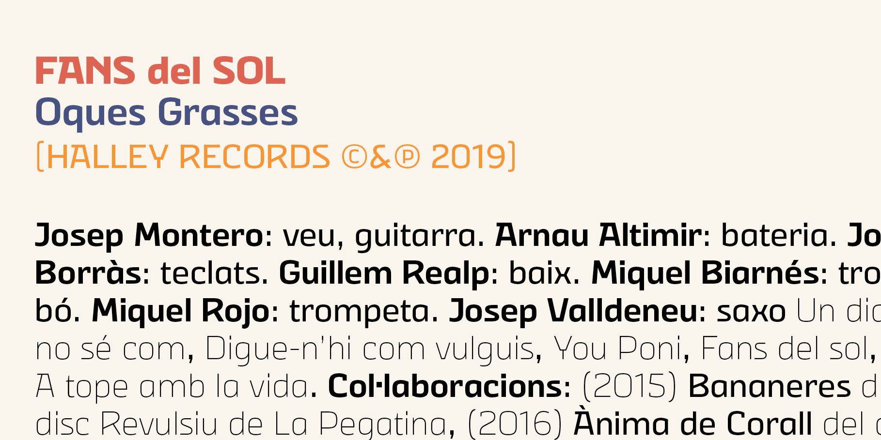
Like the rest of the families in the Eixample series, Villa shows its origin as a display font, but it has been engineered to give good results at small sizes as well.
Tags
Sans Serif, Display, Text, On Screen, Editorial Design, App