2016/06/19
The Design of Multi
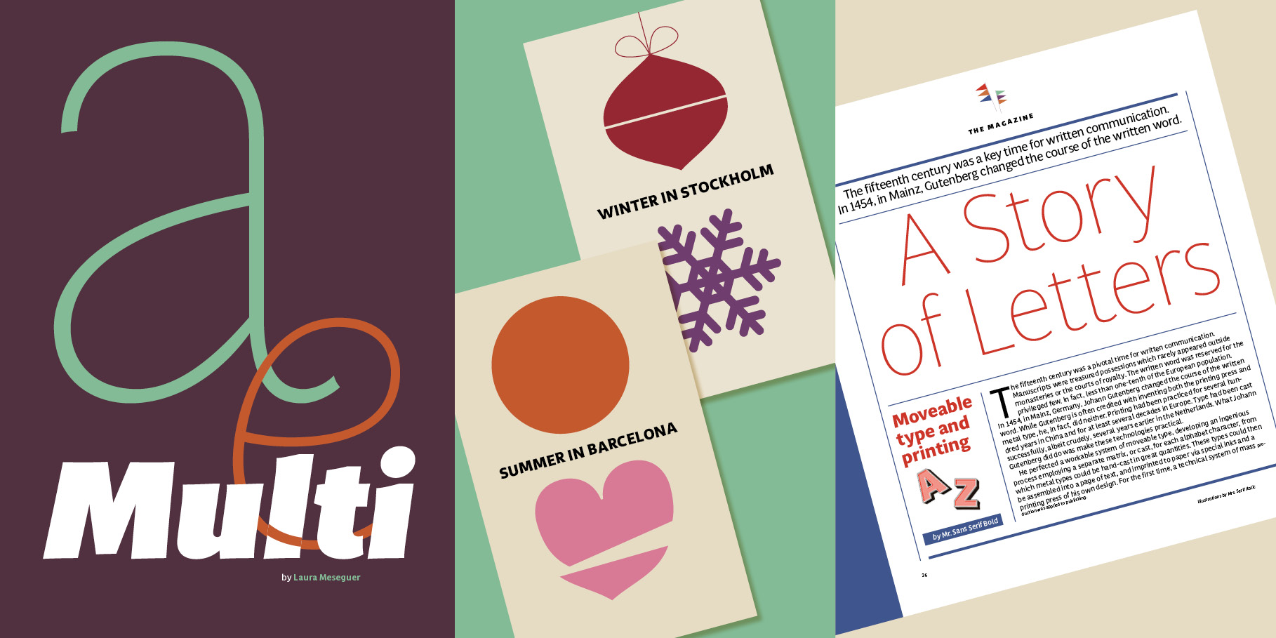
Multi is Laura Meseguer's first extensive typeface family. The process of design started as a custom work, developed later and released now as an extended and versatile system for print and screen. It was originally commissioned by the publisher of Dutch regional newspapers in 2011, with the aim to match the serif typefaces (Lexicon by Bram de Does and Tiempos by Kris Sowersby) used for a comprehensive layout overhaul project supervised by editorial art director Luis Mendo. The keywords provided by the client were unequivocal: warm, dynamic, optimistic, friendly, human… Like most of Laura’s typefaces —Rumba, Magasin, Lalola—, vitality bursts forth from Multi. It has a distinctive ‘phrasing’ (in the musical sense), neither humanist nor glyphic, somewhere in between, exploring uncharted territory. Its design is pragmatic, yet not rigid, slightly tinged with tiny incised touches.
Visit the mini site!
Since the completion of this first version, Laura has considerably expanded the character set and the family, and implemented a few modifications.
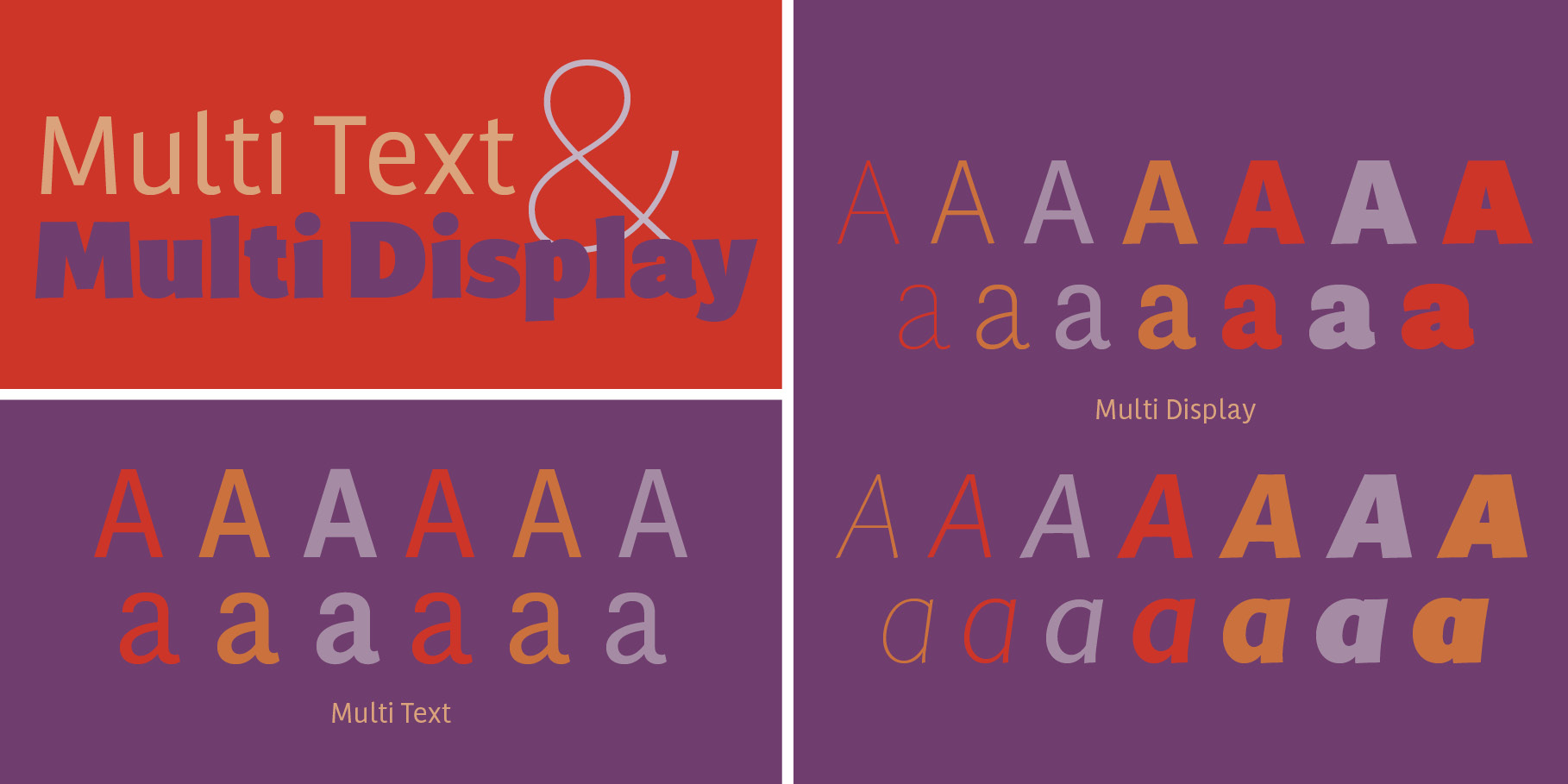
Multi™ is available in two series: Multi Display and Multi Text.
Multi Display consists of seven roman weights with their italics: Thin, Light, Regular, Medium, Bold, ExtraBold, and Poster. Multi Text consists of three roman weights with their italics: Regular, SemiBold and Bold. All the fonts comprise special characters designed for specific language requirements. They are optimized as webfonts, and the Multi Text fonts are manually hinted. The main purpose is to bring a fresh and strong personality to print and online publications.
Sturdy and fancy bold and breezy, Multi can transform words and sentences into bangs and whispers!
Multi Type Specimen
