
Author
Joan Barjau
Creation
1997
Actual version
2 (2007)
Styles
3
Character sets
Basic Latin
Latin-1 Supplement
License Types
Desktop, Webfont, ePub, App, Server
Description
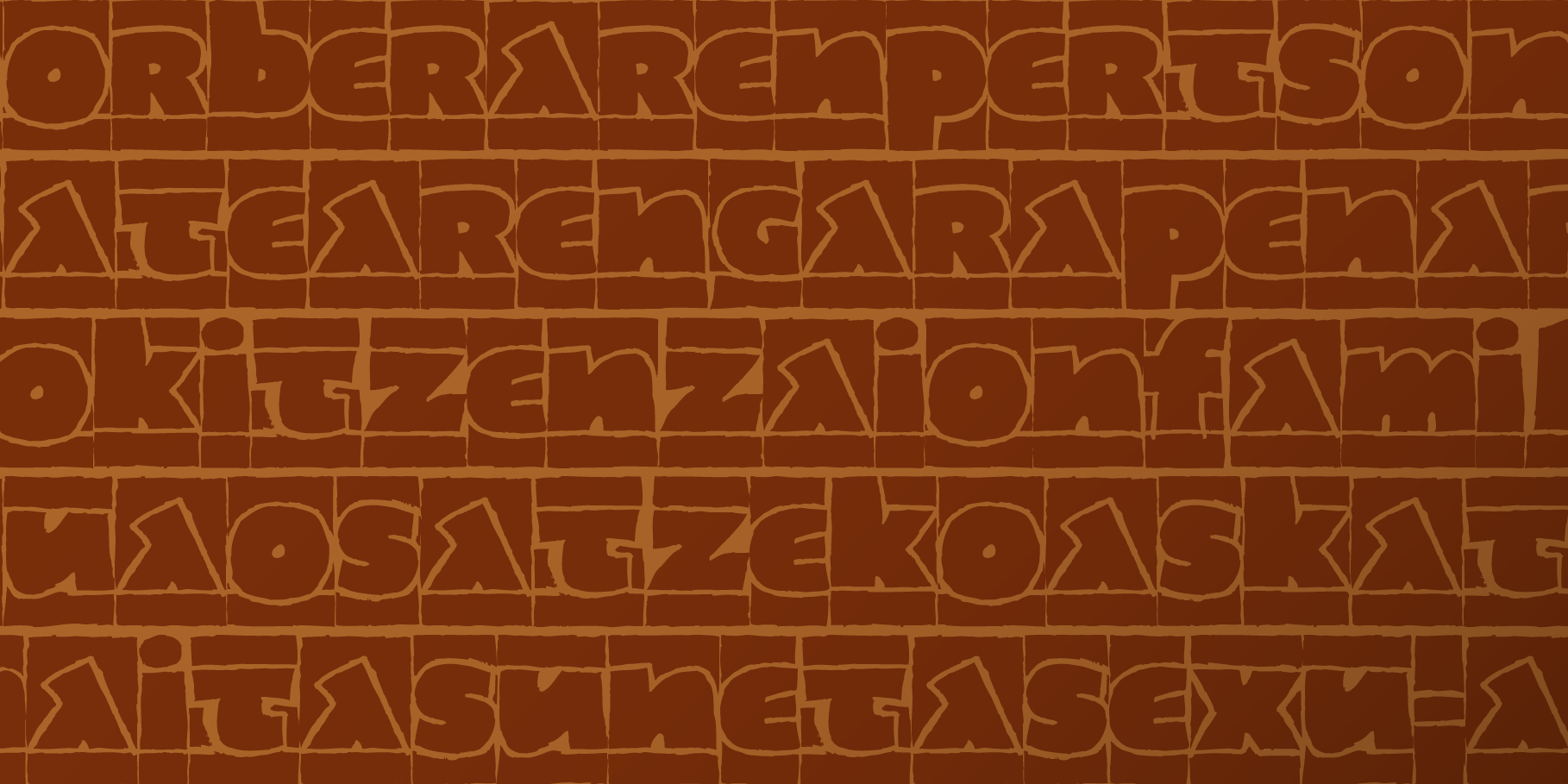
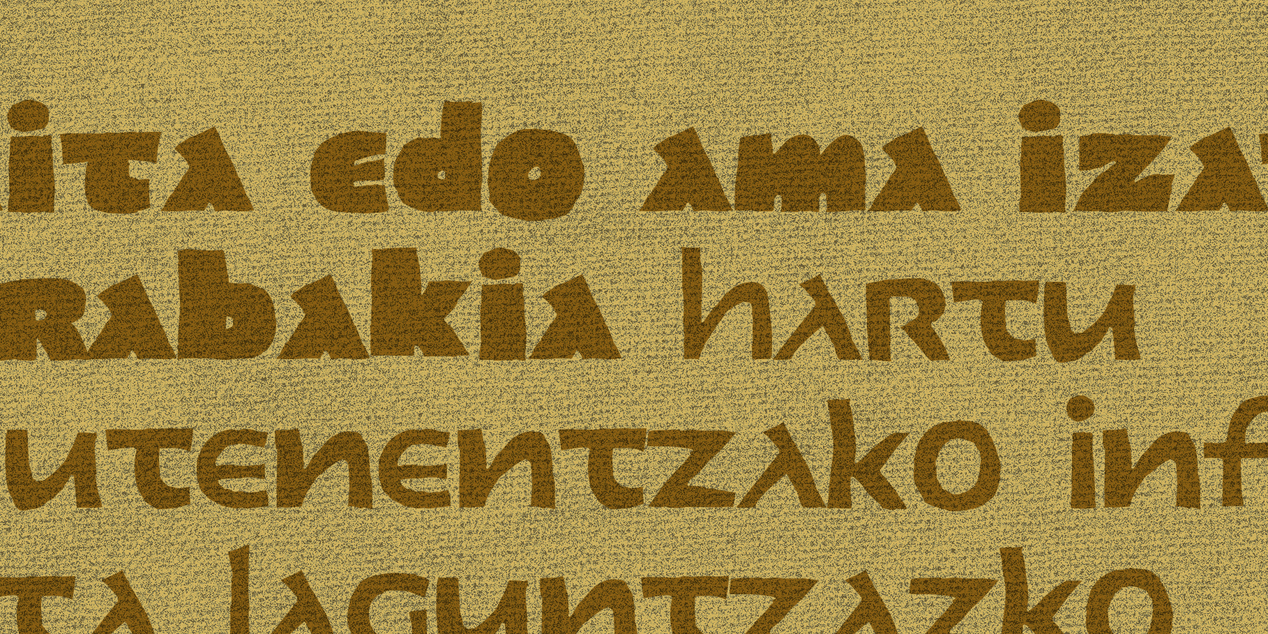
In almost all traditional drawing techniques,the artist starts out from nothing, filling inwith materials –ink, paint...– whatever it is that he or she is creating. Contrary to the traditional process, this typeface was created with the opposite technique in mind: emptying out. We could say that the font has been “sculpted” out of an initially black background, like in the traditional engraving technique used in the fabrication of lead letters, though it produces clearly different results. Thus, Joan Barjau has emptied by hand maps of pixels in order to achieve a drawing profile of extreme roughness. This font is also characterized by the structure of its characters, and came about from former experiments that its creator carried out on typefaces by Jan Tschichold and Adrian Frutiger, which had no differentiation between upper and lower cases. Oddly enough, the result achieved by mixing these two formal traits is a type with Basque reminiscences: another old dream of Type-Ø-Tones involuntarily come true.
This happy coincidence has been baptised with a name still familiar to the people from our country: Zubizarreta.
Tags
Display, Handwritten, Layered, Script