

Author
Laura Meseguer
Creation
2020
Actual version
1
Styles
4
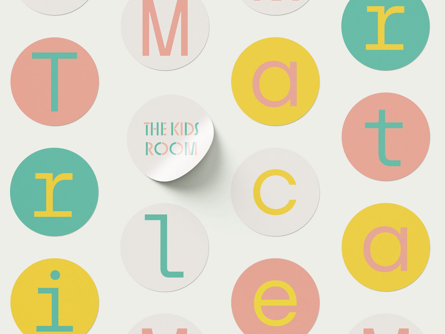
Character sets
Basic Latin
Latin-1 Supplement
Latin-2 Central European
Latin Plus
License Types
Desktop, Webfont, ePub, App, Server
Description
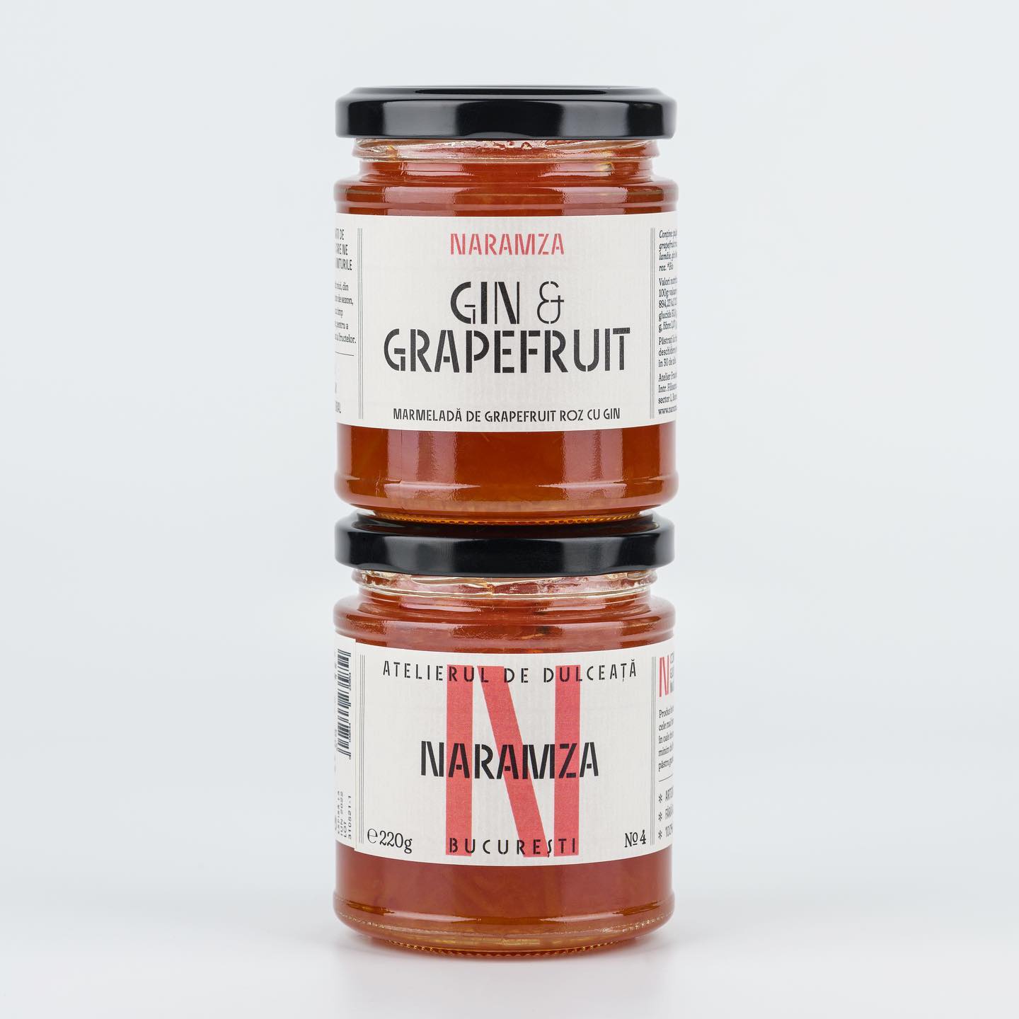
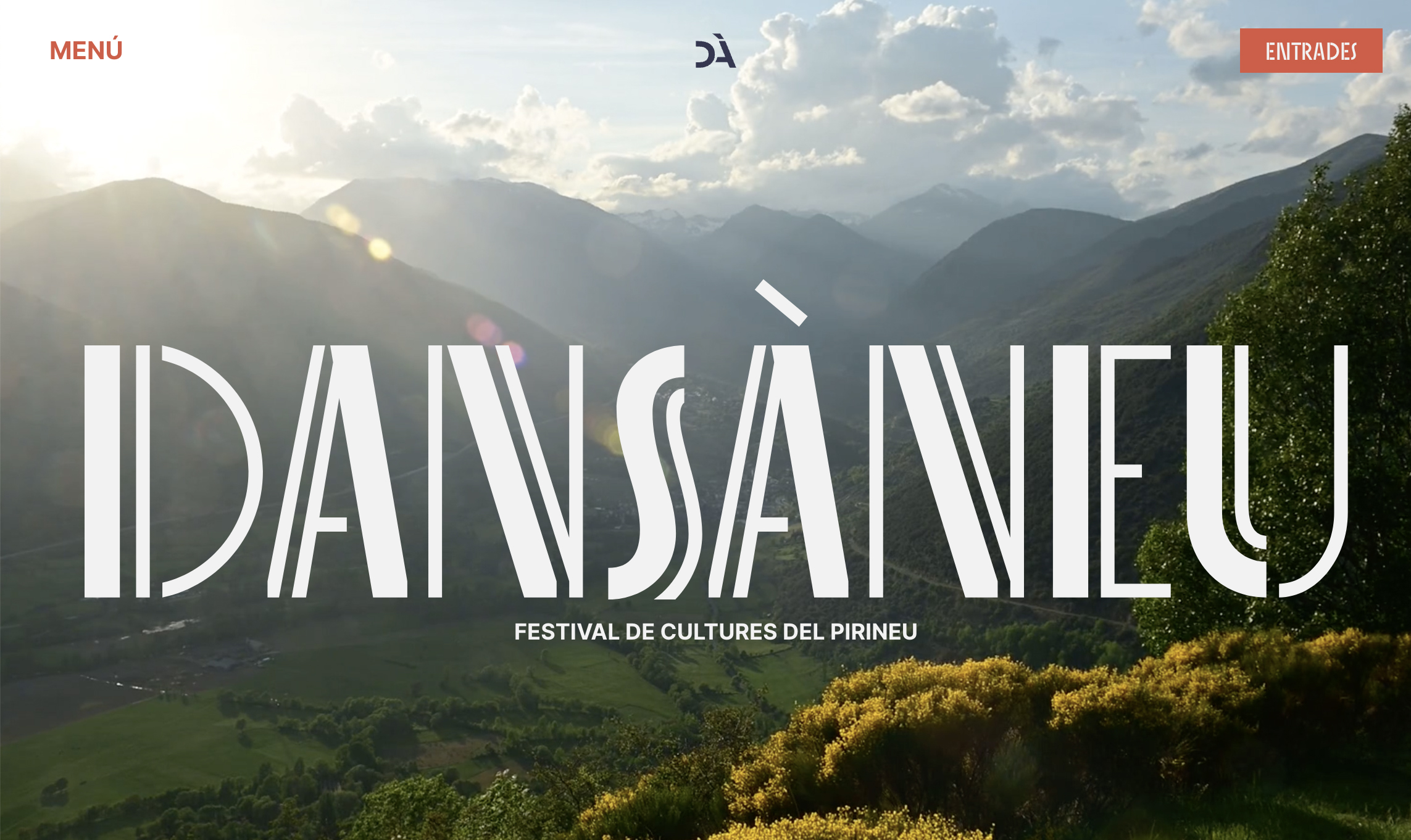
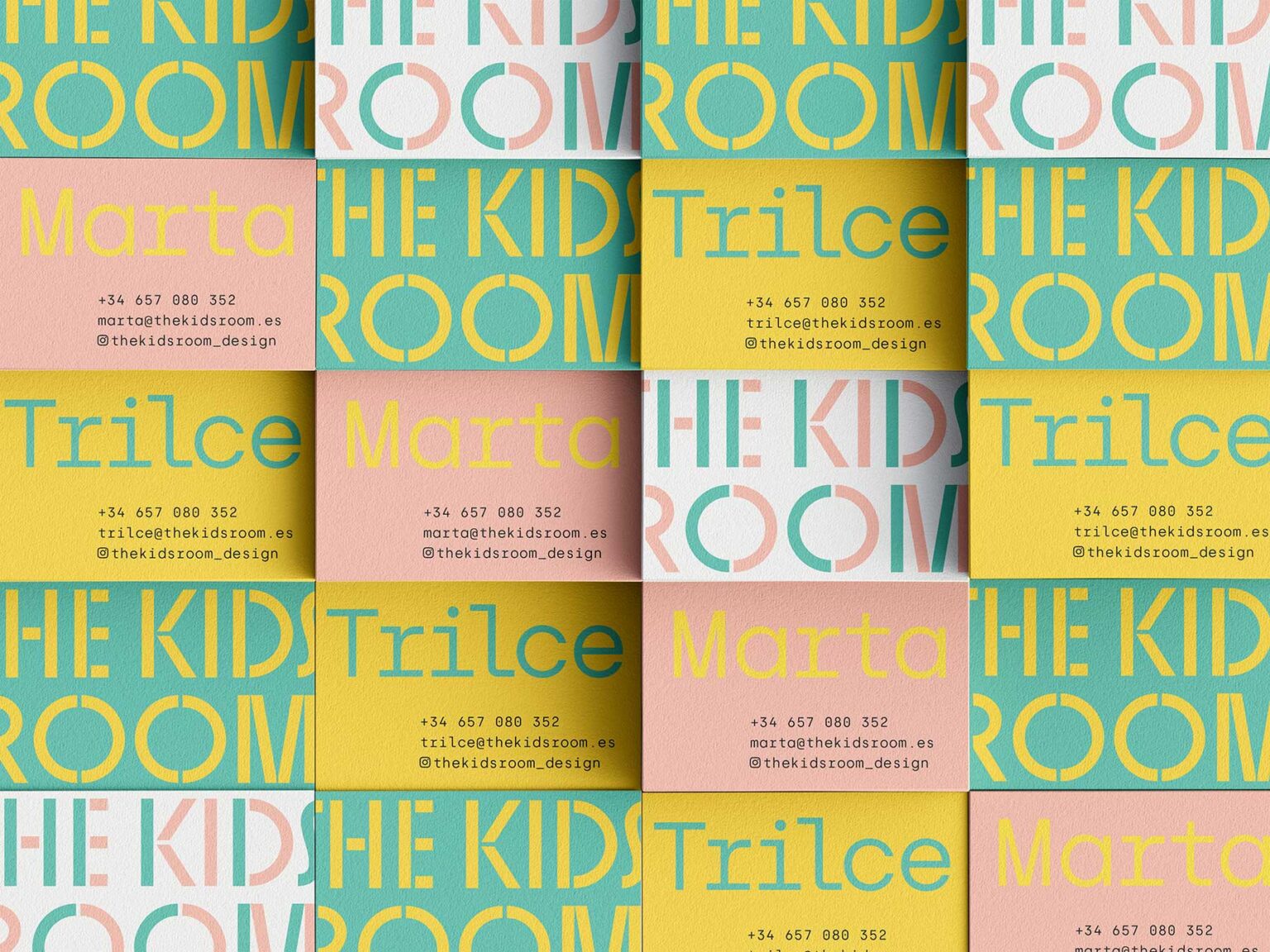
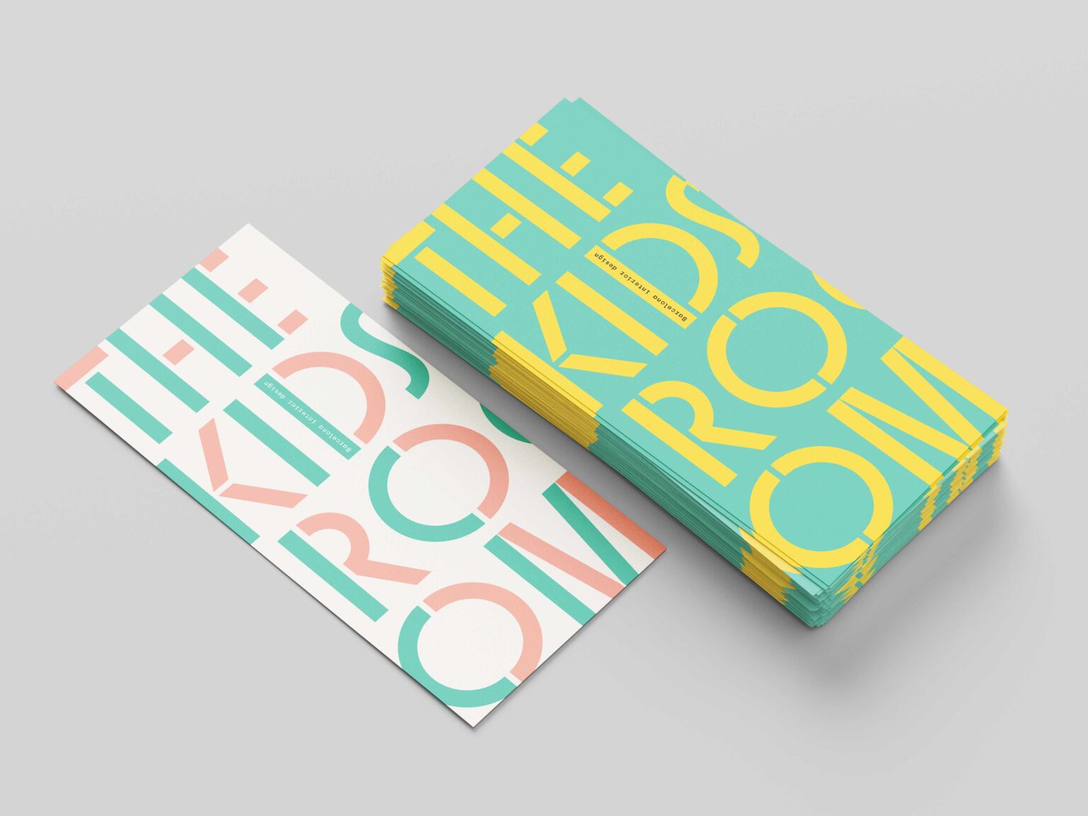
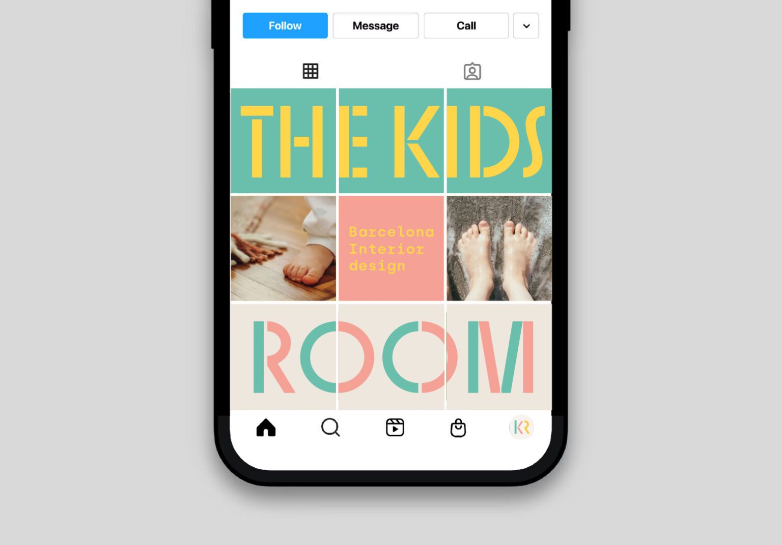
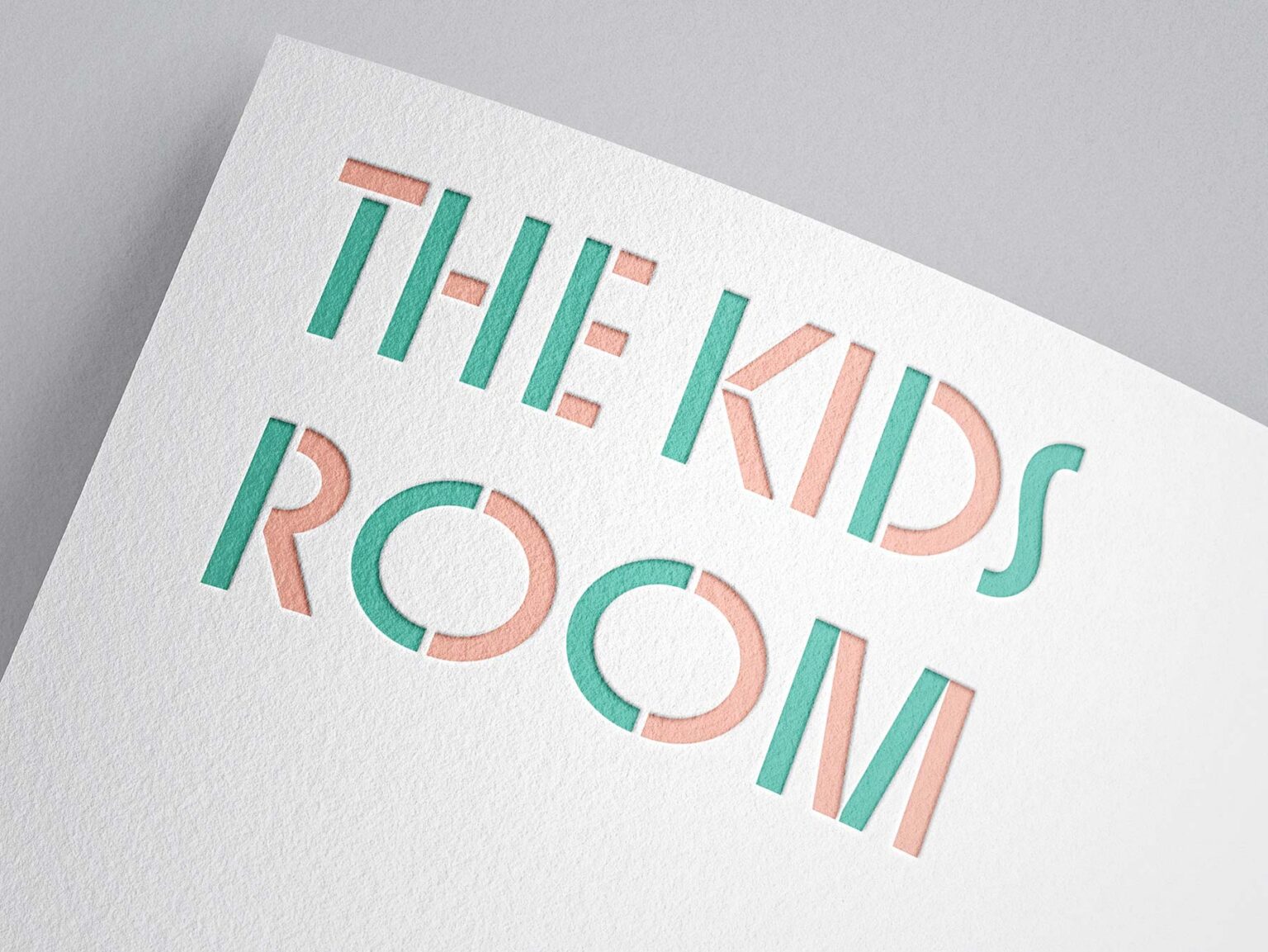
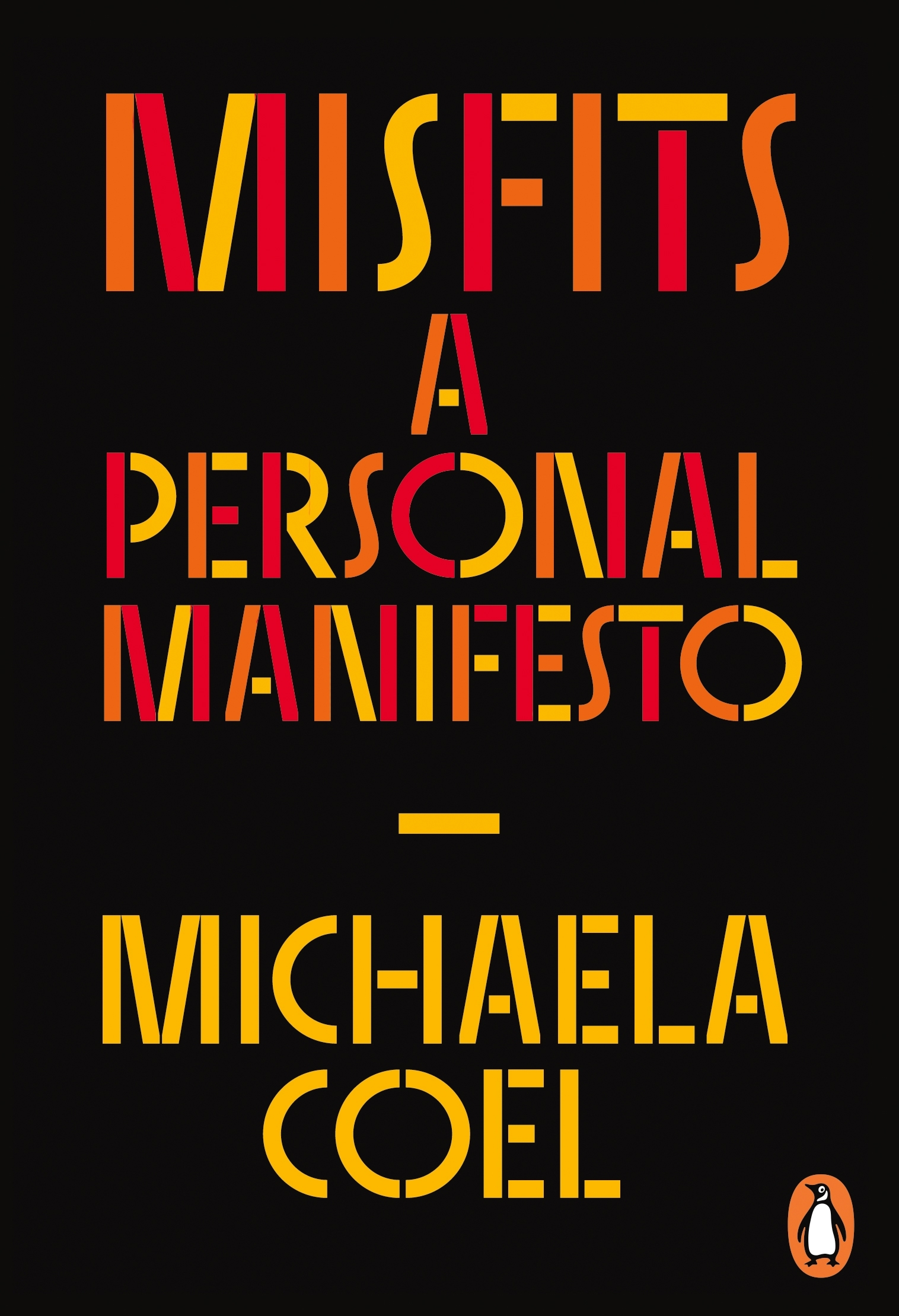
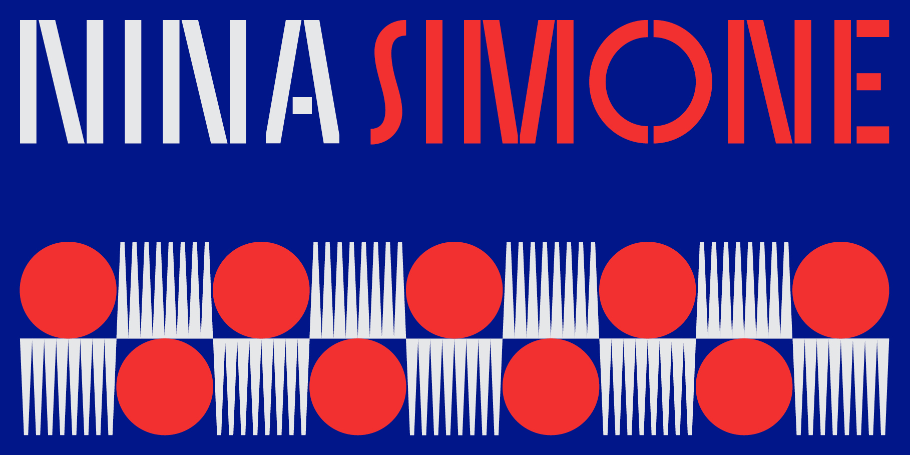
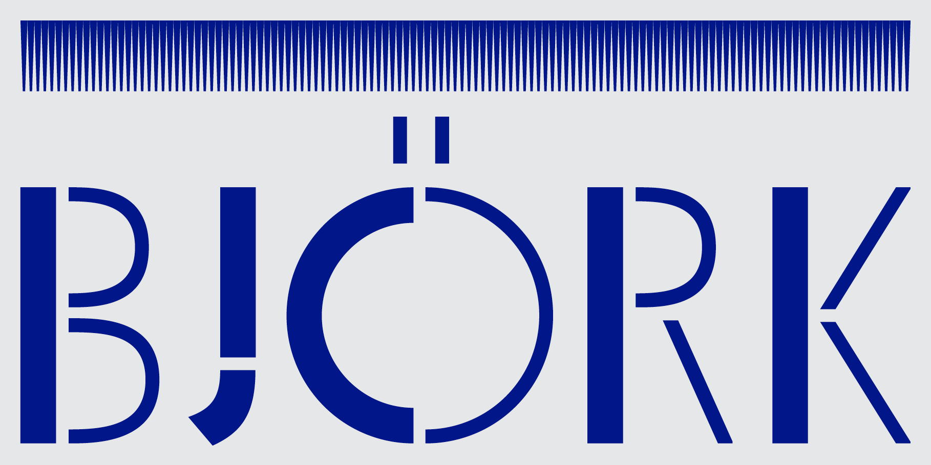
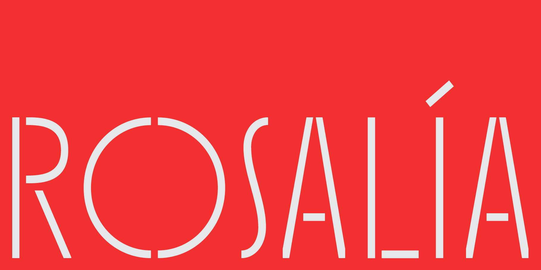
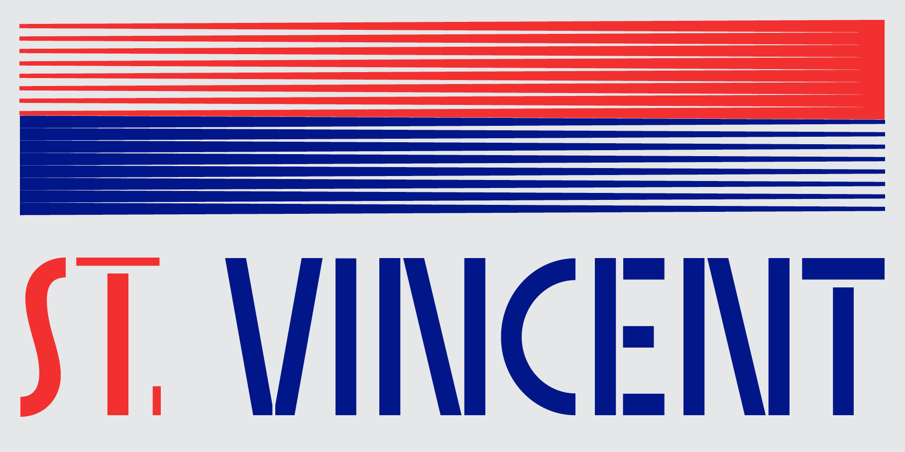
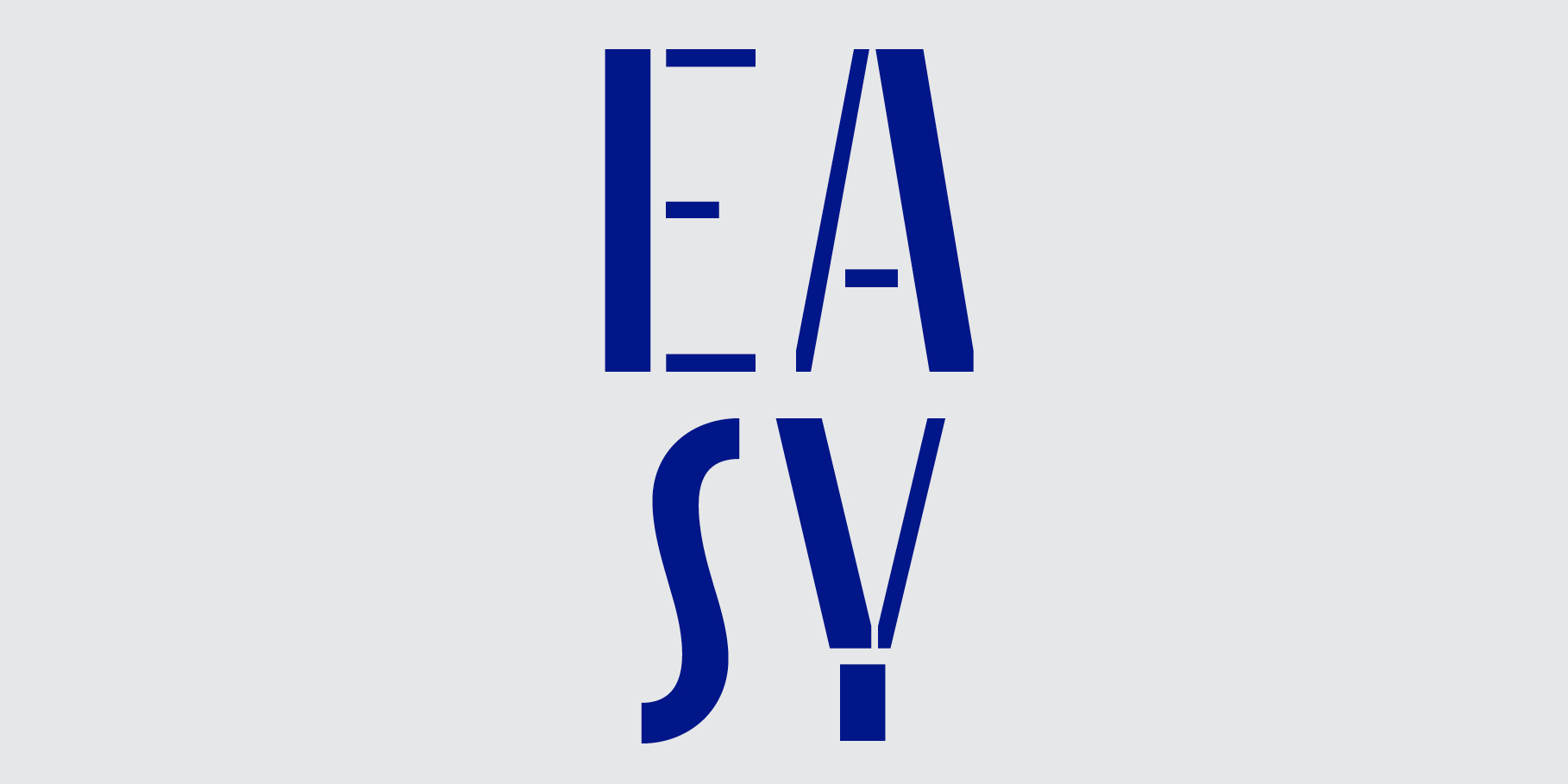
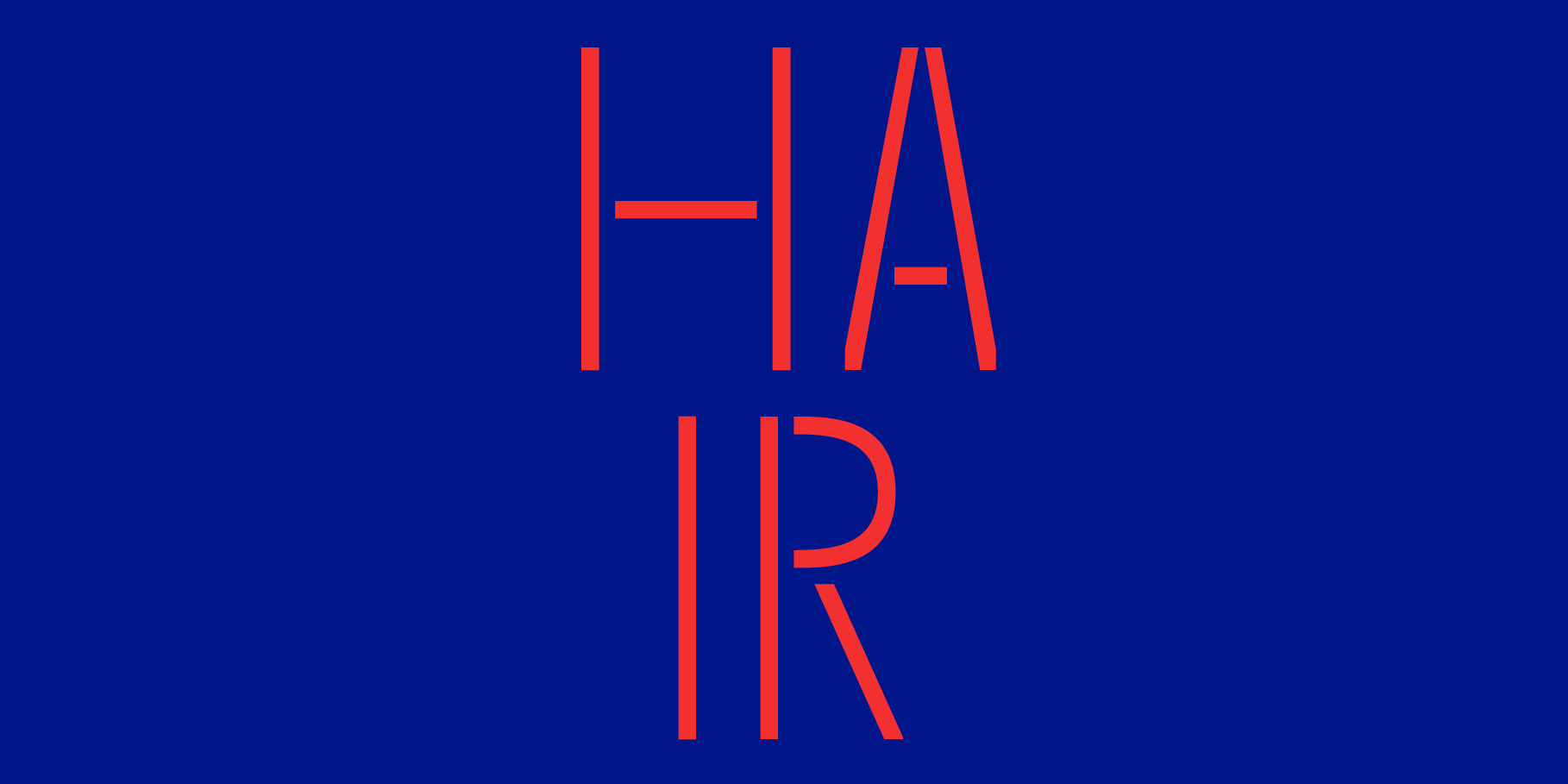
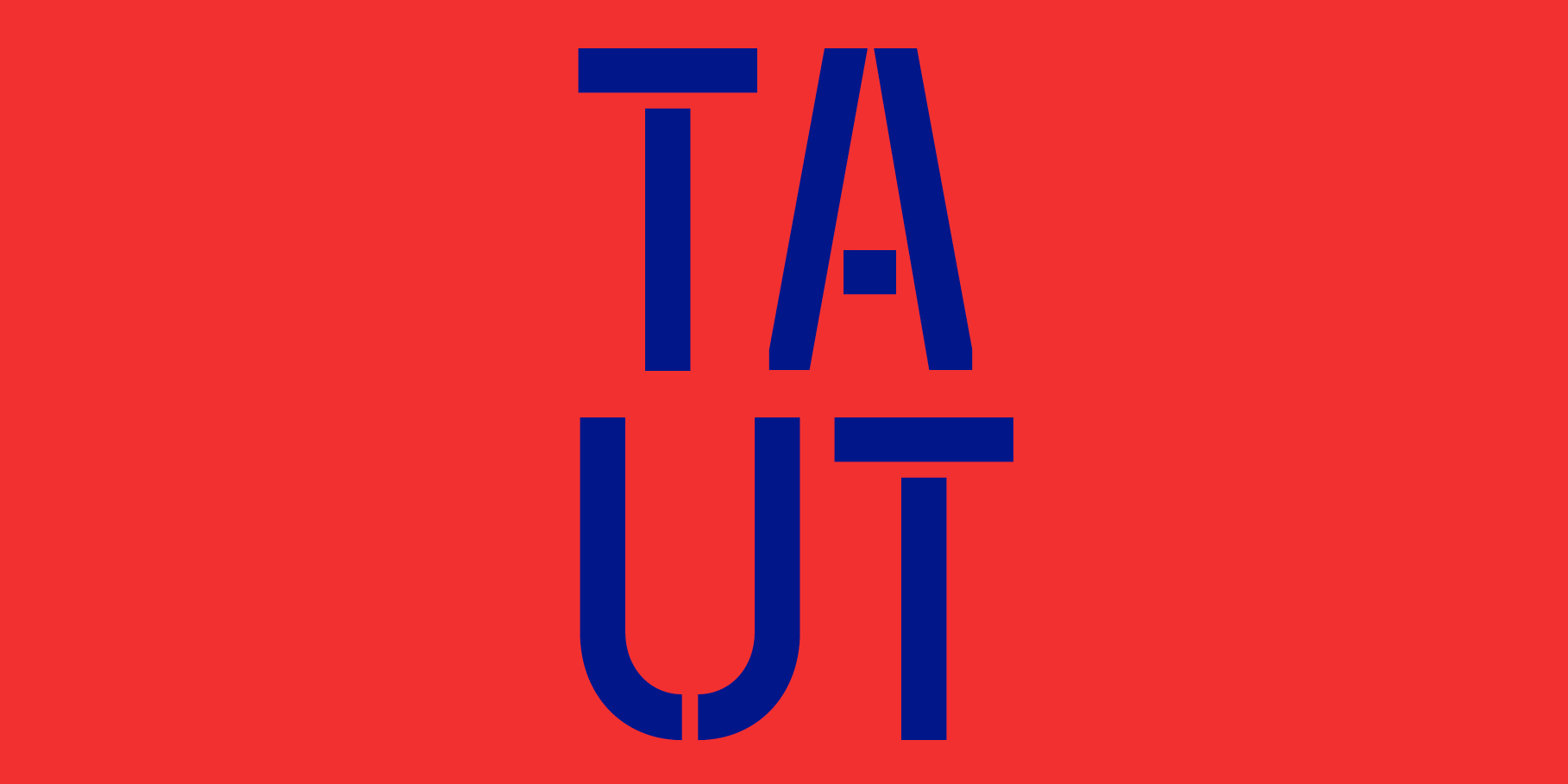
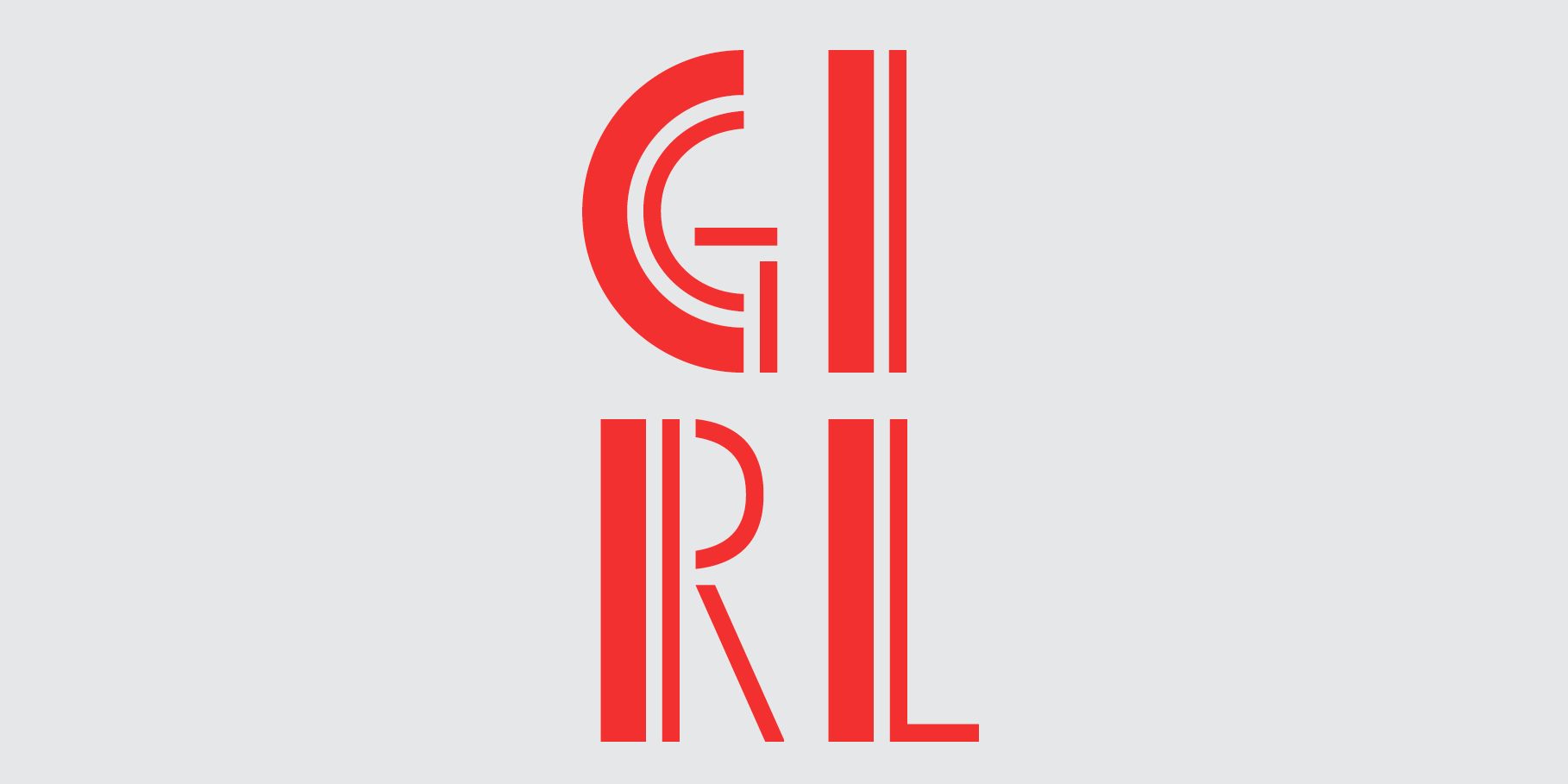
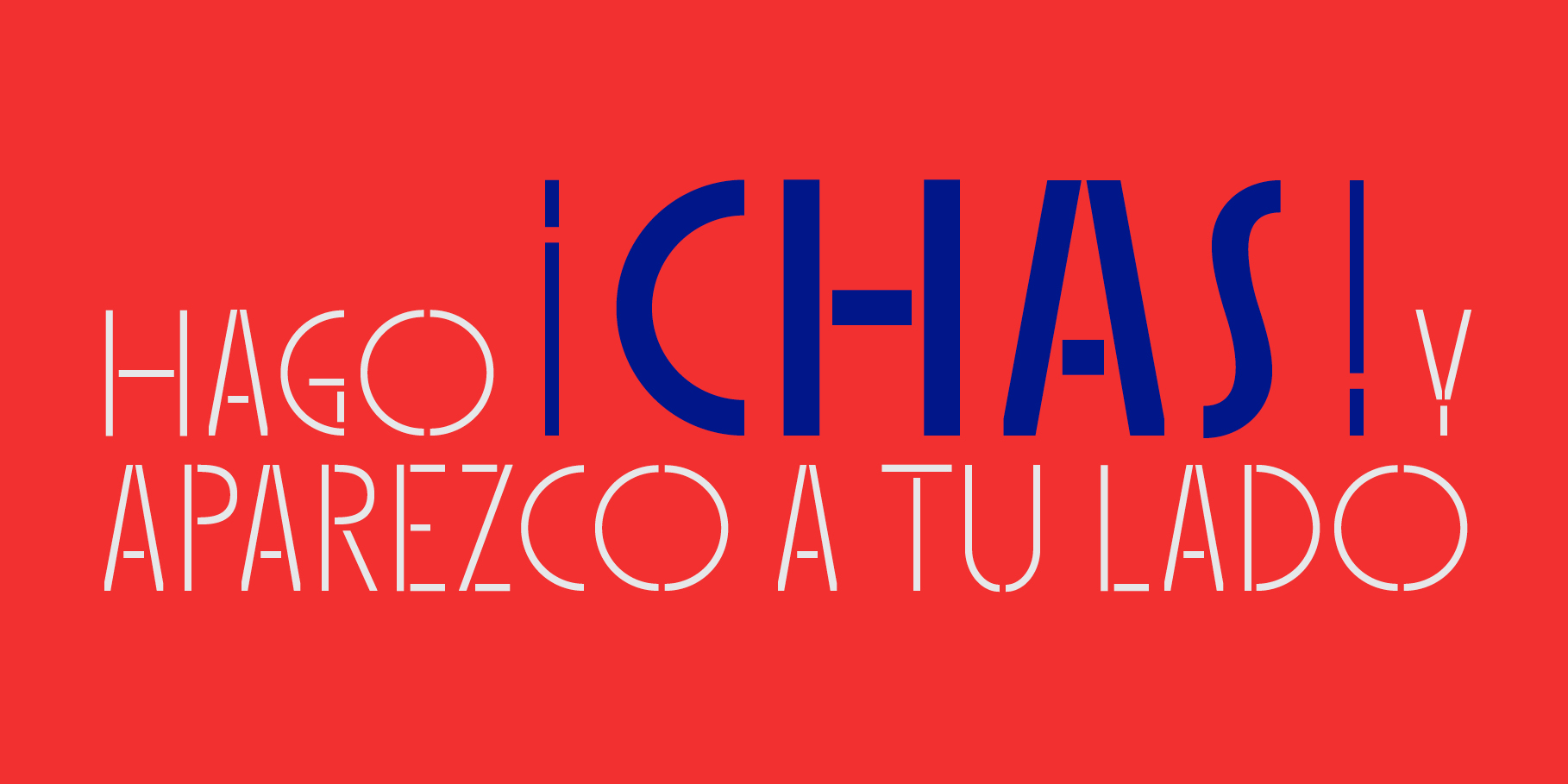
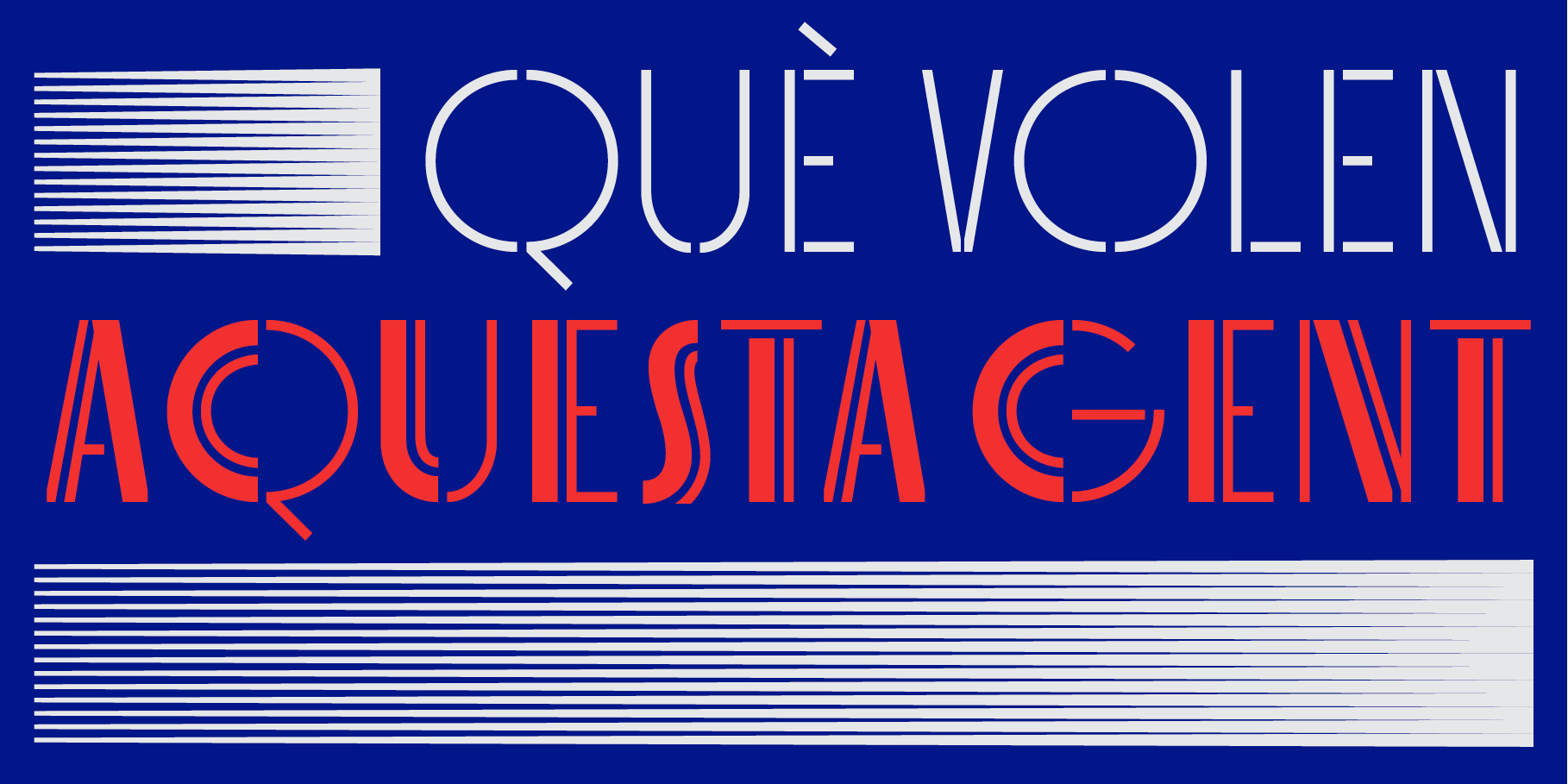
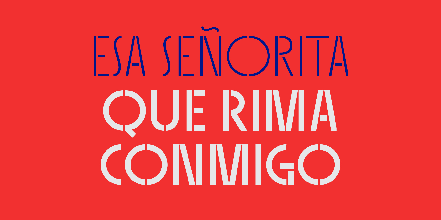
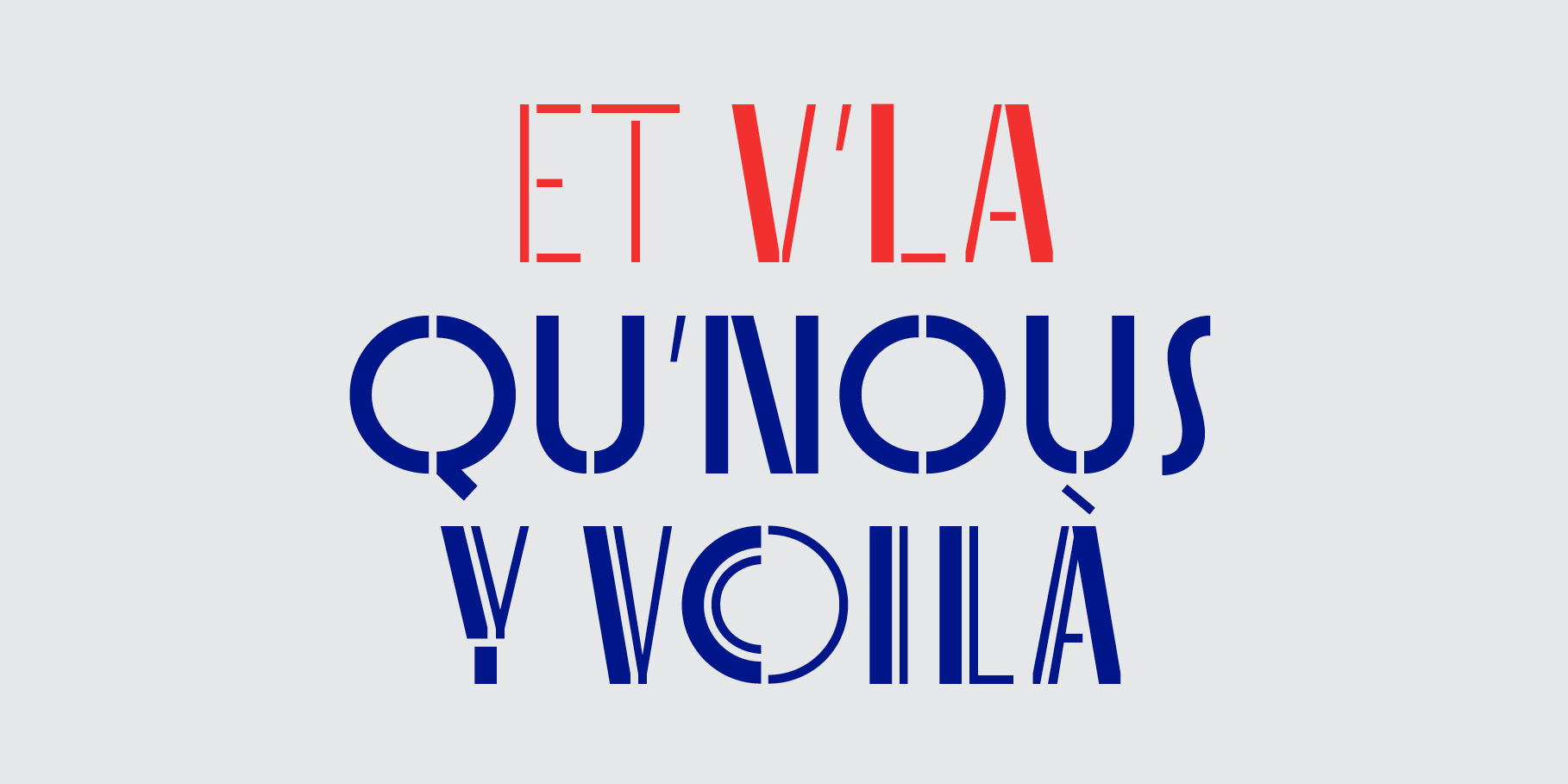
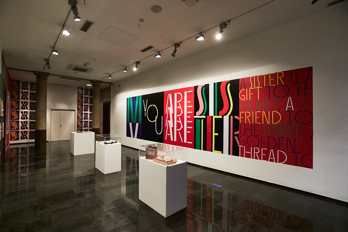
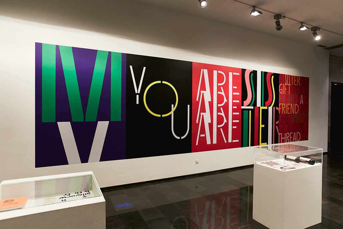
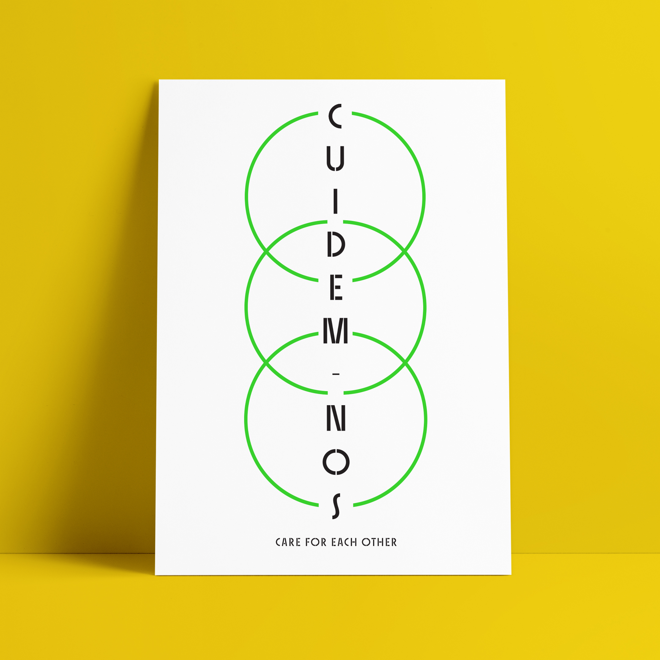
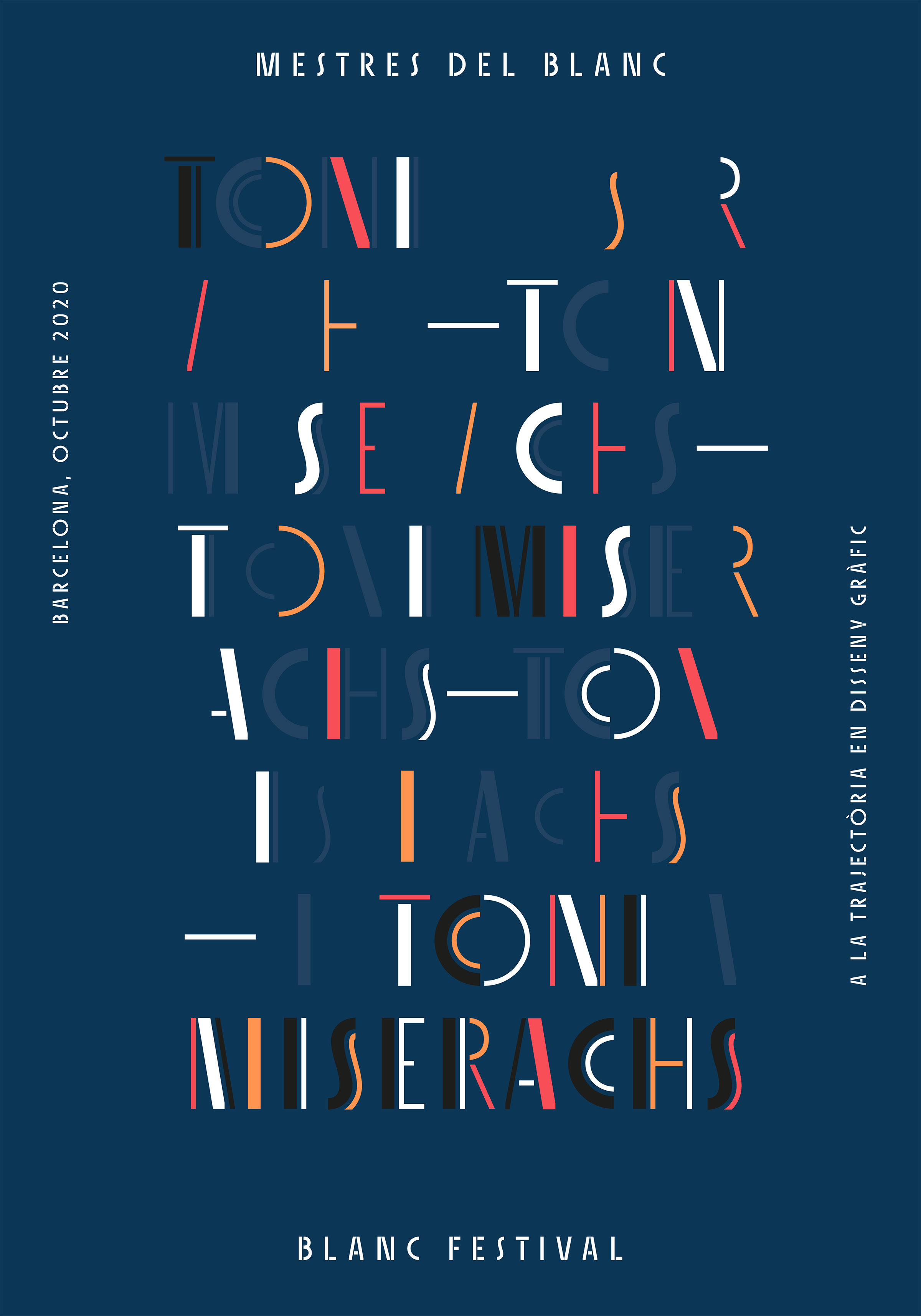
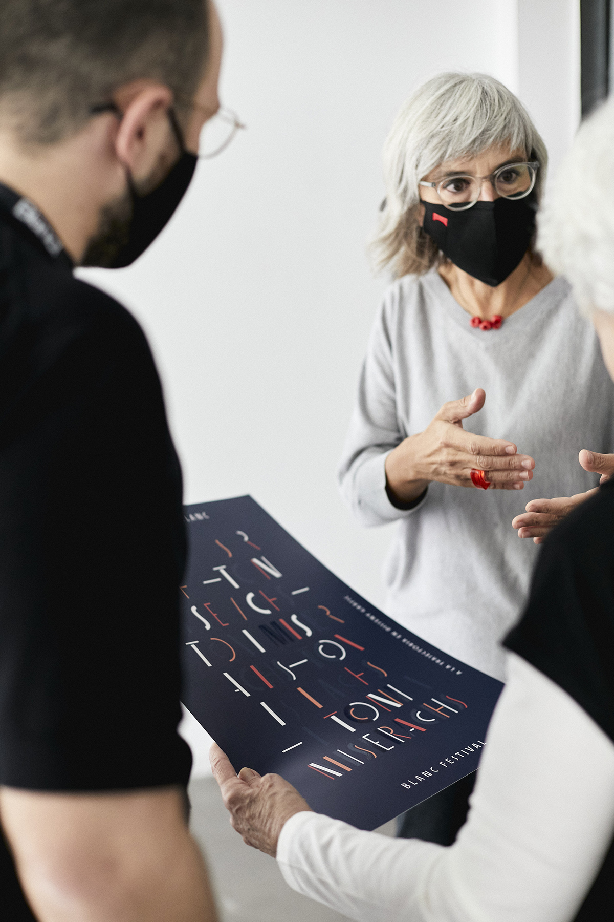
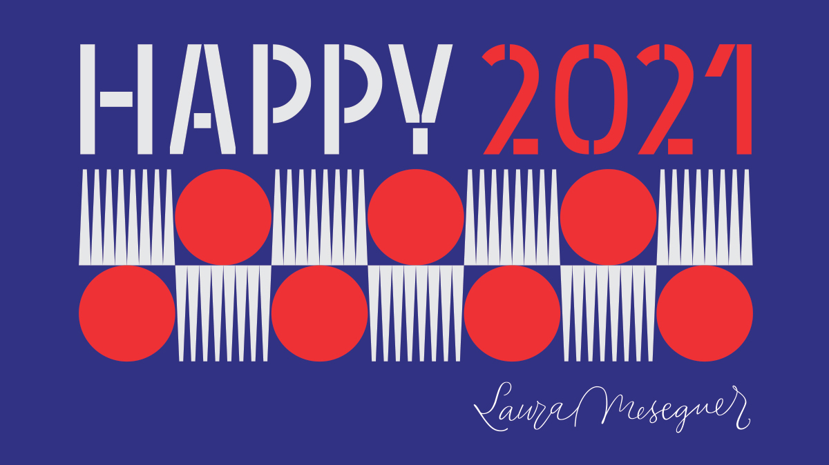
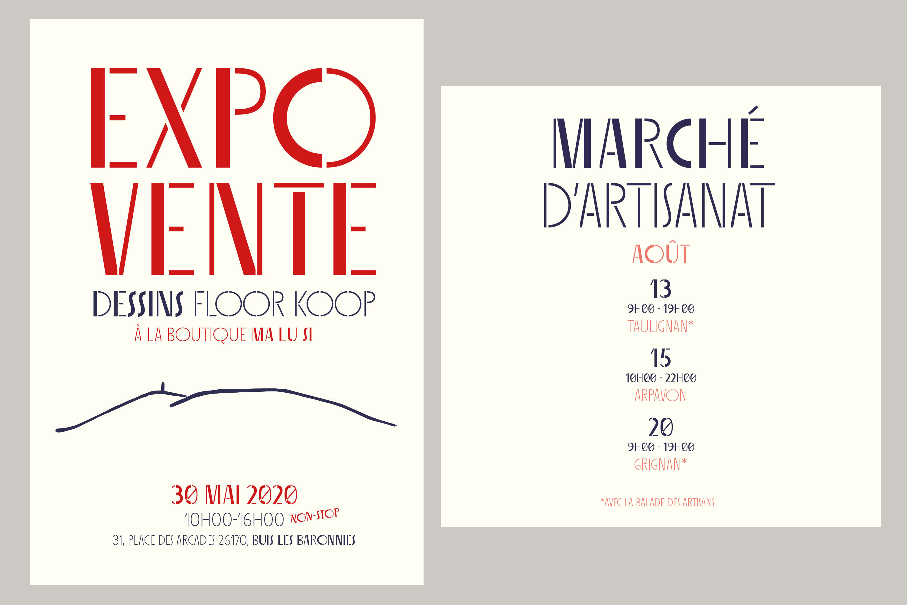
Sisters is a lively set of stencil display typefaces designed by Type-Ø-Tones’ co-founder Laura Meseguer. The family features four fresh fonts that share foundational principles of construction yet complement each other—as sisters do—by celebrating their differences. Variations in contrast, weight, and design characteristics result in four distinct styles dubbed One through Four. This cool quartet contains no lowercase, asserting the family’s rightful place in the titling typography space.
Like many Type-Ø-Tones typefaces, Sisters was conceived as a custom lettering project—in this case, the design was crafted for the identity of an art exhibition. Laura initially drew only the limited character set the show required, but from the outset, she saw great potential for a fully developed type family based on her lettering concept.
The first member of Laura’s new family was, naturally, Sisters One. She later added contrast to produce Sisters Two, then equalized the weight of Sisters Two to create Sisters Three. To round out the group, Laura added a deco touch to Sisters Two, resulting in the festive but retro-elegant Sisters Four. Each Sister shares DNA with the other members of the family, just as human siblings do :).
Credit for the Sisters name goes to Eider Corral and we couldn’t imagine a more fitting moniker for this little family. The spirited graphics on display in the Sisters “in use” section were designed by Gerard Joan, and the text is by Tamye Riggs. All excellent designers and dear friends of Type-Ø-Tones. Together, we have created Sisters as an homage to all the creative women in this world. Thanks, Eider, Gerard and Tamye!
Visit the minisite!
Read the post at Eye on Design
Tags
Sans Serif, Display, Stencil, Editorial Design, Identity Design, Kids
