


Author
José Manuel Urós
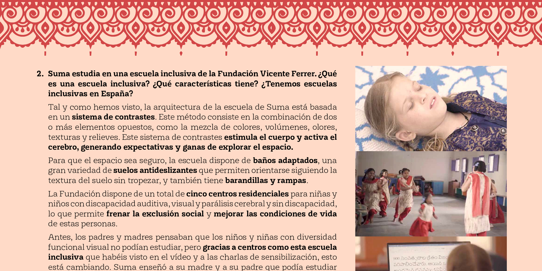
Creation
2020
Actual version
1
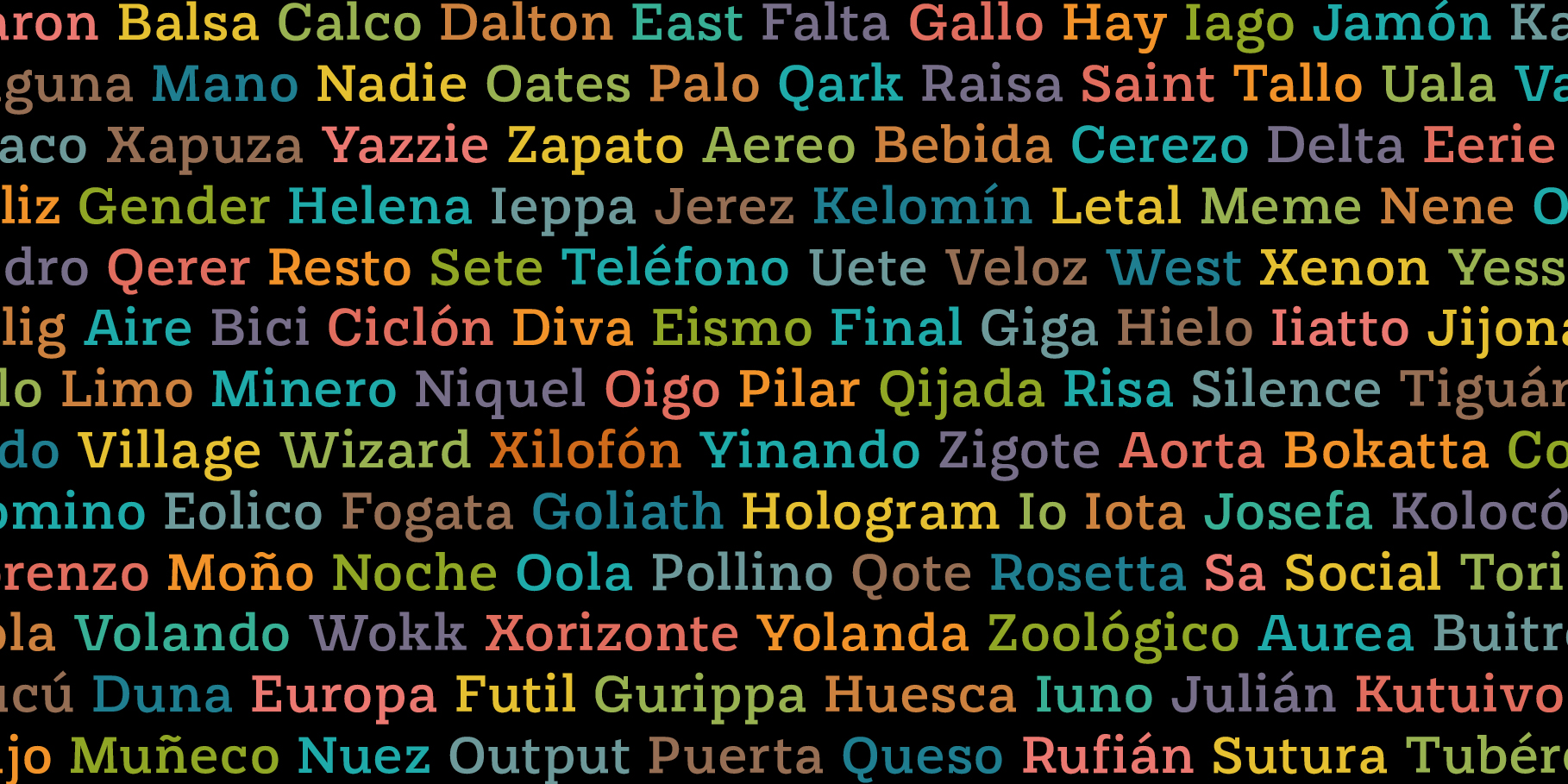
Styles
14
Character sets
Basic Latin
Latin-1 Supplement
Latin-2 Central European
Small Caps
License Types
Desktop, Webfont, ePub, App, Server
Description
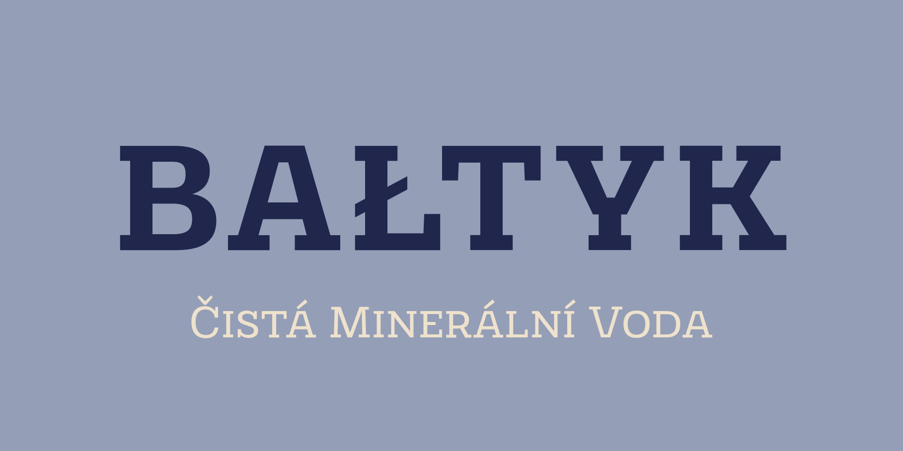
In 2011, while tutoring an exercise on Slab Serifs, Josema discovered Robert Thorne’s work for Thorowgood. Specifically, he was fascinated by the extraordinary density of the 6-line Egyptian Pica from 1820-21.
As a simple exercise, he wanted to test the limits of readability within the context of a contemporary alphabet. Rothwood Ultra is the result of this experiment.
As a way of developing the series, he found it interesting to go to the opposite end of the spectrum and discover how to evolve the extra-black Ultra’s DNA into a super lightweight model. The Hairline and Thin styles are her slim sisters.
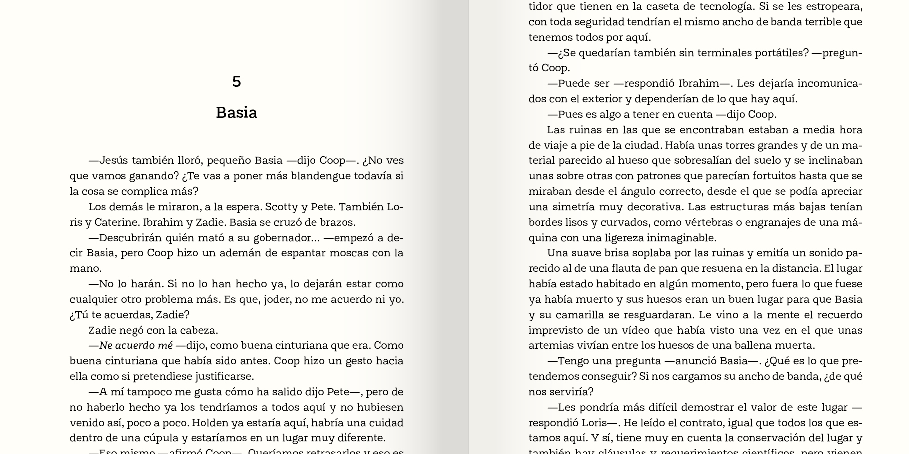
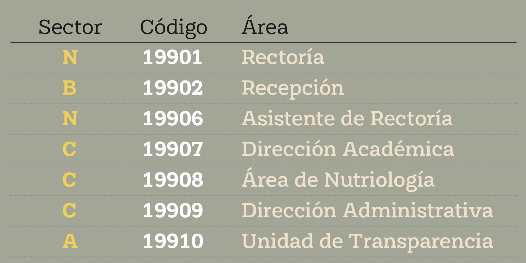
The third challenge has been the creation of the text version. Light, Book, DemiBold and Bold, including italics and Small Caps close the Rothwood cycle for editorial use.
Tags
Slab, Display, Text, On Screen, Editorial Design
