

Author
José Manuel Urós
Creation
1995
Actual version
3.5 (2017)
Styles
5
Character sets
Basic Latin
Latin-1 Supplement
Latin-2 Central European
Latin Plus
License Types
Desktop, Webfont, ePub, App, Server
Description
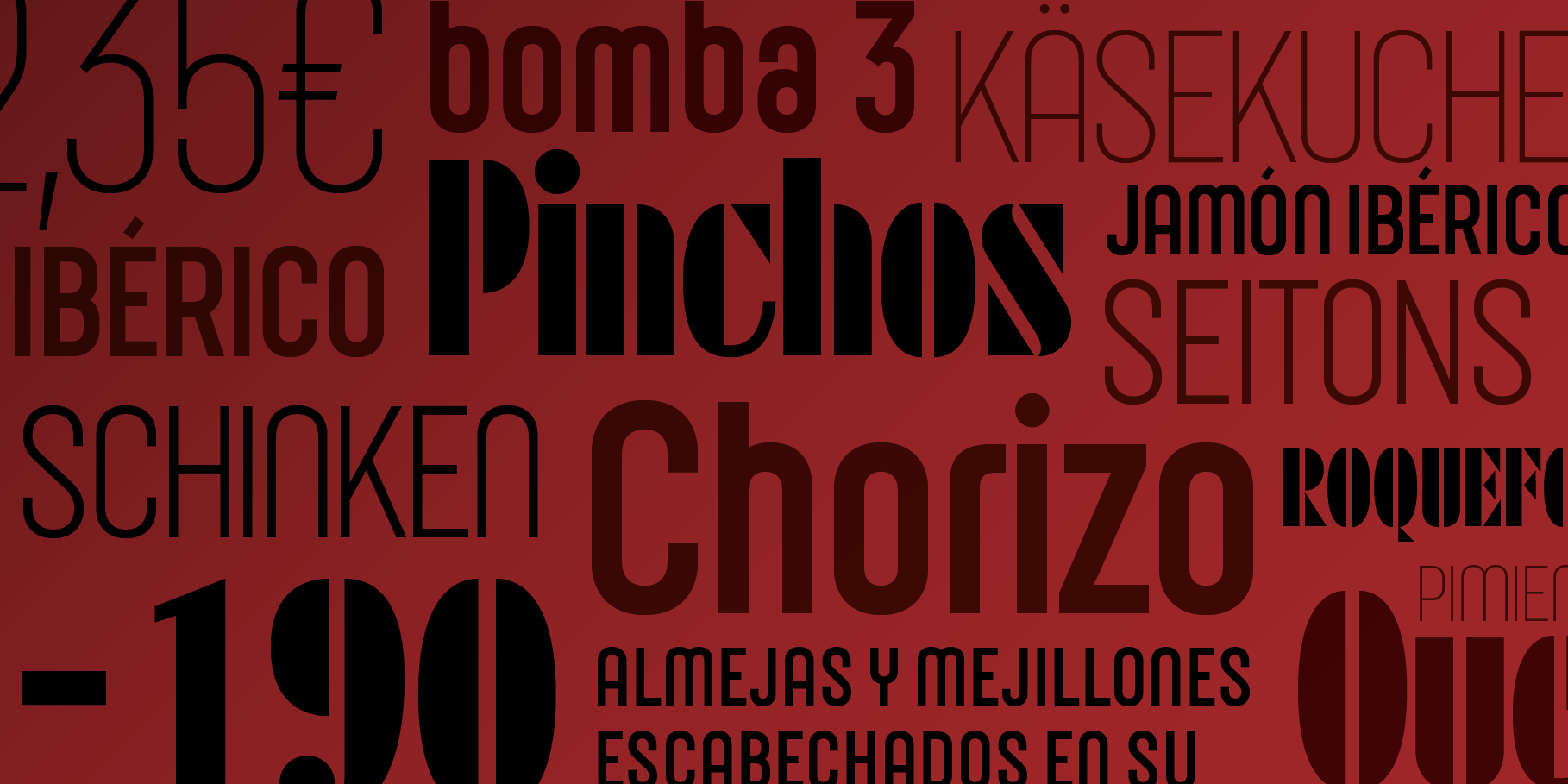
Joost is not just a study on the structure and development of the classic Bauhaus alphabets (specifically the style applied with special care by Joost Schmidt in the poster bauhaus im gewerbemuseum basel) but the need to represent a font family in a usable form with those shapes that have fascinated Josema Urós since an early childhood.
Joost version 1, published in 1995, claimed to be radically attached to the concept of Universal Alphabet, which contains only lower case characters, but betrayed that spirit with diacritics, punctuation and a full 256 ASCII table.
Joost version 2, 2009, incorporated a useful upper case and some serious design improvements.
The current version of 2016 has grown to contain a complete character set of Central European, OpenType features and a new system of curves, keeping it evolving 86 years after the publication of the original poster.
Hosted webfonts
TypeNetwork
Free trials and desktop rentals
Fontstand
Tags
Display, Editorial Design, Historical, Sans Serif, Stencil
