
Author
José Manuel Urós, Sabina Chipară
Creation
2022
Actual version
1
Styles
9
Character sets
Basic Latin
Latin-1 Supplement
Latin-2 Central European
Latin Plus
Small Caps
License Types
Desktop, Webfont, ePub, App, Server
Description
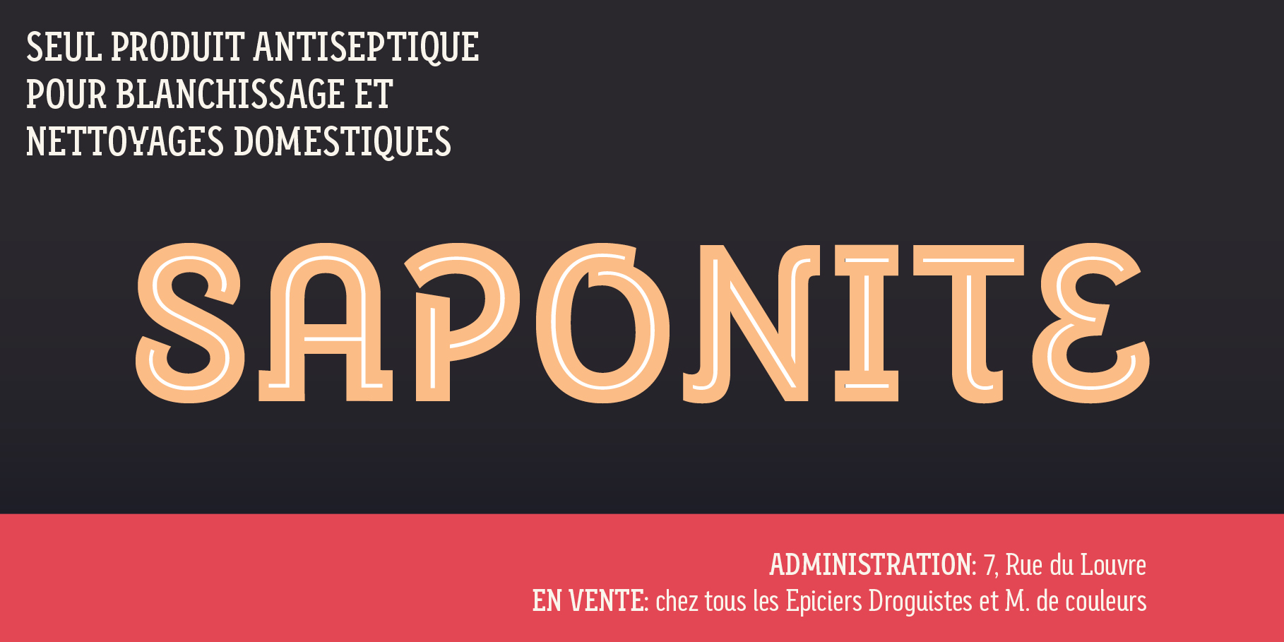
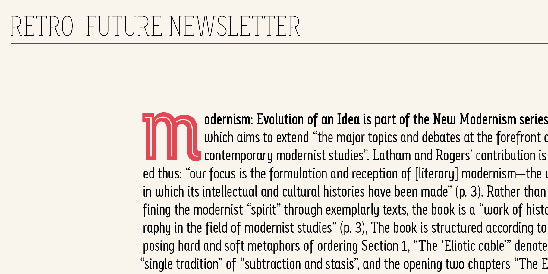
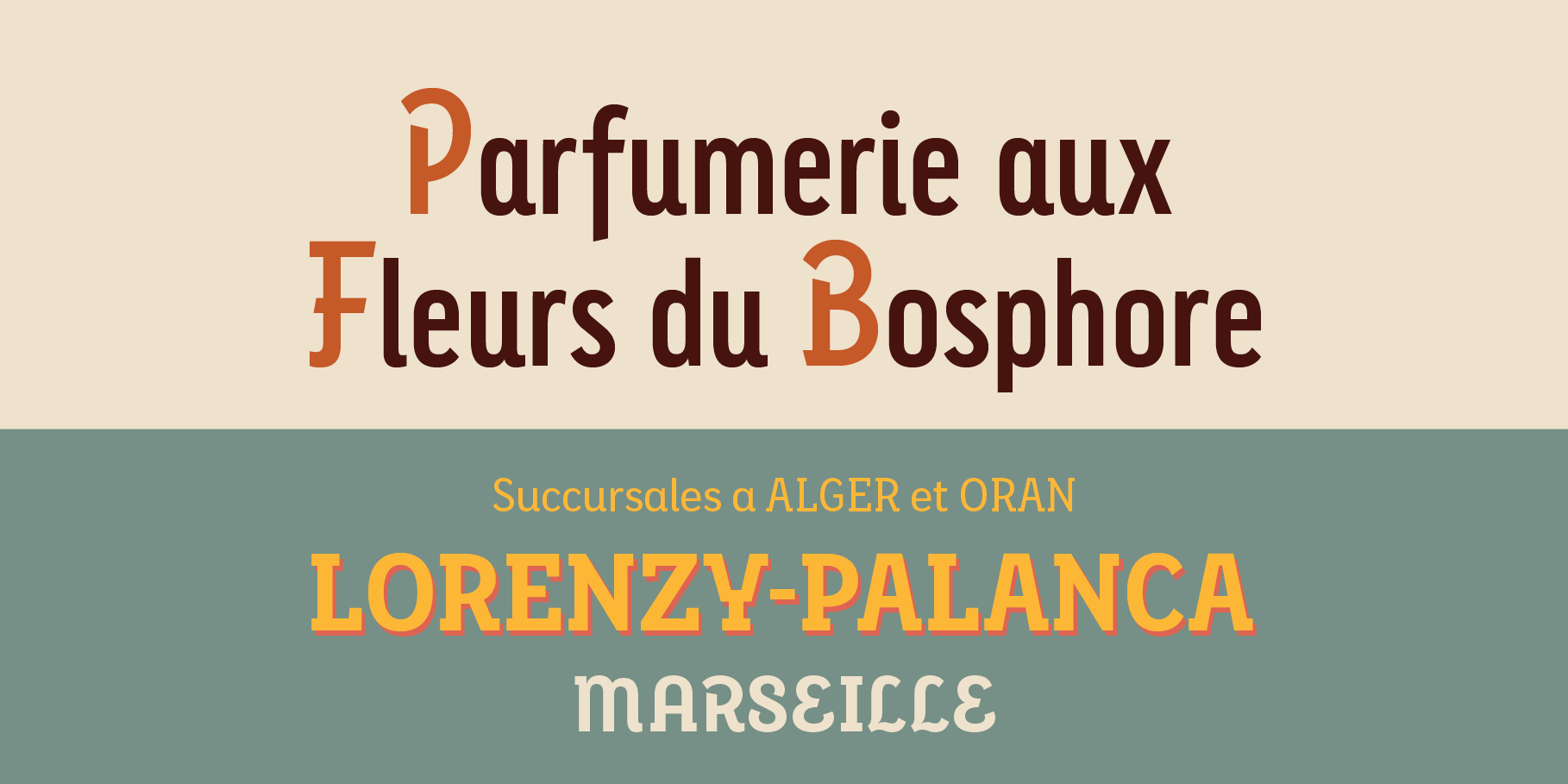
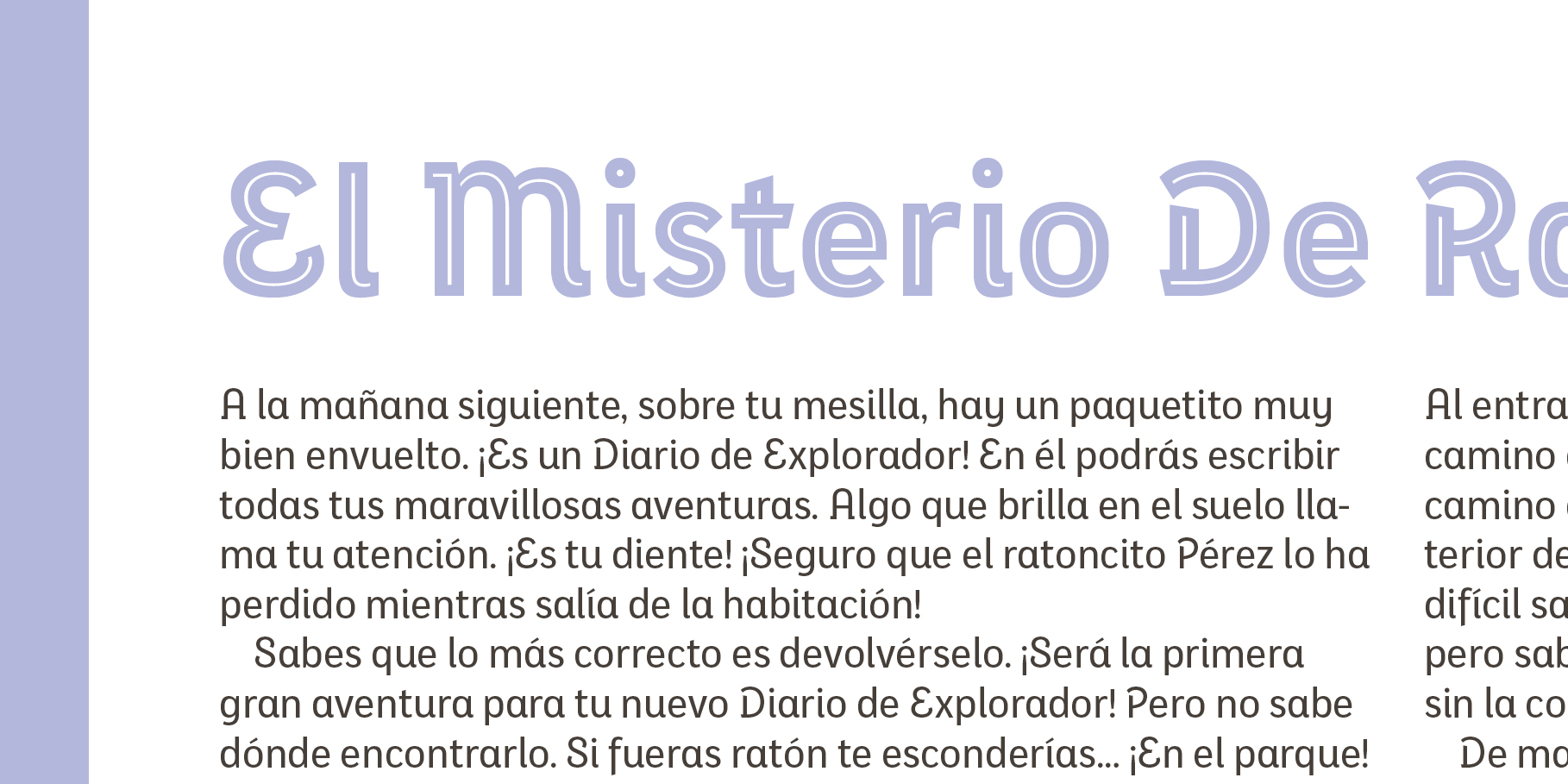
The Eixample project is inspired by modernist signage of various examples found in the Eixample neighbourhood in Barcelona. The name of each subfamily is related to its location or to specific elements of the original sign.
Dip is the abbreviation for Carrer Diputació (Diputació Street), where the original sign spells Farmacia Específicos Diputación.
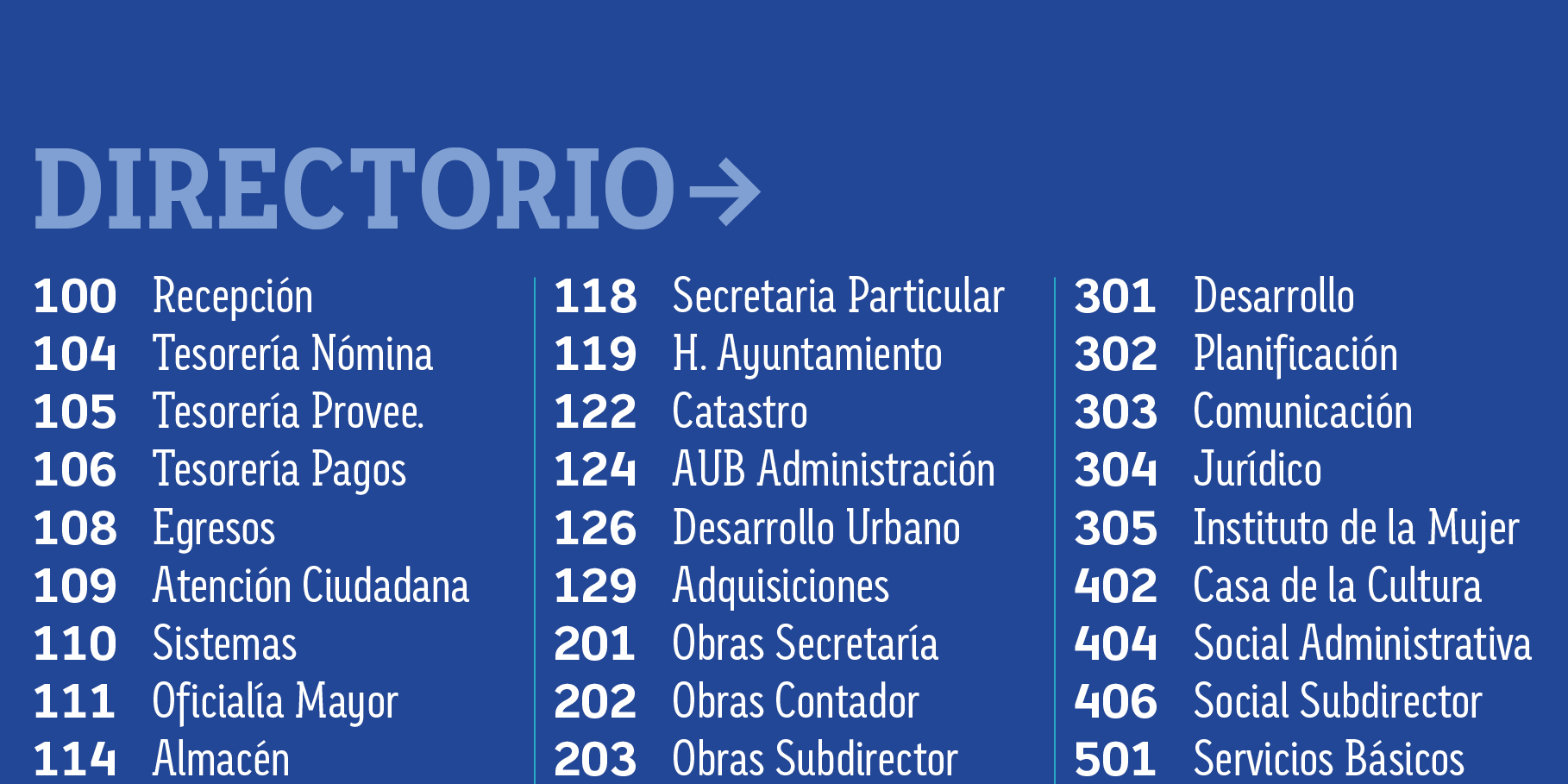
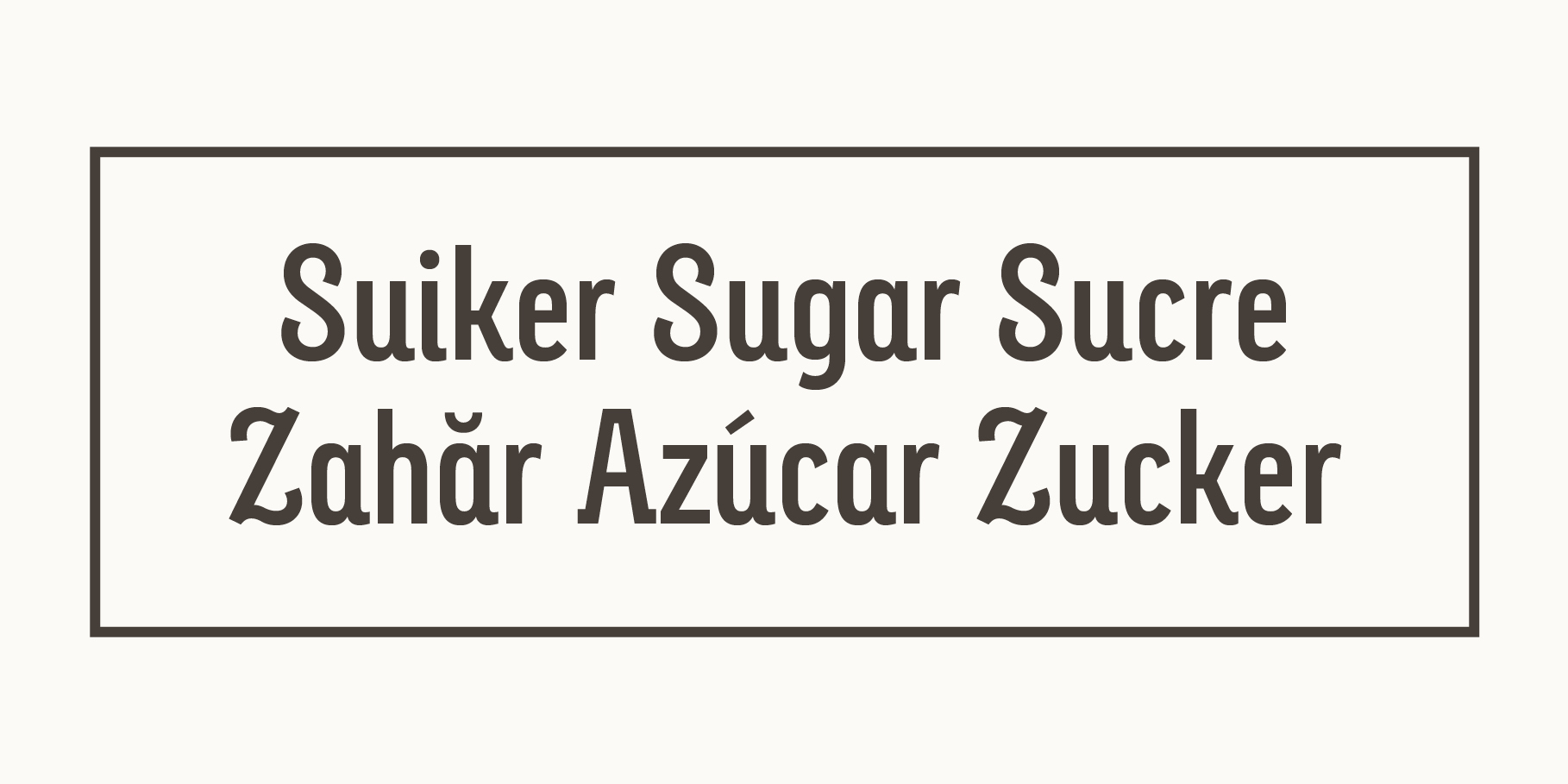
The reference taken from the pharmacy sign is a curious model, where sans-serif lowercase letters coexist with script uppercase. This fundamentals create the system that we have introduced in Eixample Dip.
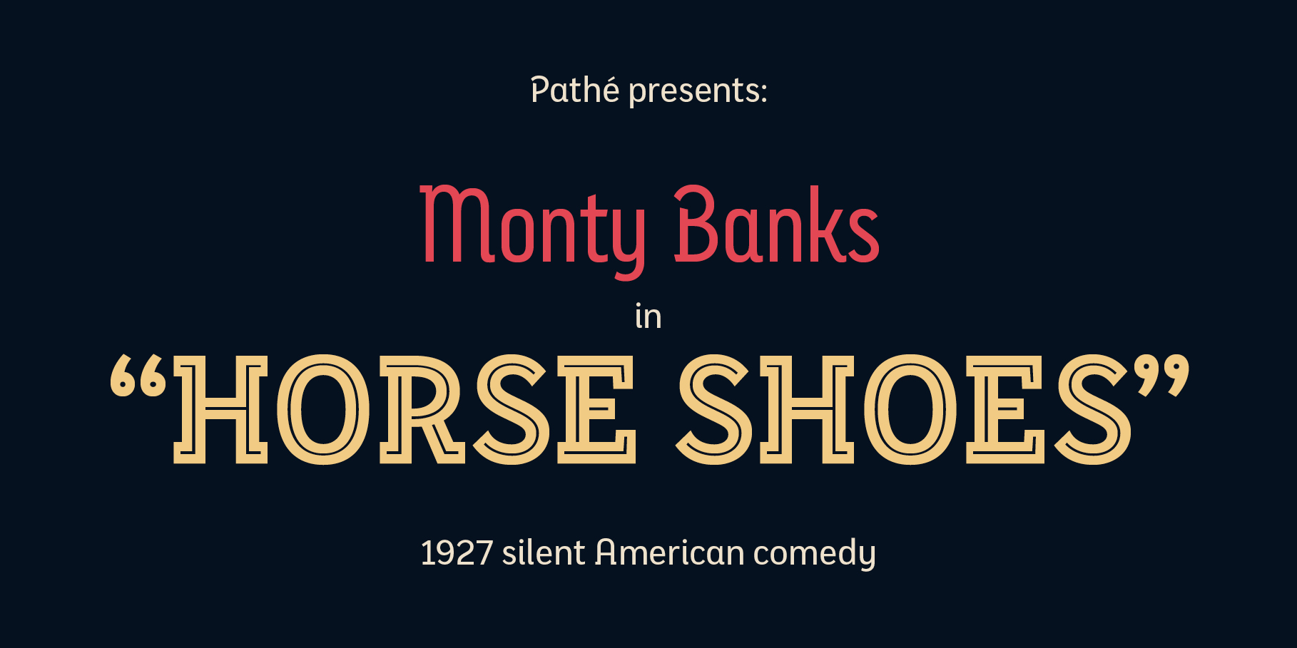
The capitals are built with contained decoration to achieve maximum compatibility between letters. The script capitals are the default uppercase but we have also included alternative capitals, a slab style that can be combined with the scripts.
The narrow influence of the original sign is correlated with the Narrow styles of the Dip family. But for more versatility, Eixample Dip explores normal widths and weights as well. Furthermore an Inline version was added to the suite.
Tags
Sans Serif, Display, Text, On Screen, Editorial Design