
Author
Laura Meseguer
Creation
2016
Actual version
1
Styles
20
Character sets
Basic Latin / Latin-1 Suplement / Latin-2 Central European / Latin Plus
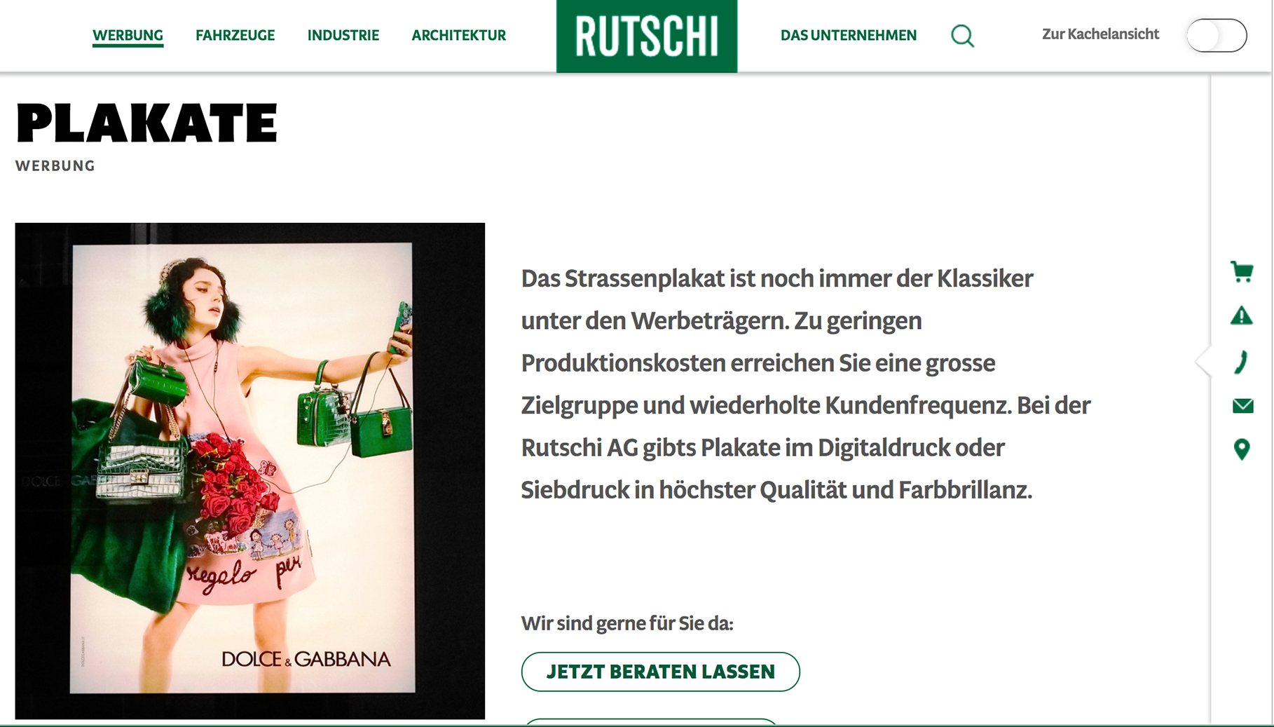
License Types
Desktop, Webfont, ePub, App, Server
Description
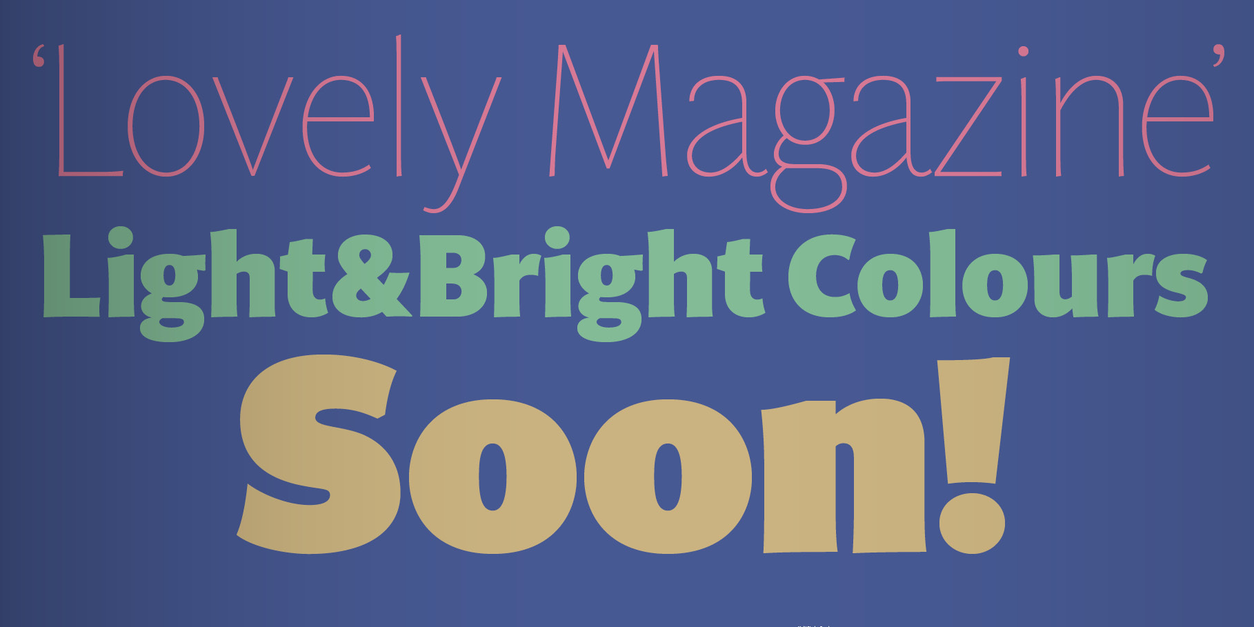
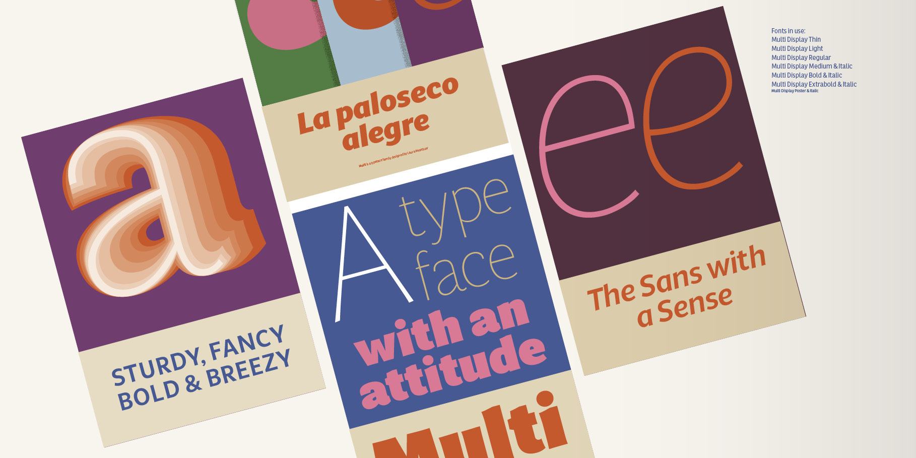
Multi was conceived as a custom type project for newspapers. It consists of two series: Text and Display. Multi Text presents a more rational approach, with an increased x-height, simplified contours, and adapted key glyphs to improve legibility in small sizes and on screen. Multi Display has a lovely calligraphic quality. The strokes are slightly curved, with endings that are delicately flared, featuring notches reminiscent of pen strokes. With weights ranging from the svelte Thin to the puissant Poster, Multi can be both a gentle whisper or a commanding baritone.
Production: Joancarles Casasín and Noe Blanco
Further information
Prizes & Mentions
Favourite typefaces of 2016 at Typographica
Reviewed by Yves Peters
Hosted webfonts
TypeNetwork
Free trials and desktop rentals
Multi Display at Fontstand
Multi Text at Fontstand
Tags
Display, Display & Text, Editorial Design, On Screen, Optical sizes, Sans Serif, Text
