2016/02/1
Logo for the redesigned Dutch newspaper 'Het Parool'
The art directors of Het Parool, John Koning and Floor Koop, requested some proposals for the masthead and logo for the redesigned newspaper, released the past 10th of February 2016. Our work was based on a clear briefing: ‘back to basics’ and design a logo with a strong and powerful identity. I presented different ideas, and final solution is based on a combination of the two typefaces that play a lead role in the new newspaper, Quarto (also the typeface for the headlines) and Tiempos. The new logo not only adorns the front page and the homepage, but is also visible in all expressions of Het Parool.If you want t read more about the redesign of the newspaper you can do it at the newspaper online or here (only in Dutch).
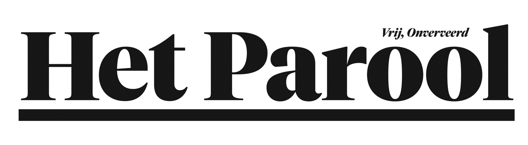
The Masthead
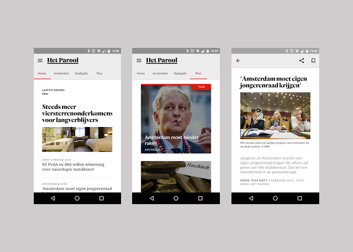
The logotype in the app
One of the first printed newspapers
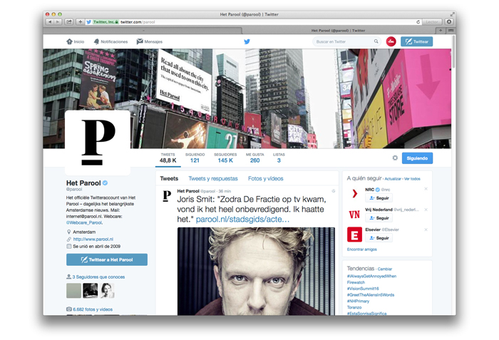
The identity in twitter is shown as the isolated P
