2016/09/24
Custom type for the titles of the documentary ‘Barcelona. The Rose of Fire’.
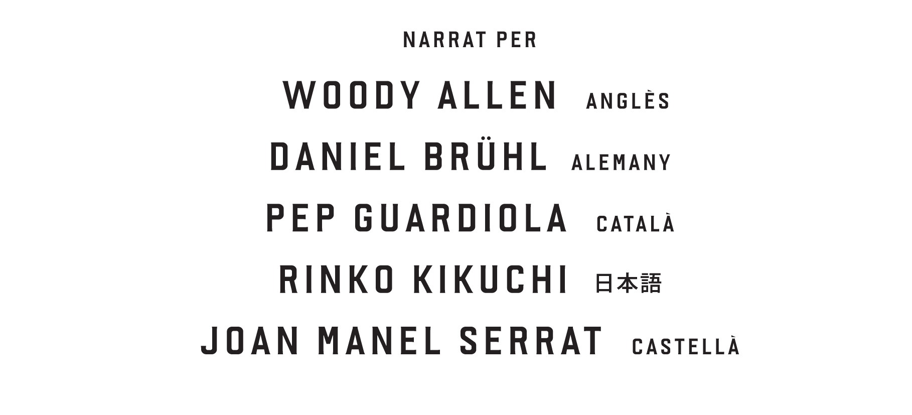
This project was done in collaboration with Mariona Omedes from Nueve Ojos, produced by Media Pro and directed by Manuel Huerga. The documentary is a walk through the city of Barcelona in 3D, carried out in a single plane sequence. An immersive experience where the music, the three-dimensional sound and the narrator, a different one for each language, are protagonists too.
Here you can see the trailer.
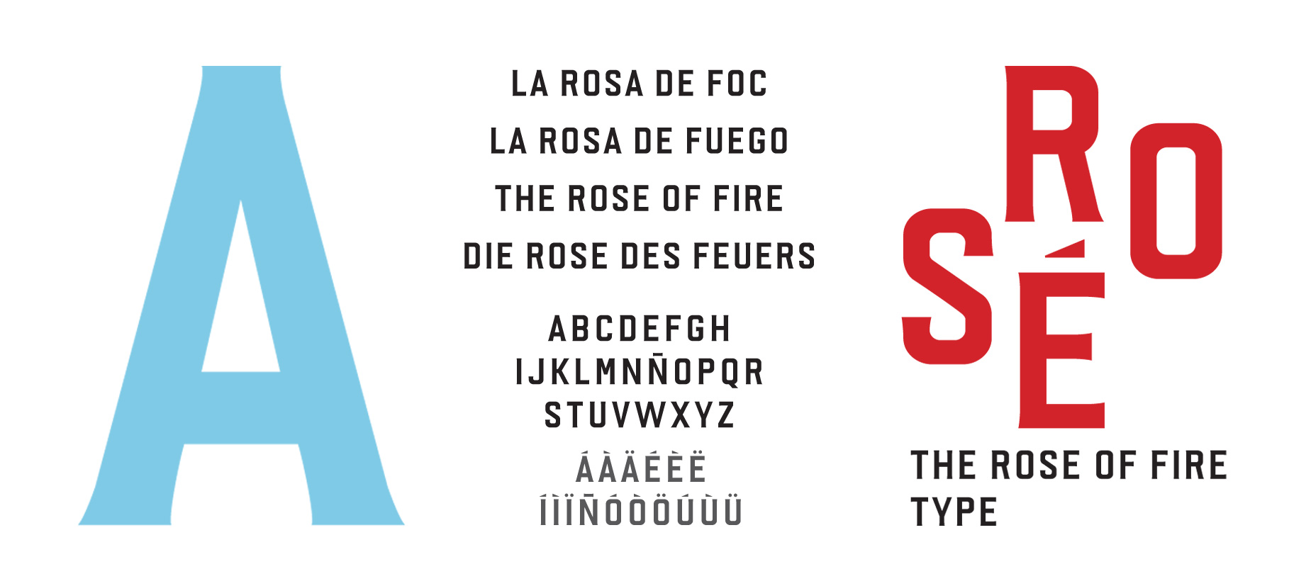
The concept of the custom typeface is based on the answer to this question: “Which would be the typeface that best represents the city of Barcelona? That’s a difficult question because Barcelona doesn’t have such a strong and clear typographic identity. The idea came after watching some trailers of the 3D movie, where you can easily see that the streets of Barcelona have a main role. When observing the arquitectural details, and especially the street signs, there is not only one typeface but the geometrical condensed sans serif is dominant.