

Author
Enric Jardí
Creation
1995
Actual version
2 (2007)
Styles
19
Character sets
Basic Latin
Latin-1 Supplement
License Types
Desktop, Webfont, ePub, App, Server
Description
You might find Wilma under different names –such as Railroad–, since it is, in fact, a classic version of the wooden type which was often used in posters, crates and industrial machinery during the first half of the twentieth century. Recently, Stephen Coles at Typographica found a reference, a model by William Dressler found in the book “Lettering art in modern use” by Raymond A. Ballinger (New York: Reinhold Pub. Corp., 1952).
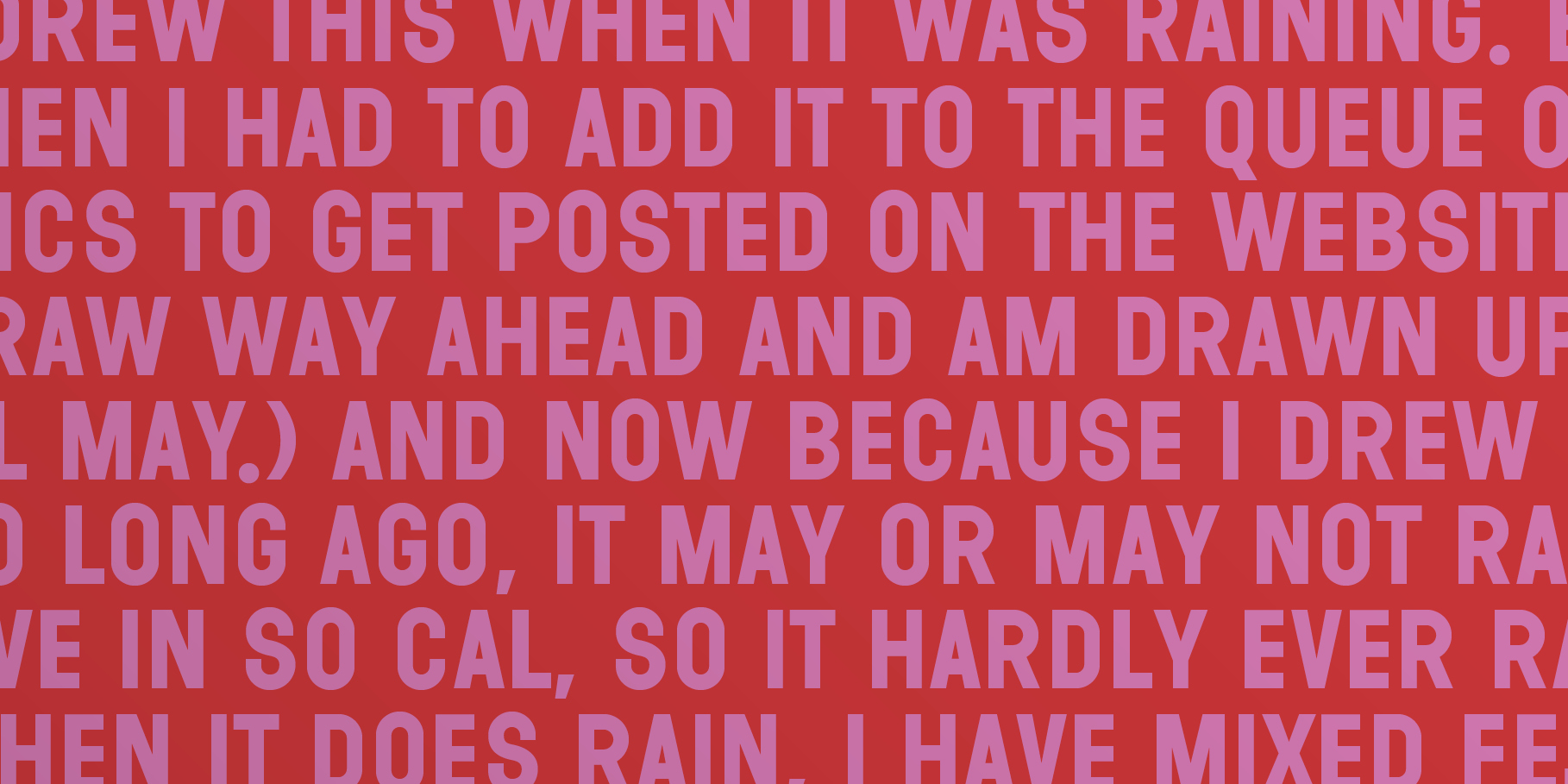
Wilma is one of Peret’s favourite types, and he was the one who called our attention to it. It does not have lower cases, but it has the beauty of the uncomplicated geometry according to which it was created. It is one of those fonts whose lack of special traits is precisely the reason for their power.
You will find a chart of possibilities and examples of good combinations in our pdf specimen.
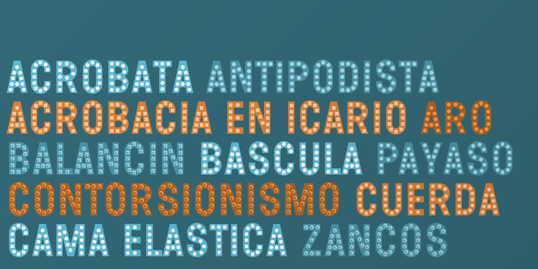
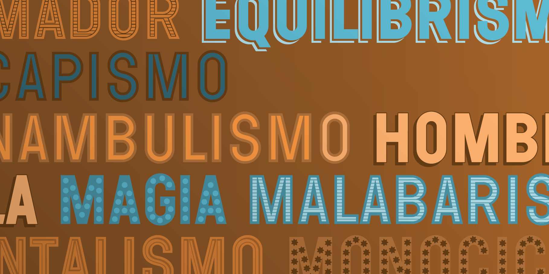
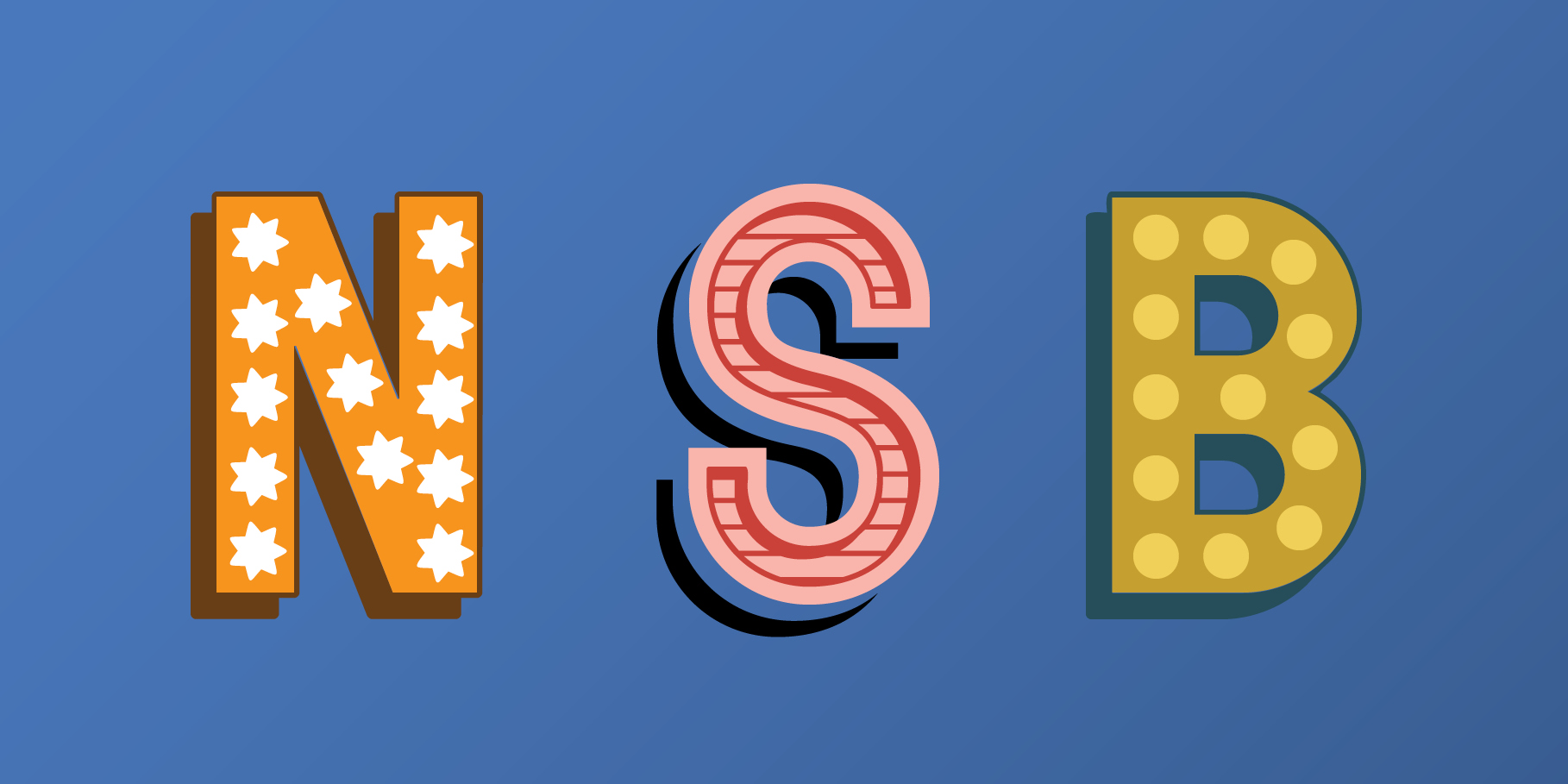
We have developed it with a series of extensions that work on layers, the same as with other alphabets in this catalogue. The result of the different combinations is our homage to the old sign painters who used to decorate shops by hand, especially with golden colours and paint on glass and wood. The extensions, as you will see, have been created from what we call “Base”, and are grouped together according to the effect they cause, which may be a needle in the letter’s leg or a shadow. Combinations of two, three or even four different effects will depend on your taste.
Tags
Display, Layered, Sans Serif