Author
José Manuel Urós
Creation
1991
Actual version
4.5 (2018)
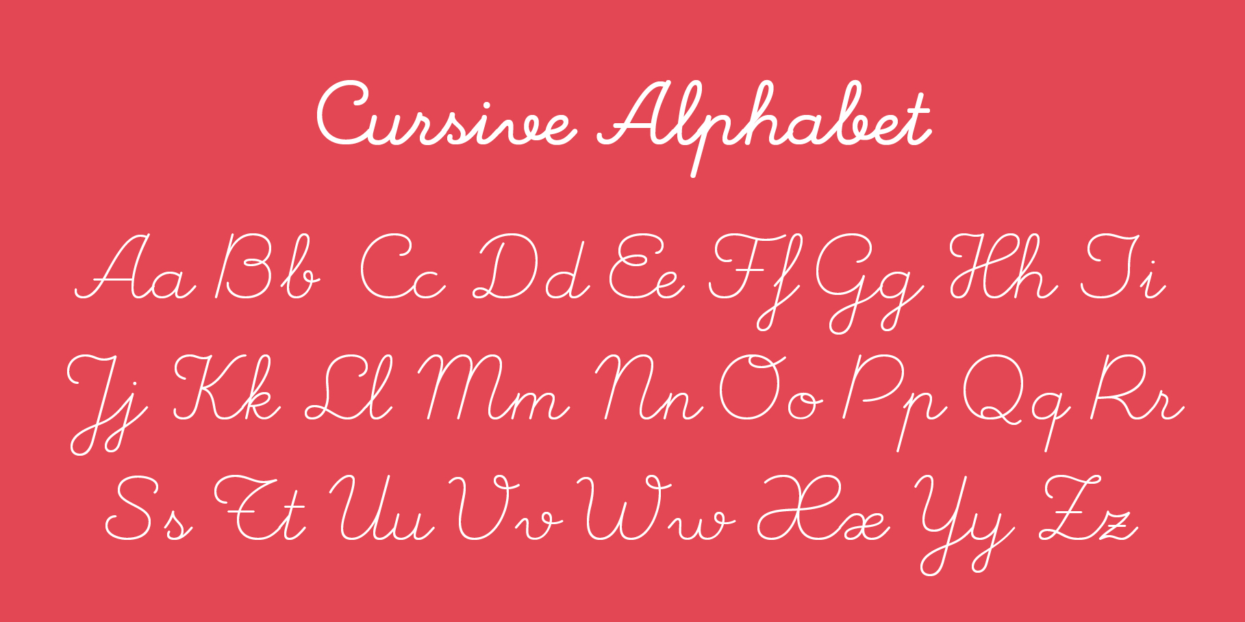
Styles
12
Character sets
Basic Latin
Latin-1 Supplement
Alternate Caps
Ligatures
License Types
Desktop, Webfont, ePub, App, Server
Description
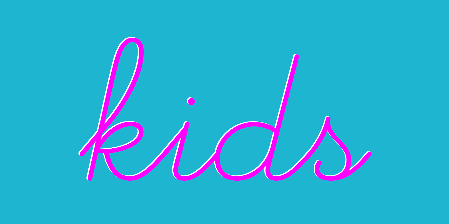
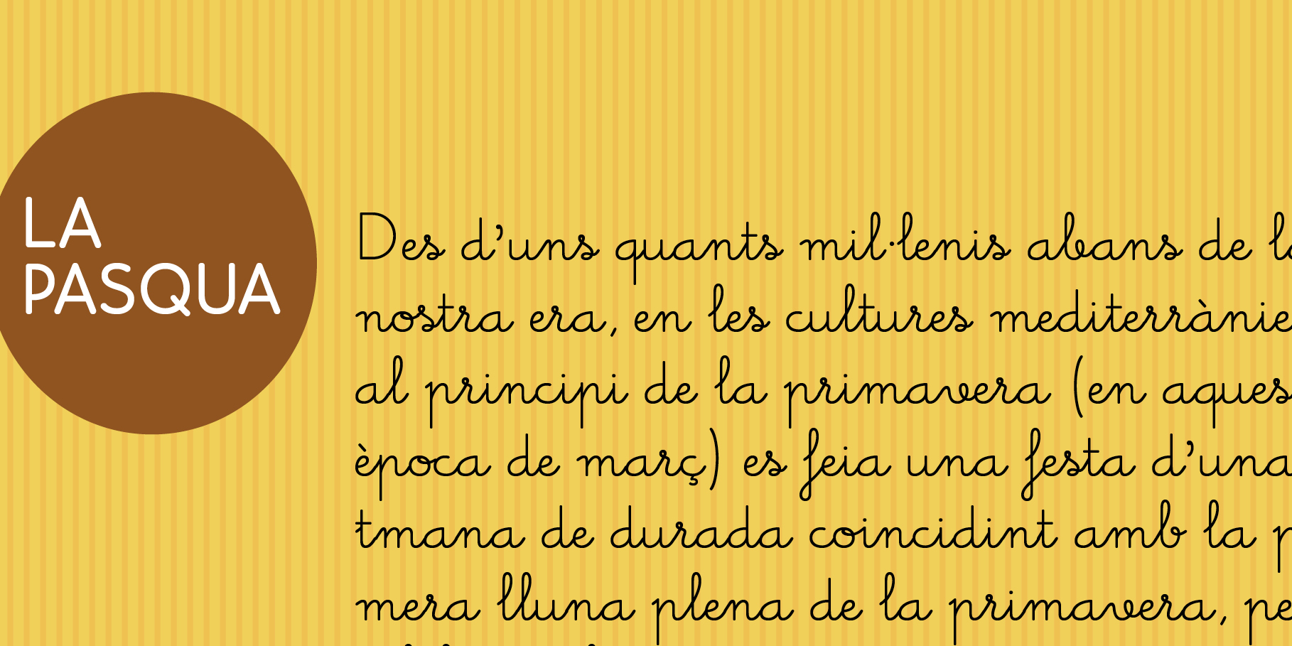
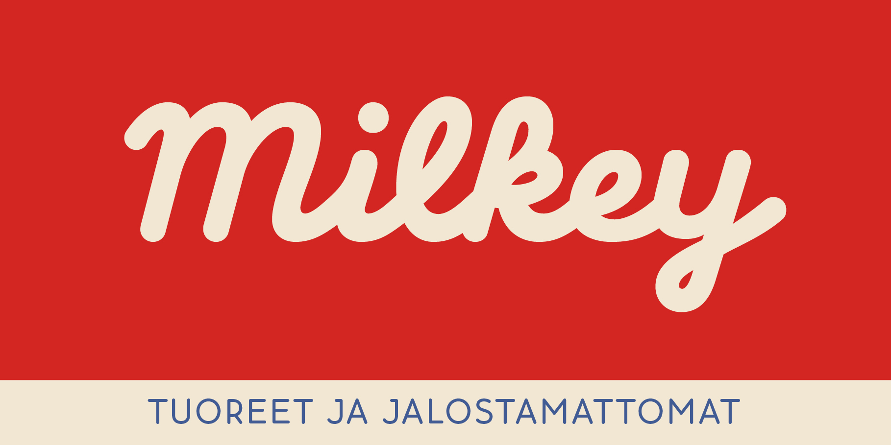
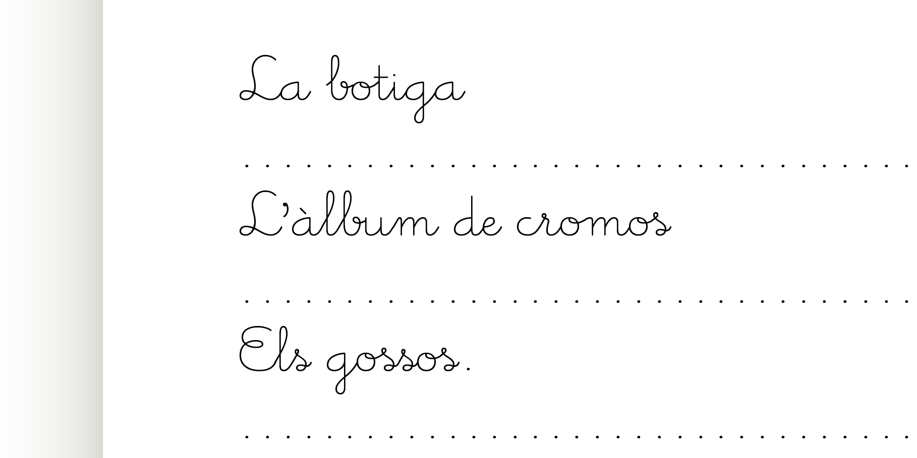
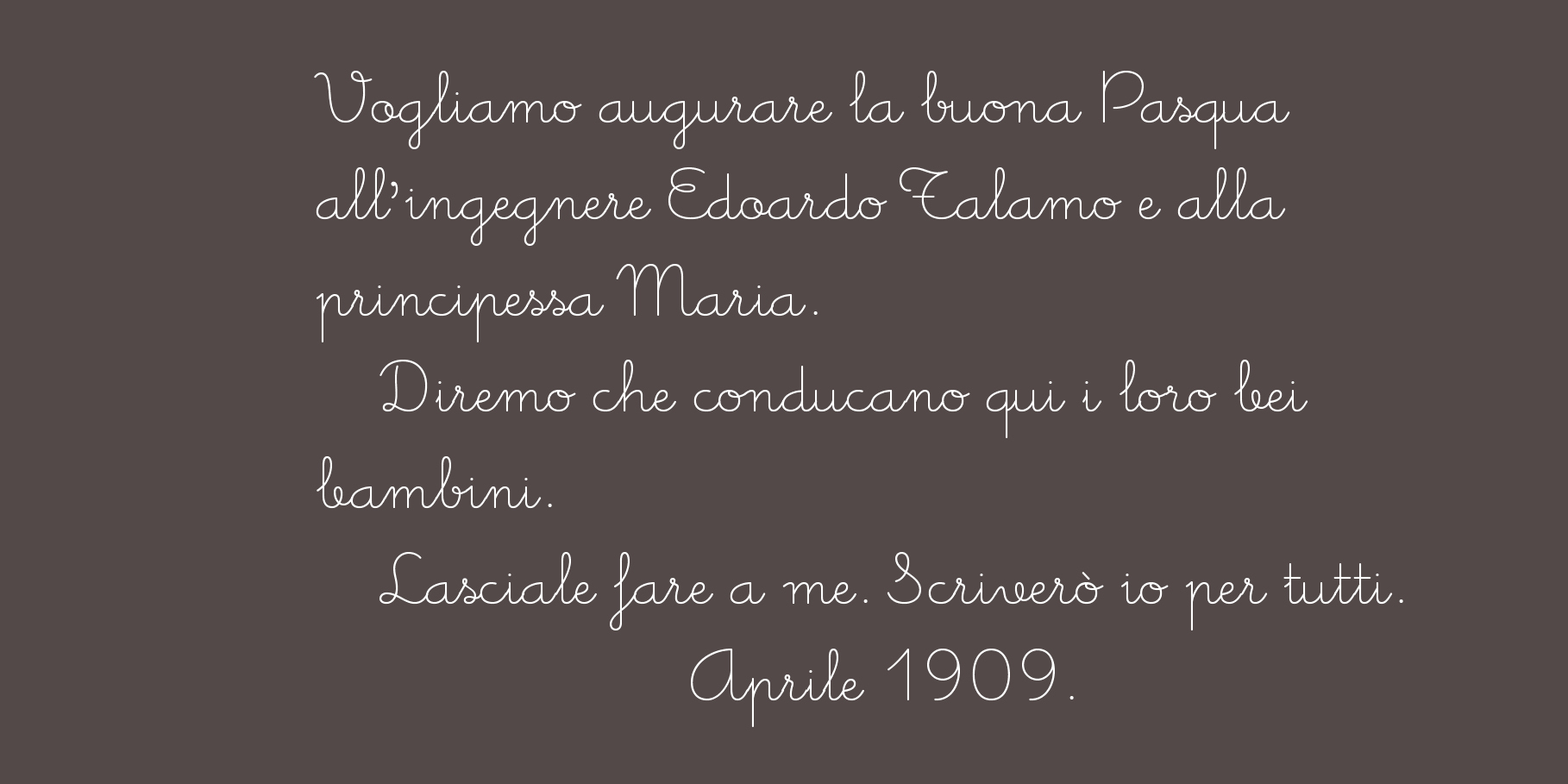
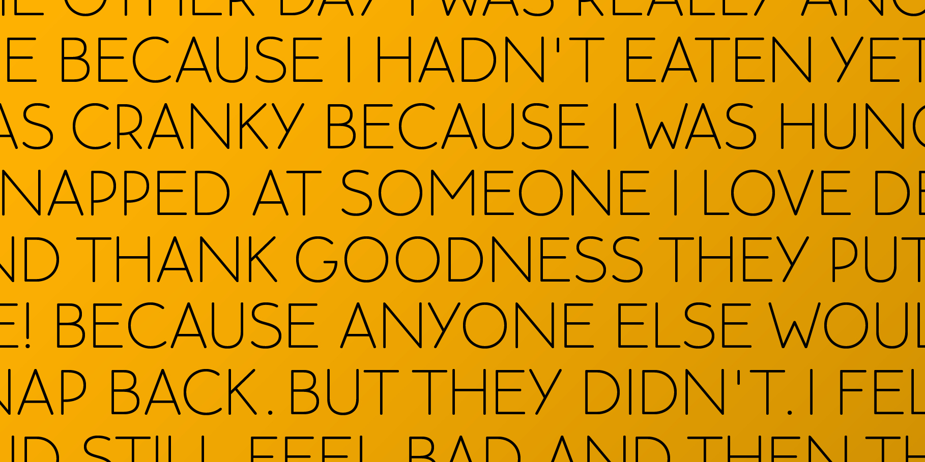
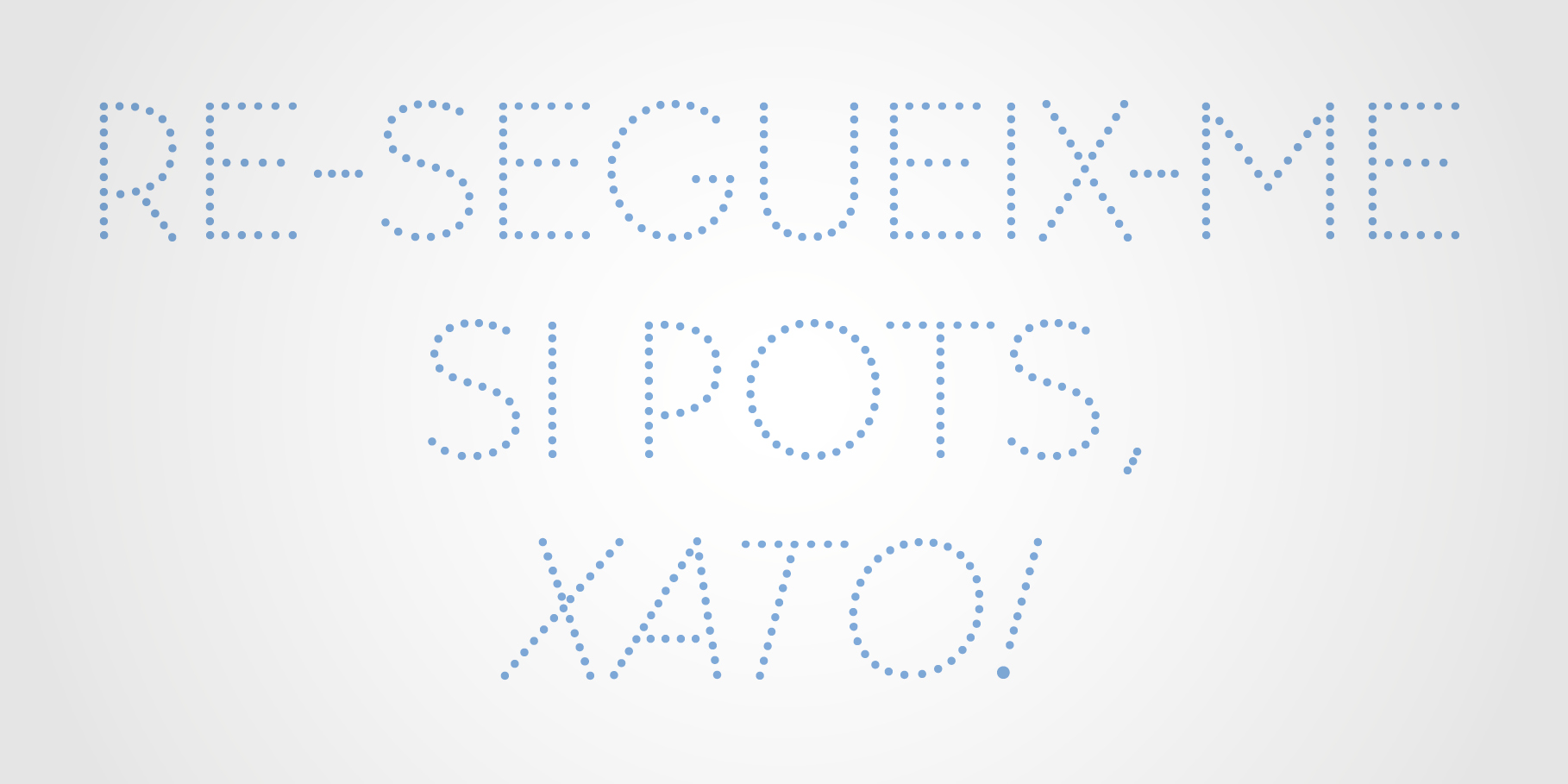
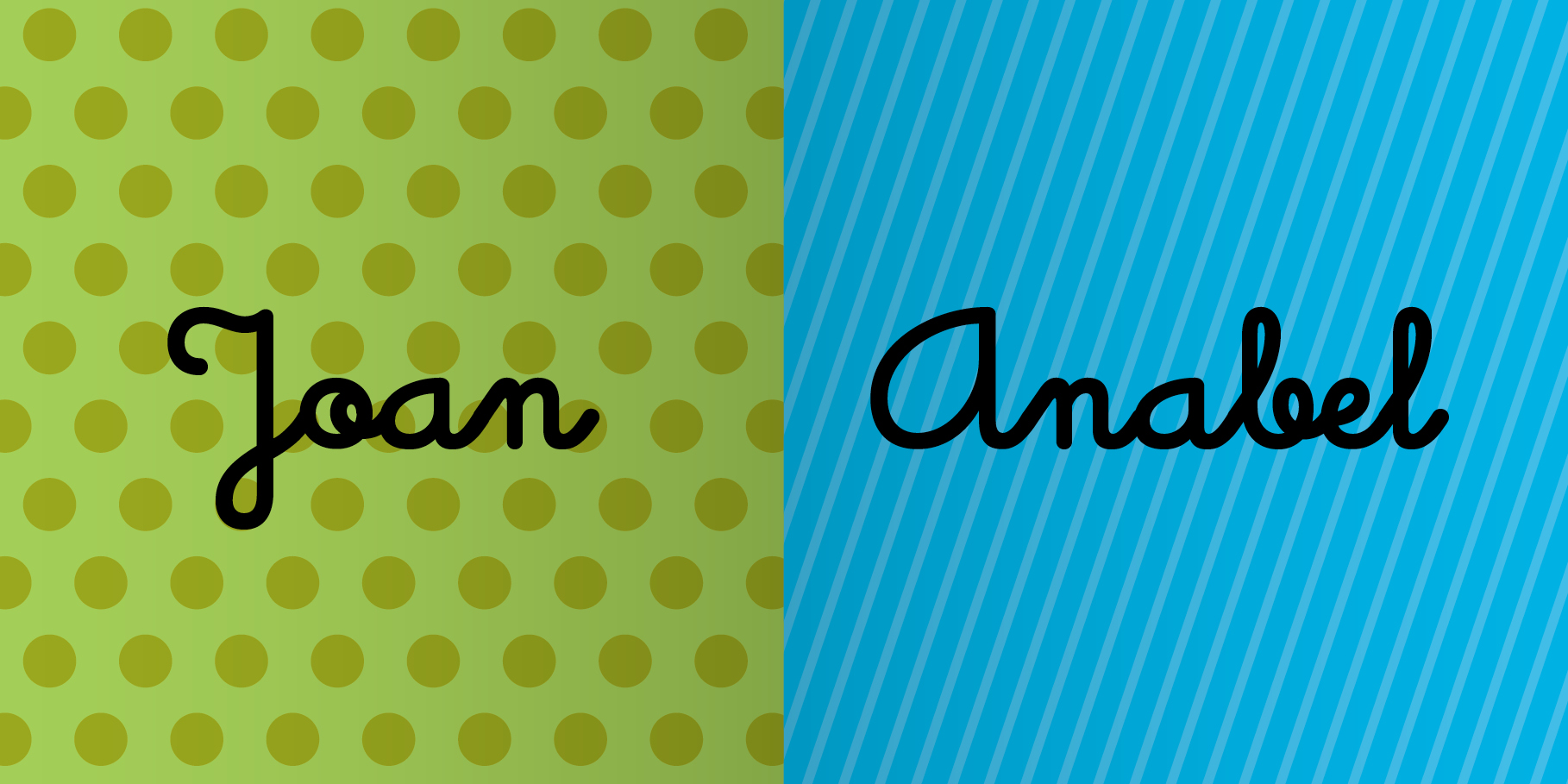
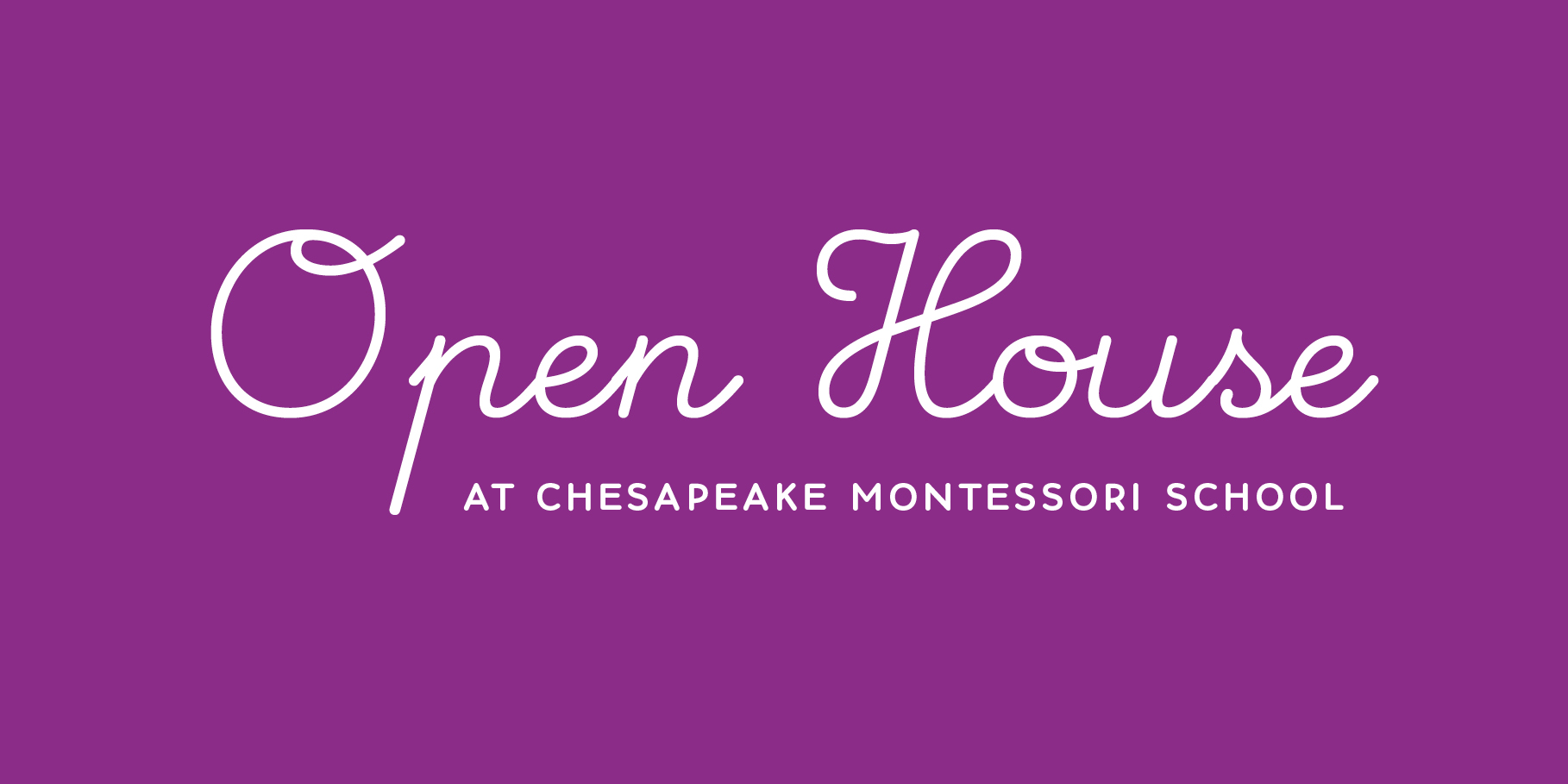
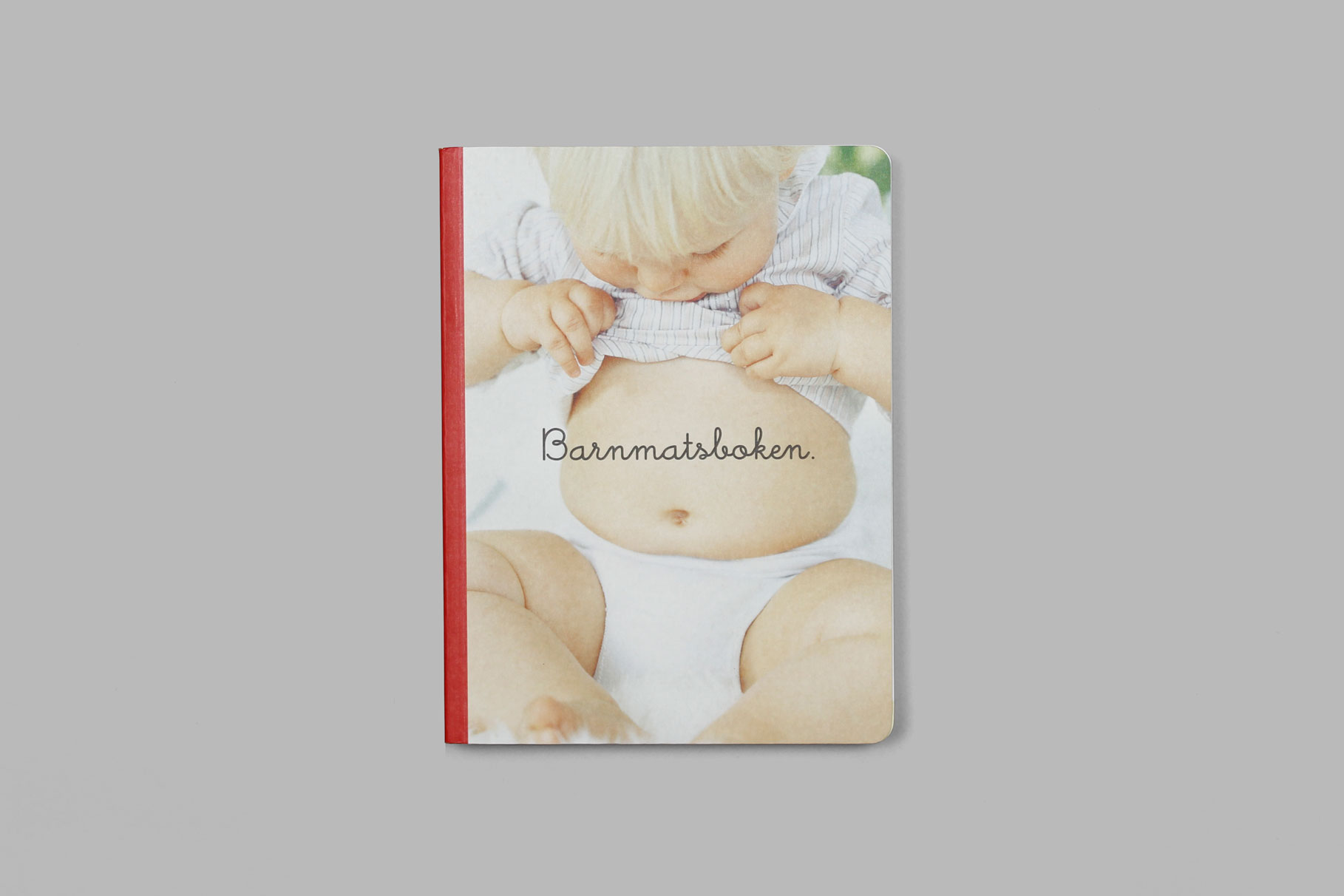
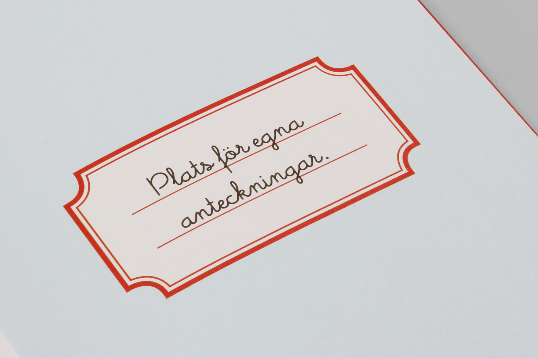
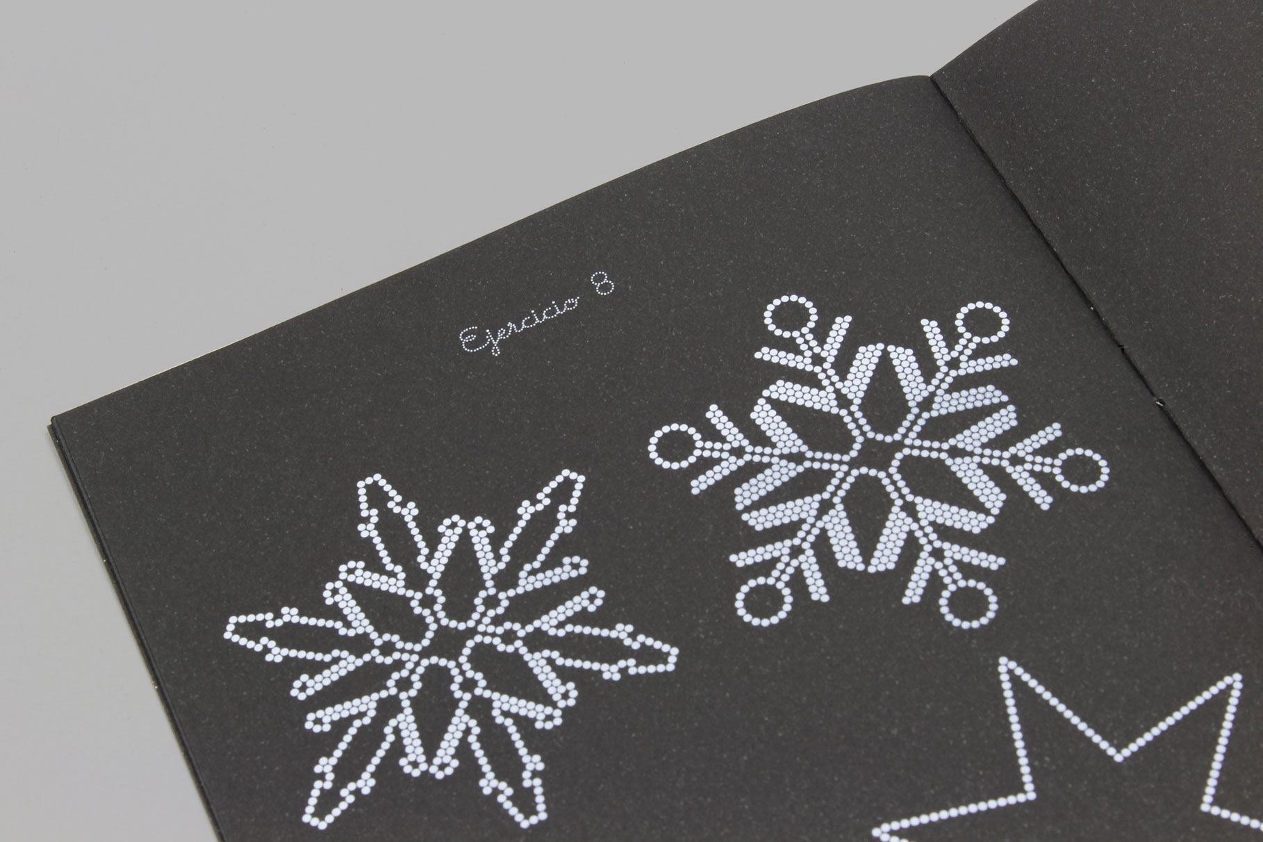
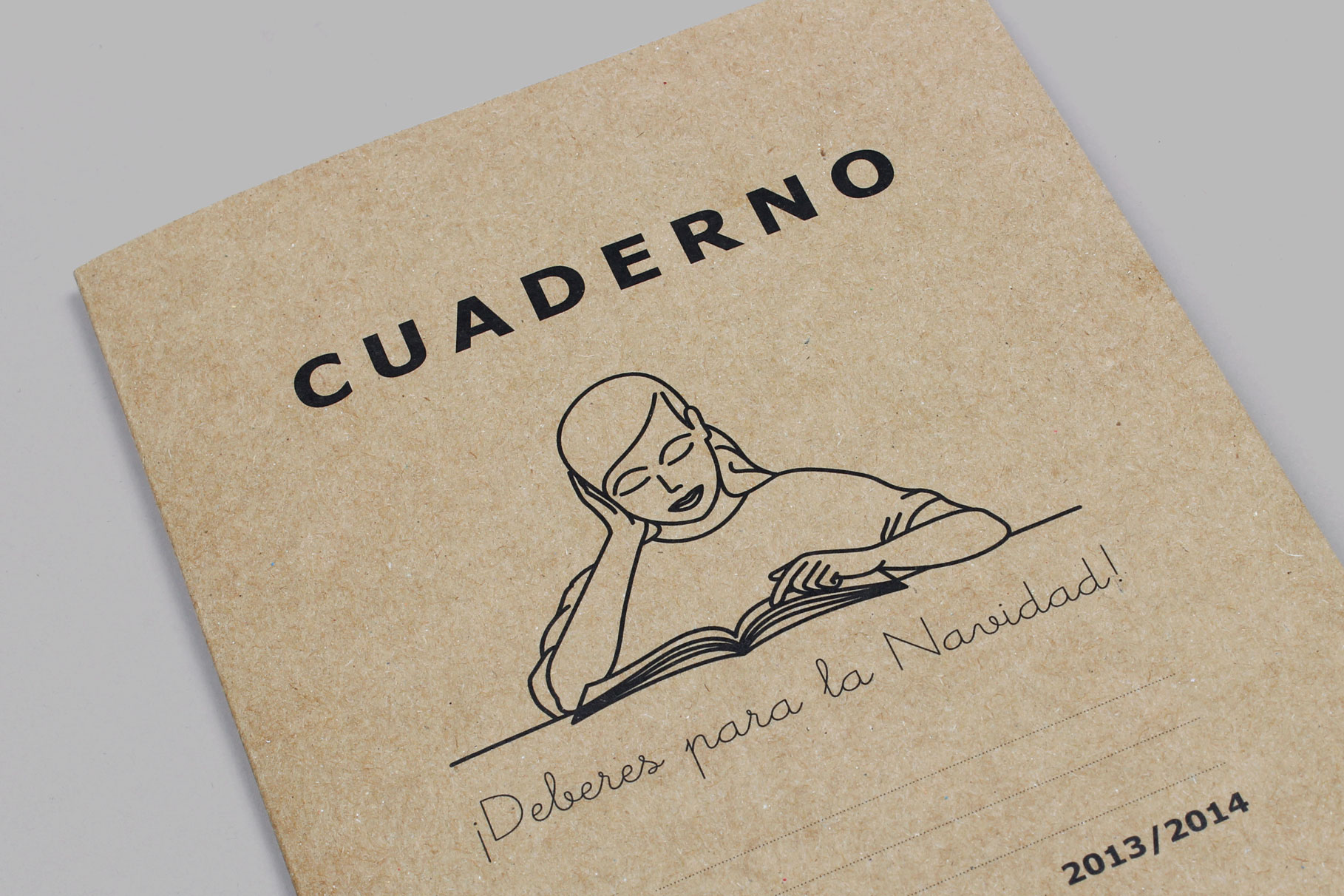
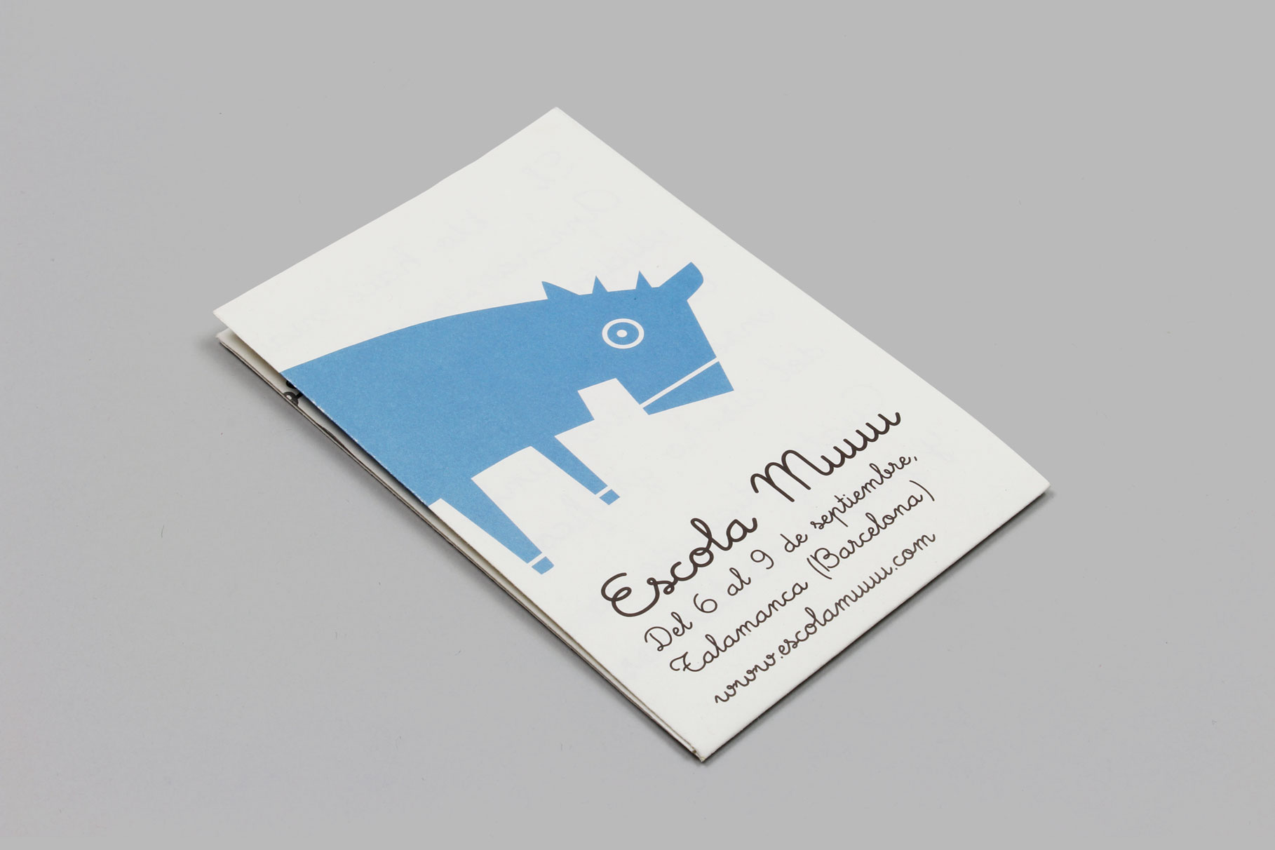
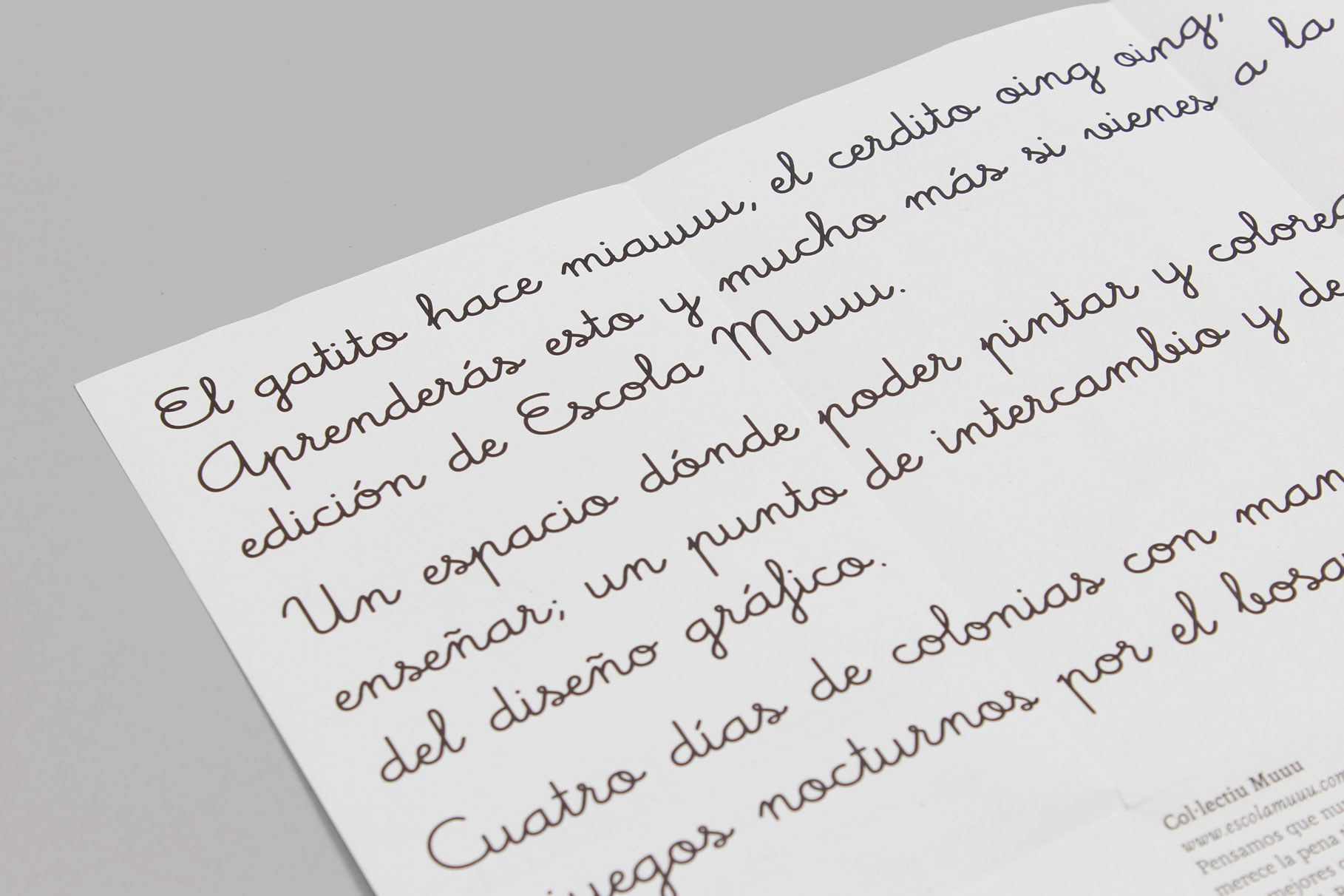
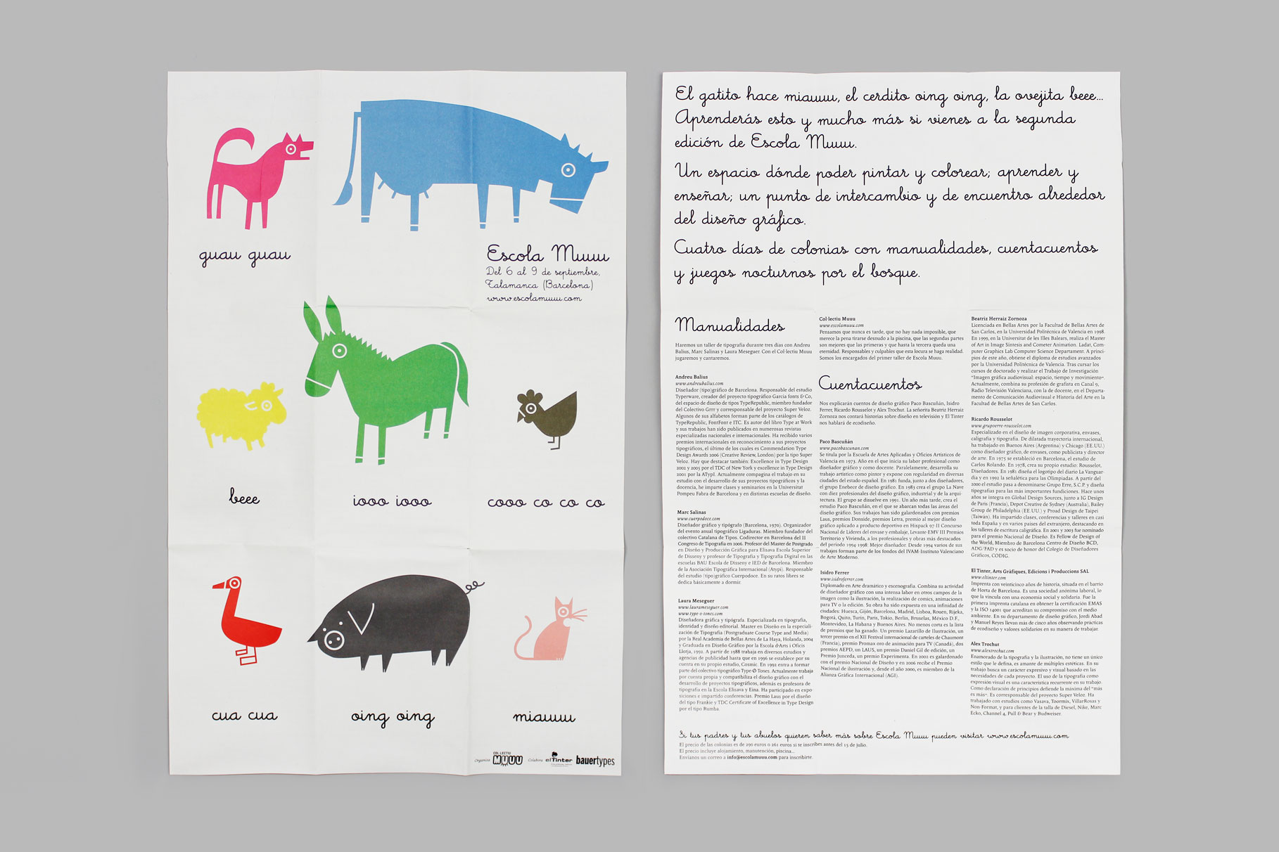
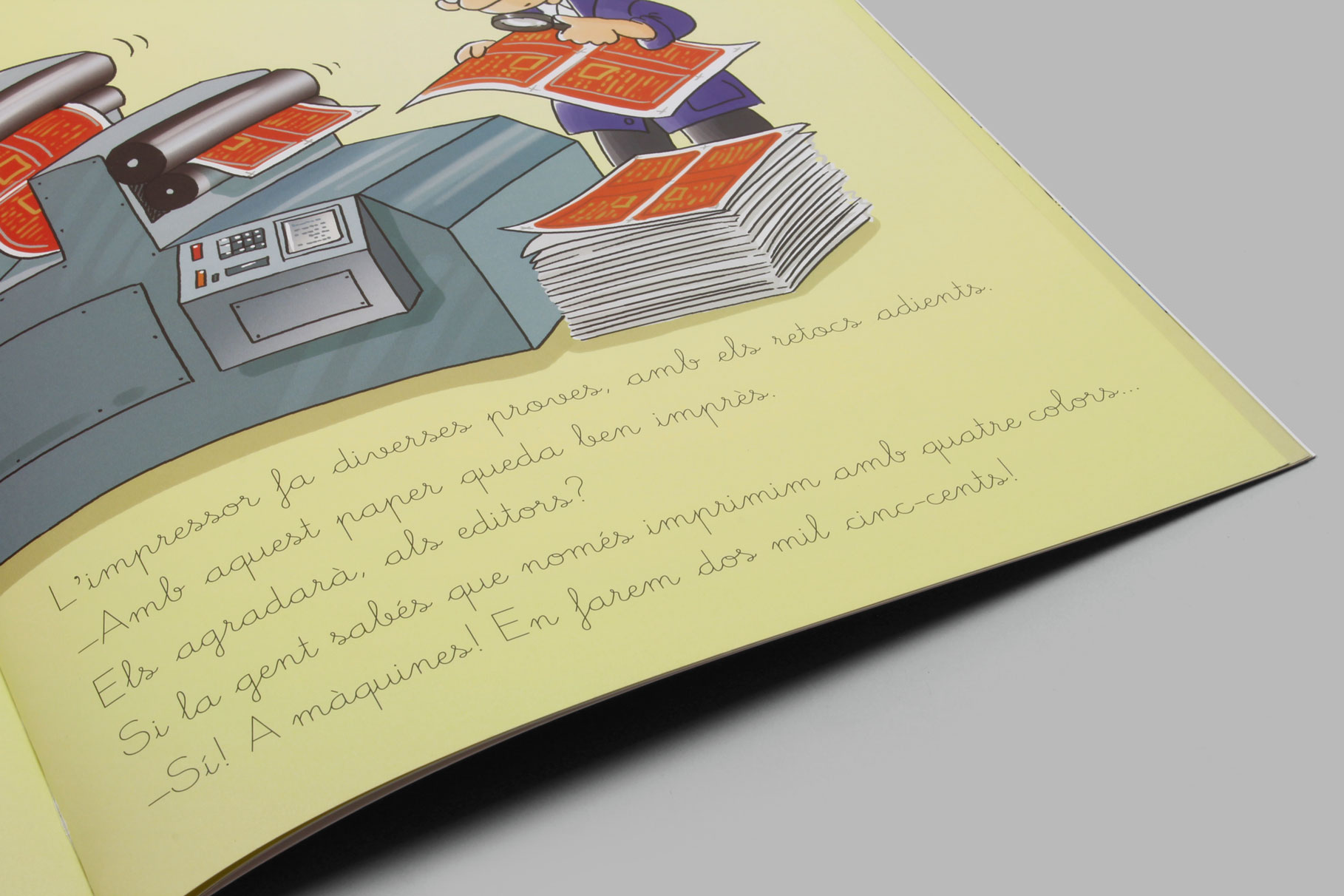
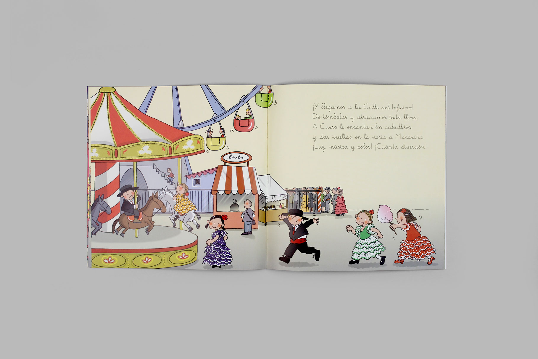
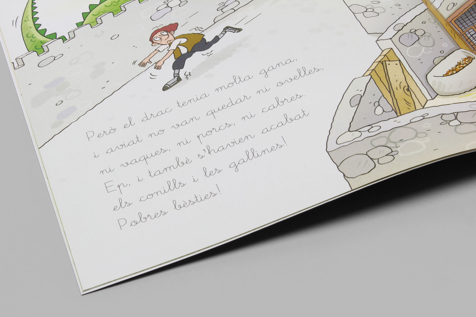
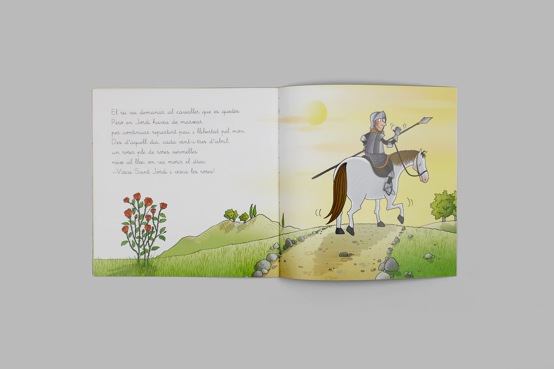
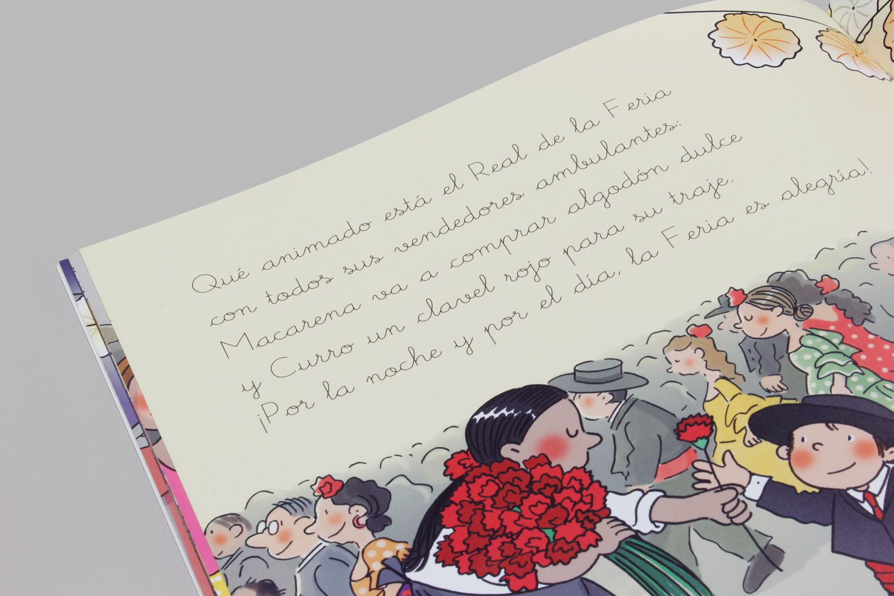
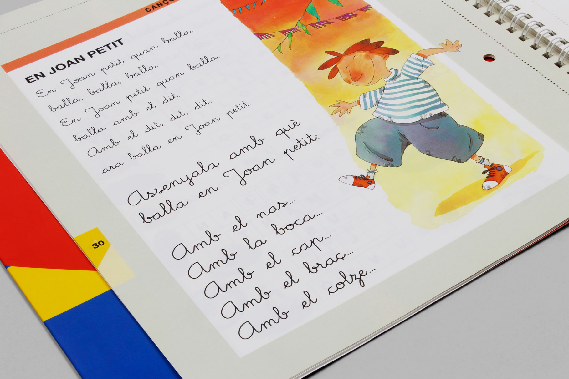
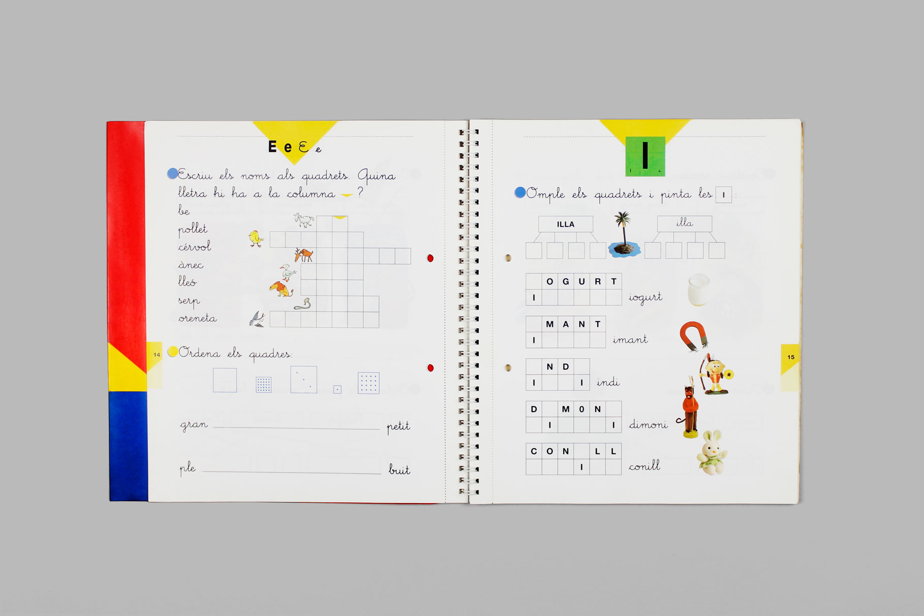
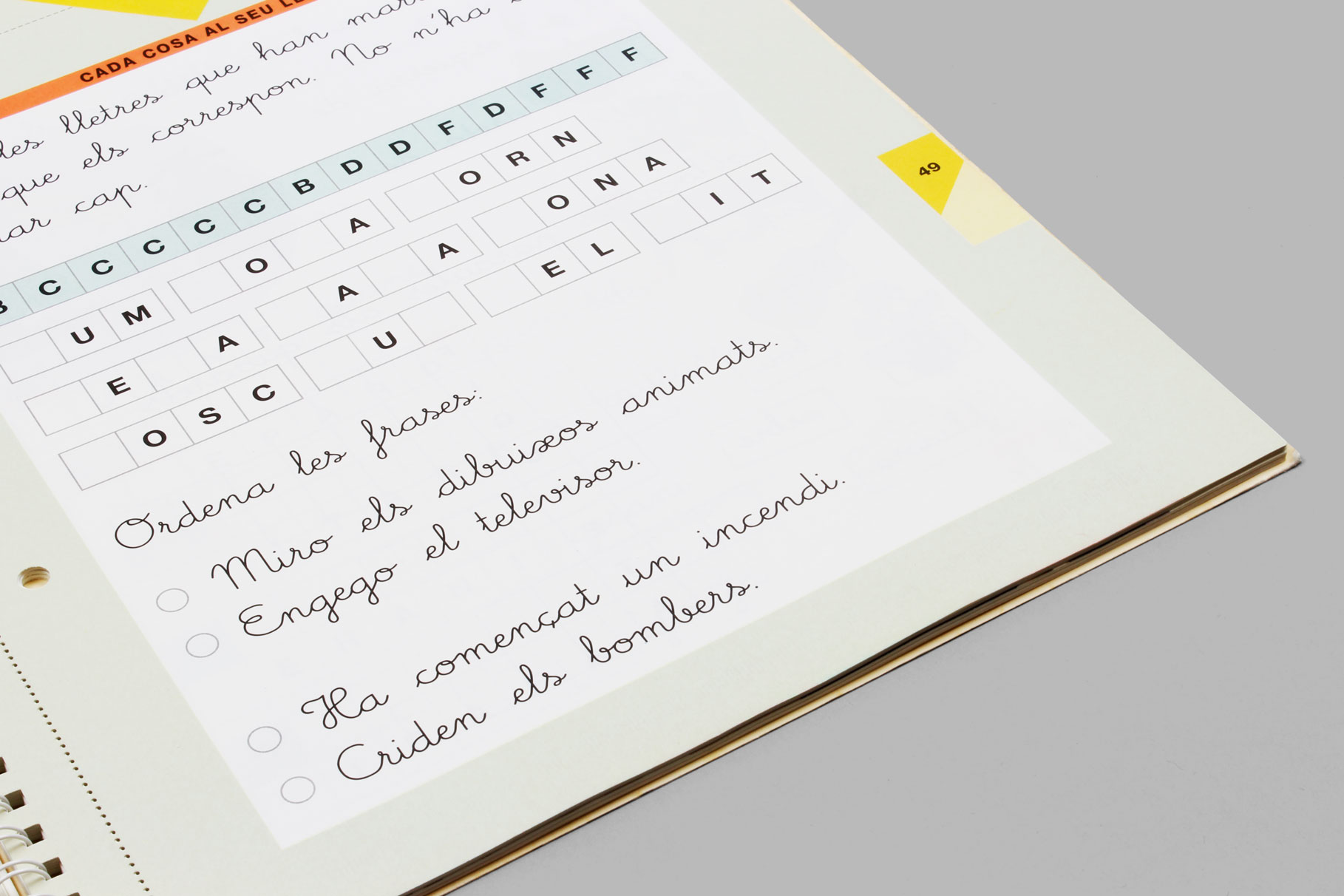
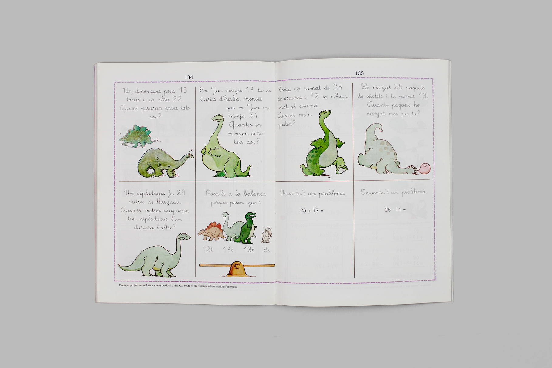
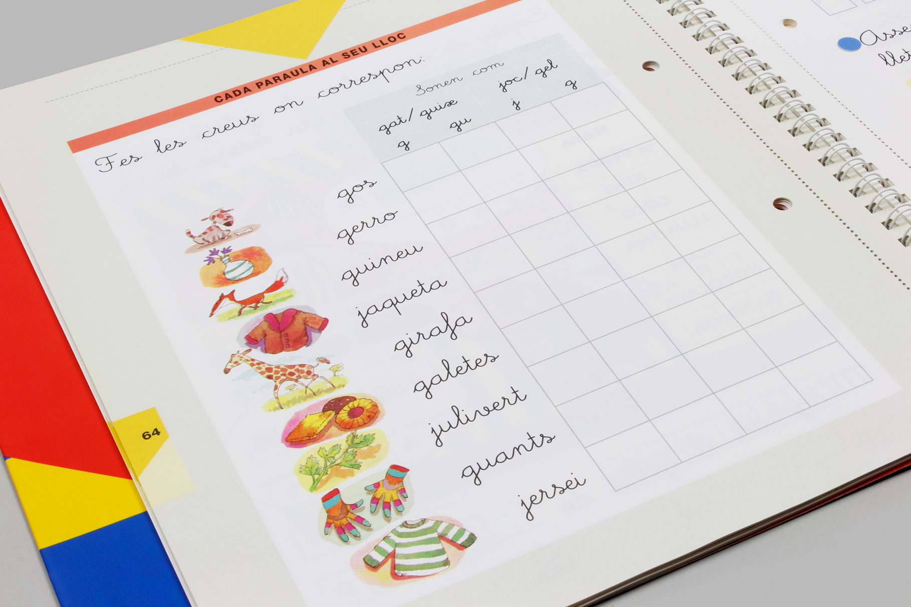
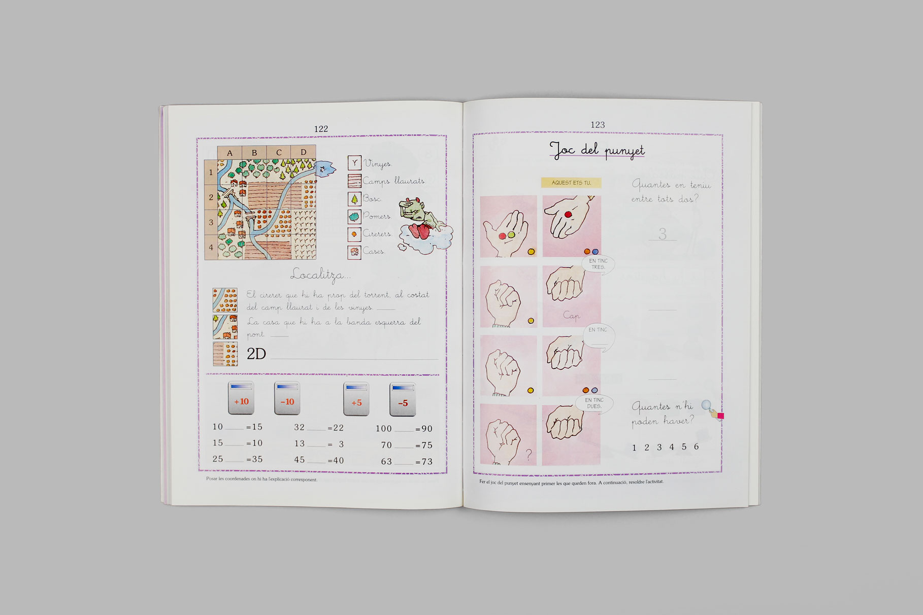
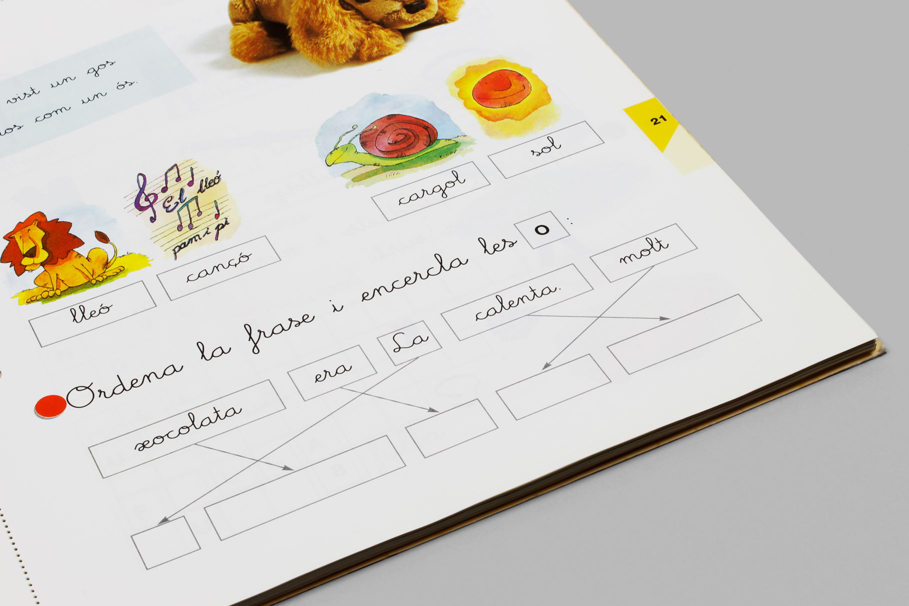
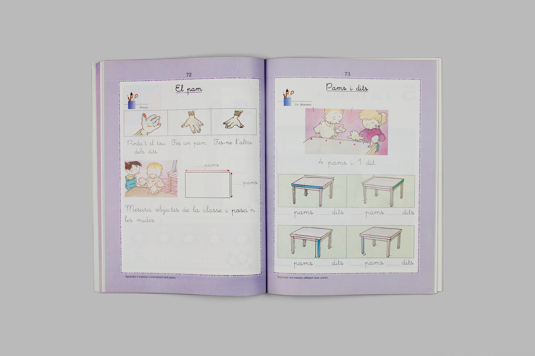
This is the font with which we all learned to read and write. We know that it stirs much affection because it reminds everybody of their primary school days, and most of you will find it has a self-explanatory name*. Its shape is engraved on all our minds as if on stone.MeMimas was the first typeface to be commissioned to Type-Ø-Tones. In 1991,the Barcelona-based publishing house, Barcanova, needed a digital version of this typeface to use it for its children’s books. We came up with a structure –a skeleton– which evolves into four weights, and has a set of links between characters which is peculiar to script fonts. The actual version has been named Pro as we reunited in single weights both Alternate Caps, ligatures and a number of useful OpenType features, designed and programmed by Josema Urós and Joan Carles Casasín. In version 4.5 we introduced the Italic versions -in fact, the ‘natural’ forms of a Upright Roman– and Ultra, with an altered x-height for display applications.
Article
‘New Memimas for 2019’ by Josema Urós
Tags
Display & Text, Kids, Sans Serif, Script
