Author
Laura Meseguer
Creation
1992
Actual version
2 (2010)
Styles
1
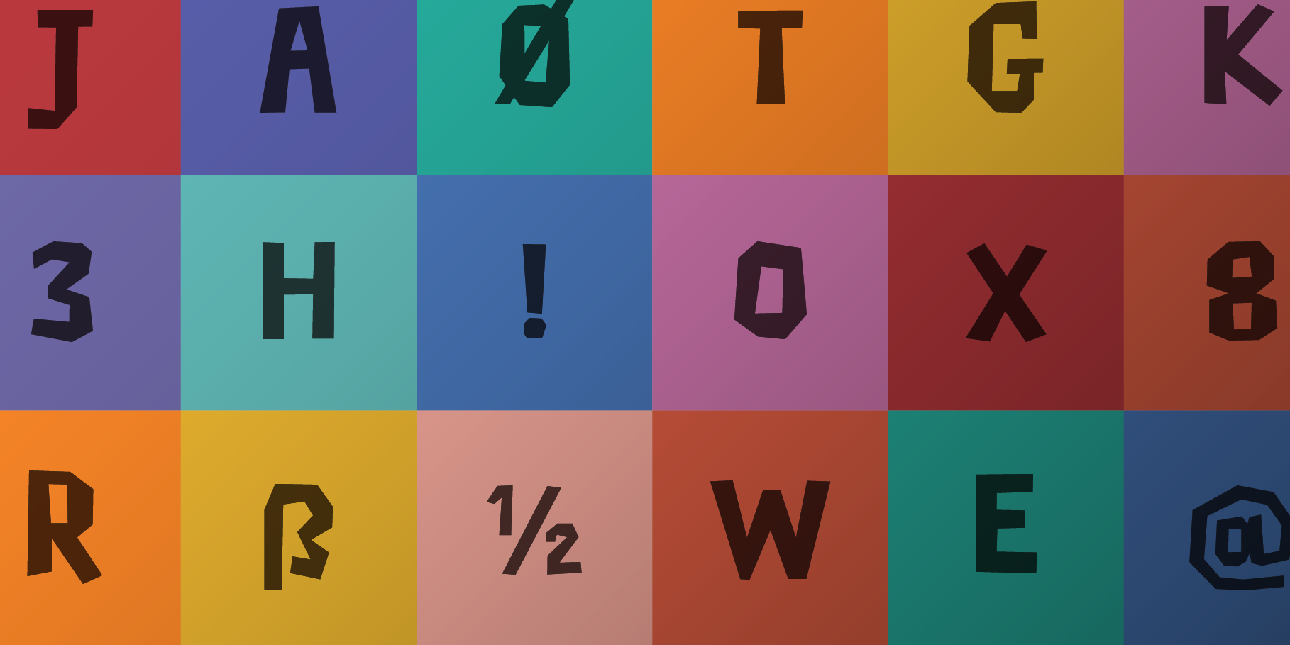
Character sets
Basic Latin
Latin-1 Supplement
Latin-2 Central European
License Types
Desktop, Webfont, ePub, App, Server
Description
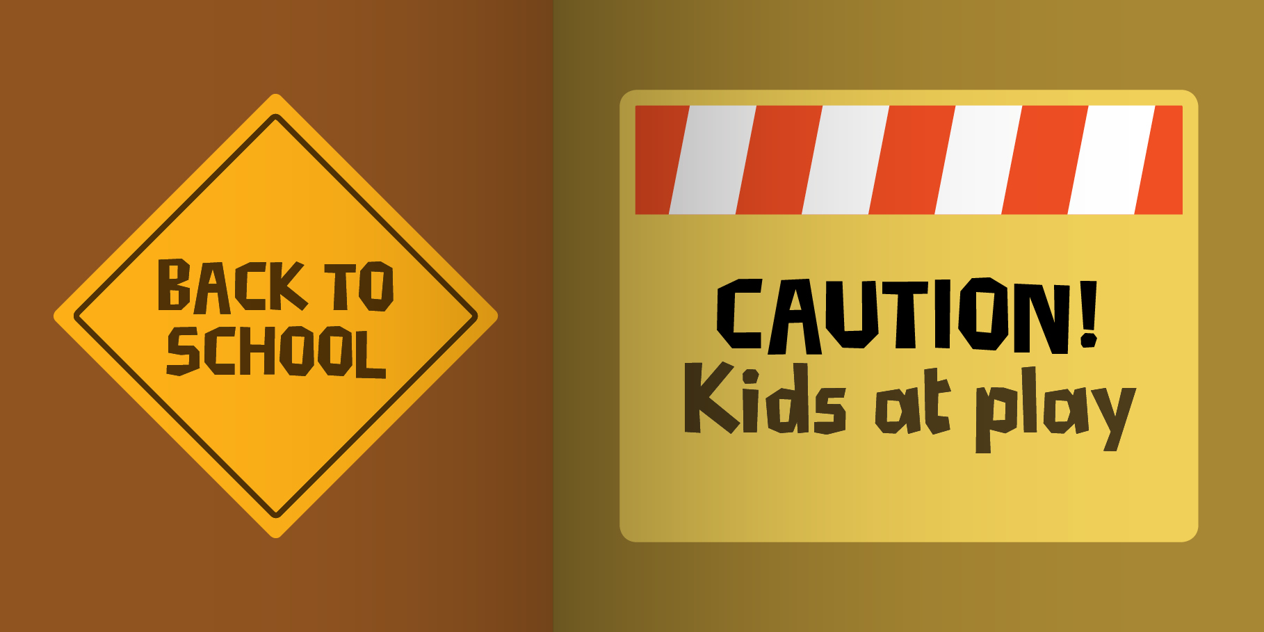
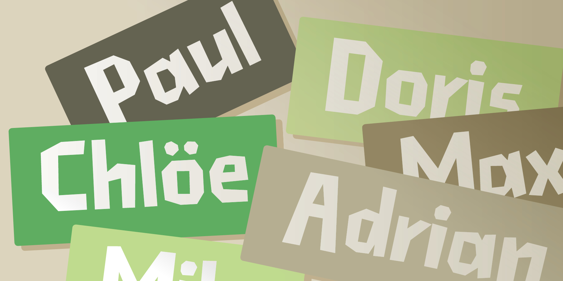
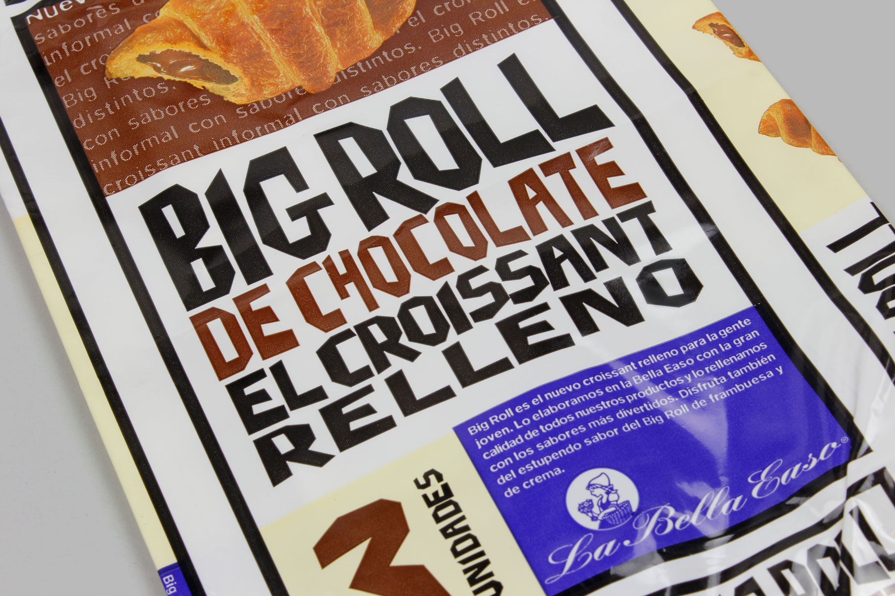
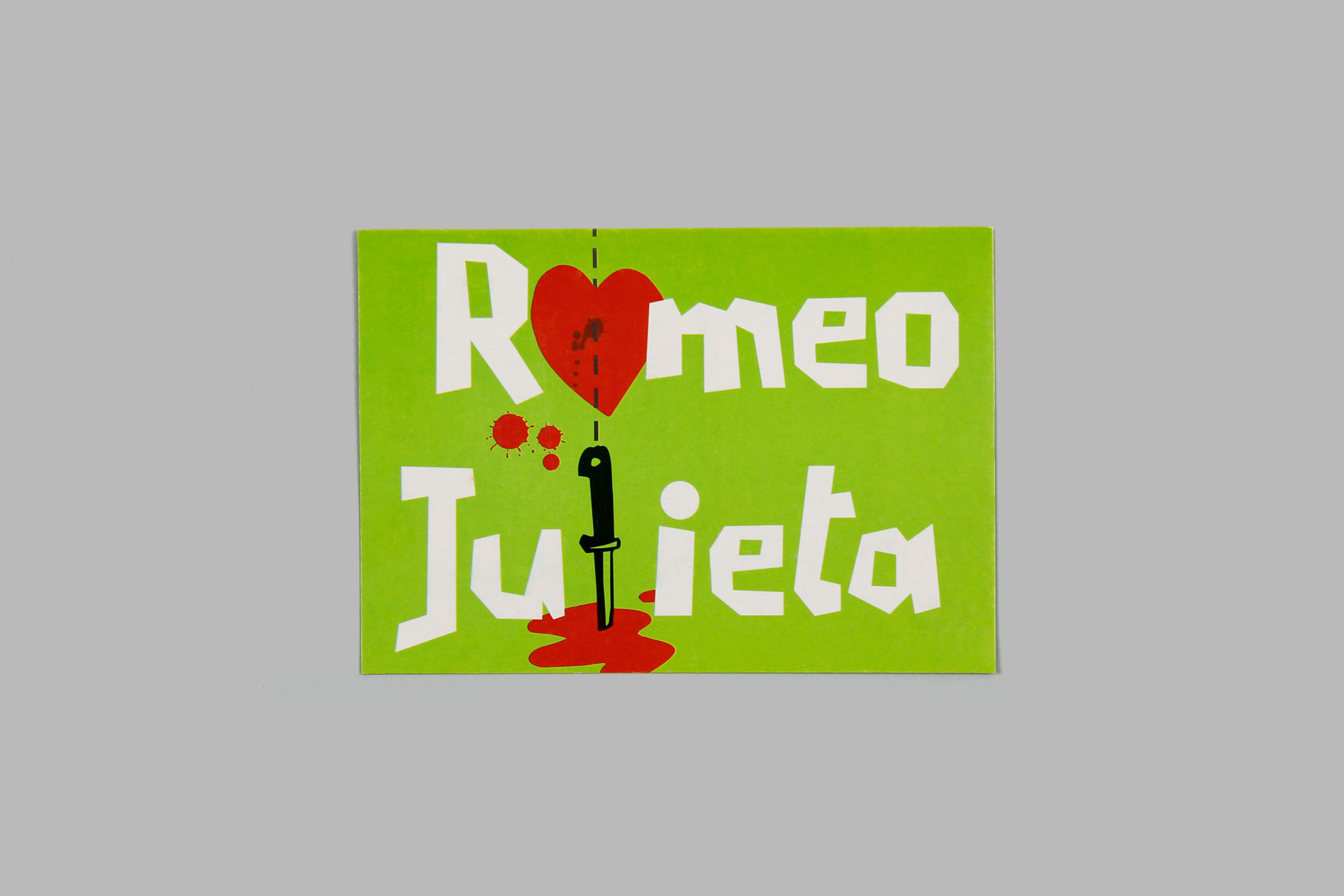
This typeface is a clear example of the explosion in technology that occurred in the 1990s and which spread into the sphere of font design, a task that until then had been restricted to a very small number of highly specialised professionals. This letter came about as a result of experimenting in hand-drawing, without using curves, in the Fontographer font editor. The result is a font in which every letter seems to have been cut out of black paper, hence its name (Cortada means cut in English). This was Laura Meseguer’s first project as a member of Type-Ø-Tones.
Tags
Display, Kids, Sans Serif