2019/01/1
“Radar, a font family with a Spanish accent” by Marta Sánchez Marco
The design of Radar is an homage to 20th-century grotesque typefaces and a product of that particular historical context. At the beginning of the 20th century, the world industrial expansion was at its peak and great advances took place in the field of technology. Among them, and in the context of the 20s, there was radio technology, an immaterial and at the same time global media and a phenomenon that contributed to the consolidation of the mass society as a whole. At the same time, a type family for advertising use named Grotesca Radio was born in the Richard Gans Type Foundry. His authorship is attributed to the German type designer and master punch cutter Carl Winkow.
Richard Gans Type Foundry created its own typeface for advertising use, which had a clean, modern and geometric drawing. At the same time, many other geometric typographies were commercialized, like Predilecta from Iranzo Type Foundry, and Grotesca Nacional and Electra from Nacional Type Foundry. On the international scene, there is a connection with Futura (1927), a Paul Renner’s design distributed in Spain by Neufville Type Foundry and with Erbar (1922) by Jakob Erbar. Although Paul Renner’s Futura is well-known in the typography world, it is important to point out at that time there were other typographic achievements.
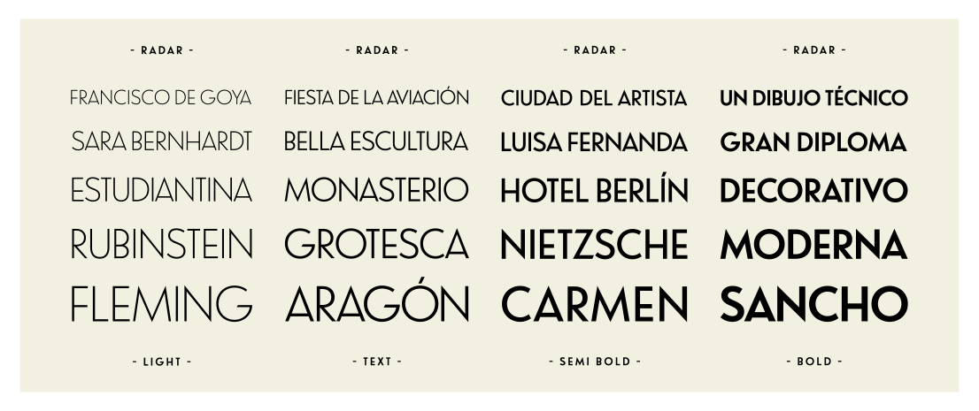
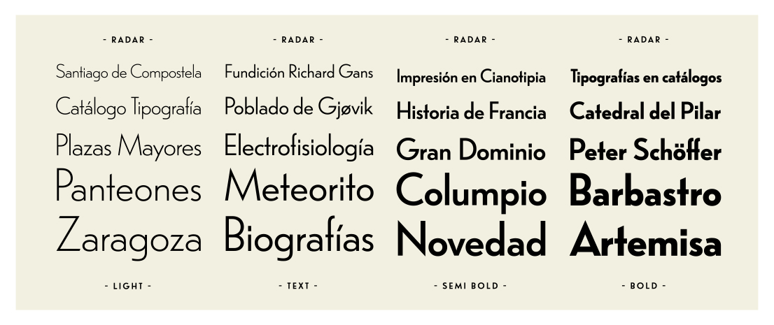
Radar connects formally with Grotesca Radio, Richard Gans’ novelty in their catalog and is a grotesque creation with a Deco twist, offered now in 4 weights and prepared for contemporary use. Choose among Radar Fina (Thin), Texto (Text), Seminegra (Semi Bold) and Negra (Bold).
I would like to point out that new typeface designs appeared at the beginning of the 20th century justified by a specific context. Until the start of the First World War Richard Gans Type Foundry (Madrid, 1881) developed its activity in collaboration with some German companies, importing from abroad most of the material needed. At the beginning of the war, and justified by the lack of supplies, the need for new designs was born. Carl Winkow did this, supported by some assistants who worked with him at the engraving workshop. A great compendium of new drawings in the typographic Spanish scene of this century was possible thanks to the professionalism and prestige of this master.
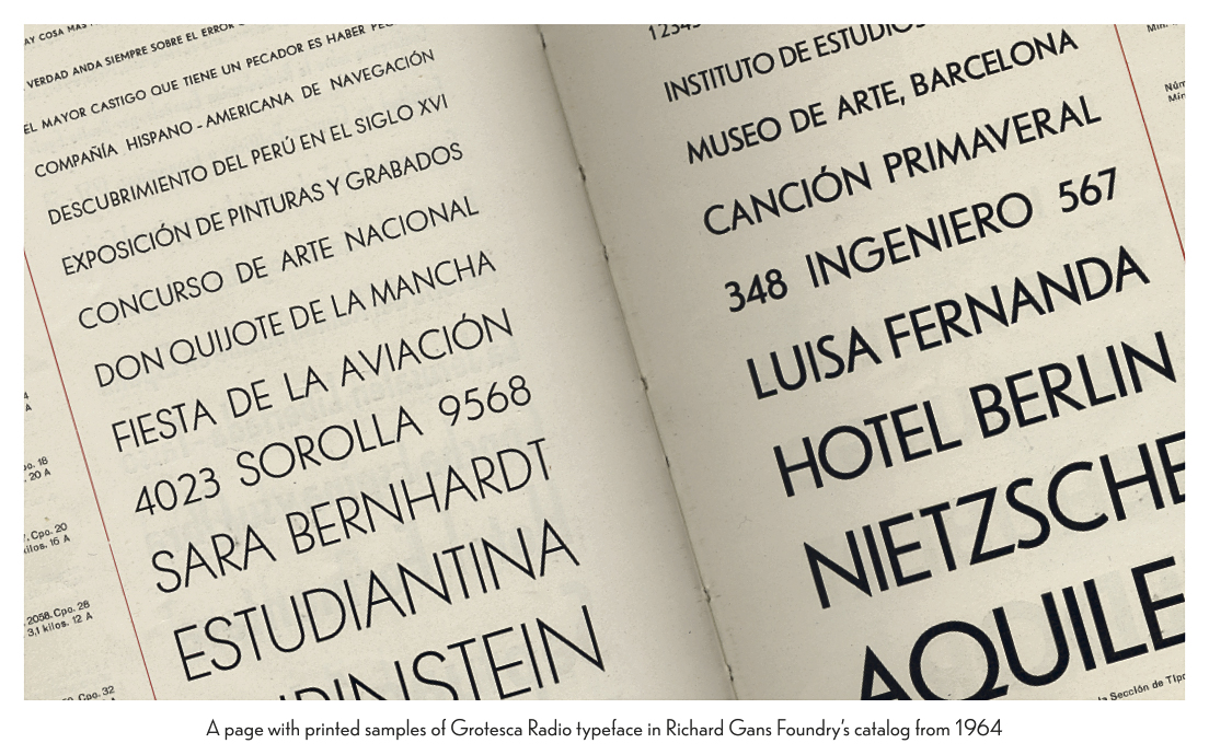
The first printed examples of Grotesca Radio typeface are in Richard Gans Foundry’s catalog first published in 1922. But the key piece at the documentation stage and the most important through all the process of digital recovery is a catalog from 1964, where we can find evidence of the general use of grotesques: “Industry businesses prefer using Grotesque typefaces, due to the simplicity, seriousness, and clarity of their drawing.” The permanence of this typeface throughout this foundry’s existence, as well as the number of styles designed, are a testimony of its success over the years, becoming an exceptional product in the catalog.
After the Spanish Civil War (1936-39) the Richard Gans Type Foundry restarted its production and commercial activity, becoming a reference for the Spanish panorama, together with Iranzo, Nacional and Neufville type foundries. But with new printing systems, firstly photocomposition and later desktop publishing, the demand for metal type was declining until it became practically null. For this reason, a great restructuring improvement was necessary and, those companies who didn’t implement them were fated to disappear. This was the case for Richard Gans, which closed down and that’s why over time Grotesca Radio typeface was left in oblivion.
Radar is a sans serif typeface, geometric and mono-lineal. Its design can be related to the body of creations from the early 20th century which, contextualized in the avant-garde European period, believed that the sans serif typographic trend was the most modern and appropriate expression for those days.
There is a clear geometric pattern in Grotesca Radio that makes it easy to spread the construction rules to all the glyphs. As a remarkable feature, this typeface has a short x-height and very high ascenders, which gives it a sophisticated air but complicates its use as a continuous text. Therefore, I recommend using it for headlines or short text paragraphs.
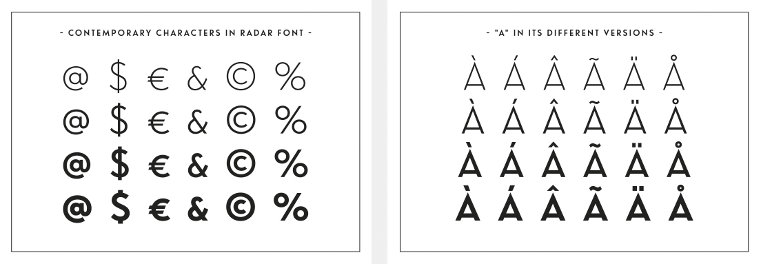
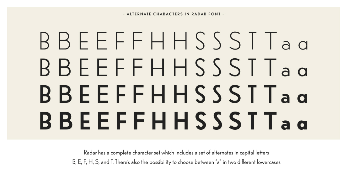
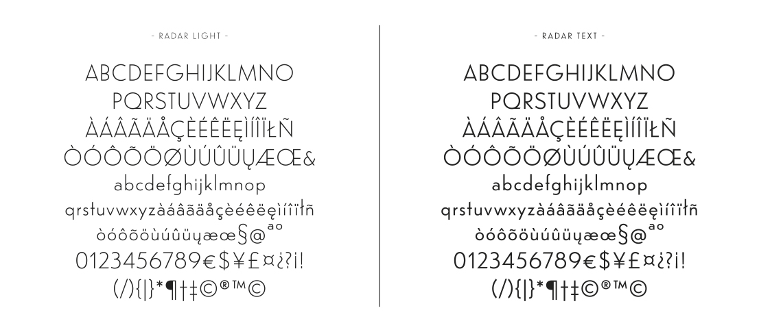
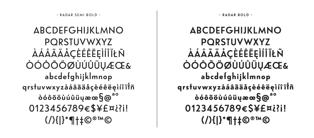
There were many challenges to adapt the old design to current user needs, involving both software aspects and graphic and drawing details. Radar has a complete character set which includes a set of alternates in capital letters B, E, F, H, S, and T. There’s also the possibility to choose between “a” in two different lowercases. Contemporary basic glyphs and their composites, the numeric section, punctuation and diacritic symbols were determined. Finally, and without compromising the mono-lineal aspect of the font, many optical adjustments were necessary, such as ink traps, more pronounced with increasing weight.
With interpolating process an intermediate version of the font was born, suitable for its use in body text. Radar family consists of four fonts: Fina (Light), Texto (Text), Seminegra (Semi Black) and Negra (Black).
Radar font took part of the Third International Congress of Typography, celebrated in Valencia, Spain (2008) and takes part of Carácter Latino (2012), written by J. Vilafranca in collaboration with Spanish publisher Index Book, which specializes in graphic design and visual communication. This book compiles the most important typographic projects of the Latin scene at that time. In 2014 Marta Sánchez was an invited teacher presenting her project at the Faculty of Computer Science and Media Technology at Gjøvik University College (Norway).
To finish with, it is important to say that this project is developed from a deep sense of respect for the original font and it is not intended as a strict revival, but as a contemporary re-interpretation. A great deal of research and drawing was necessary, for use in a contemporary technological environment.
Marta Sánchez Marco is a graphic designer, photographer, and educator. She has worked in the graphic design industry since 2008. She holds a bachelor degree in Fine Arts and postgraduate degrees in Typography at EINA and in Still Life Photography at IEFC (both in Barcelona). She has also participated in several projects and exhibitions.
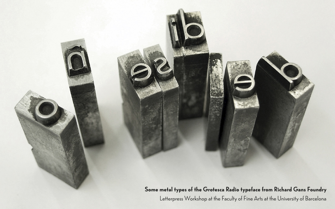
Special thanks to José Manuel Urós, Íñigo Jerez and Laura Meseguer, who provided guidance in my Postgraduate Degree in Advanced Typography in Eina. Thanks to Jesus del Hoyo Arjona and Oriol Viñals Moret, who helped me in the Letterpress Workshop at the Faculty of Fine Arts at the University of Barcelona, where I had the opportunity to work with some metal types of the Grotesca Radio as well as having access to Richard Gans Foundry's catalog from 1964. Thanks to Dimas García Moreno and José Ramón Penela Rodríguez, whose texts on Richard Gans Type Foundry I used as a primary source of information.
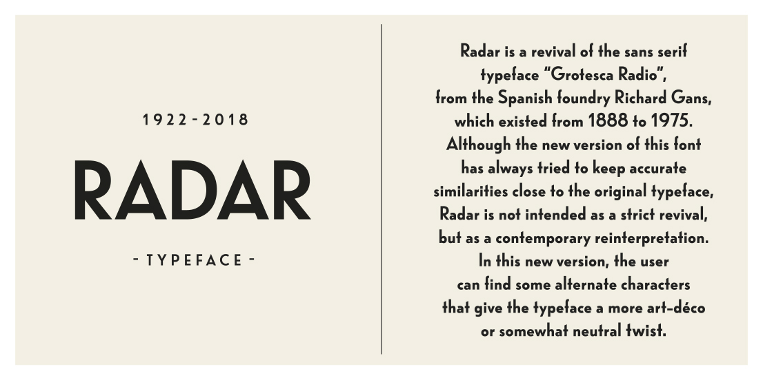
Radar is a revival of the sans serif typeface “Grotesca Radio”, from the Spanish foundry Richard Gans, which existed from 1888 to 1975. Although the new version of this font has always tried to keep accurate similarities close to the original typeface, Radar is not intended as a strict revival, but as a contemporary reinterpretation. In this new version, the user can find some alternate characters that give the typeface a more art-déco or somewhat neutral twist.
